react-tiny-popover
A lightweight, highly customizable, and non-intrusive popover react HOC with no other dependencies! Typescript friendly, as well!
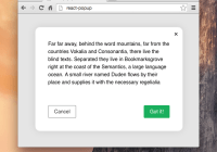
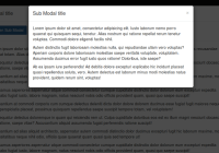
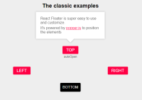
The component renders its child directly, without wrapping it with anything on the DOM, and in addition renders solely the JSX you provide when shown. It simply grabs the child component's coordinates and provides a robust and non-intrusive way for you to position your own content around the child. Your content will be appended to document.body when shown, and removed when hidden. You can use it to generate little popups around input or button elements, menu fly-outs, or in pretty much any situation where you want some content to appear and disappear dynamically around a target. You can also specify your own location for your popover content or hook into the existing positioning process, allowing you to essentially make modal windows and the like, as well!
react-tiny-popover will also guard against your window's current dimensions and reposition itself to prevent any kind of hidden overflow. You can specify a priority of desired positions to fall back to, if you'd like.
Optionally, you can provide a renderer function for your popover content that injects the popover's current position, in case your content needs to know where it sits in relation to its target.
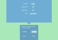
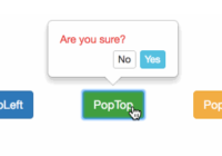
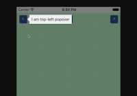
Since react-tiny-popover tries to be as non-invasive as possible, it will simply render the content you provide with the position and padding from the target that you provide. If you'd like an arrow pointing to the target to appear along with your content and don't feel like building it yourself, you may be interested in wrapping your content with the customizable ArrowContainer component, also provided! ArrowContainer's arrow will follow its target dynamically, and handles boundary collisions as well.
Install
yarn add react-tiny-popoveror
npm install react-tiny-popover --saveDemo
Examples
import Popover from 'react-tiny-popover' <Popover isOpen={isPopoverOpen} position={'top'} // preferred position content={( <div> Hi! I'm popover content. </div> )} > <div onClick={() => this.setState({ isPopoverOpen: !isPopoverOpen })}> Click me! </div> </Popover>import Popover from 'react-tiny-popover' <Popover isOpen={isPopoverOpen} position={['top', 'right', 'left', 'bottom']} // if you'd like, supply an array of preferred positions ordered by priority padding={10} // adjust padding here! disableReposition // prevents automatic readjustment of content position that keeps your popover content within your window's bounds onClickOutside={() => this.setState({ isPopoverOpen: false })} // handle click events outside of the popover/target here! content={({ position, nudgedLeft, nudgedTop, targetRect, popoverRect }) => ( // you can also provide a render function that injects some useful stuff! <div> <div>Hi! I'm popover content. Here's my position: {position}.</div> <div>I'm {` ${nudgedLeft} `} pixels beyond the window horizontally!</div> <div>I'm {` ${nudgedTop} `} pixels beyond the window vertically!</div> </div> )} > <div onClick={() => this.setState({ isPopoverOpen: !isPopoverOpen })}> Click me! </div> </Popover>import Popover, { ArrowContainer } from 'react-tiny-popover' <Popover isOpen={isPopoverOpen} position={['top', 'right', 'left', 'bottom']} padding={10} onClickOutside={() => this.setState({ isPopoverOpen: false })} content={({ position, targetRect, popoverRect }) => ( <ArrowContainer // if you'd like an arrow, you can import the ArrowContainer! position={position} targetRect={targetRect} popoverRect={popoverRect} arrowColor={'blue'} arrowSize={10} arrowStyle={{ opacity: 0.7 }} > <div style={{ backgroundColor: 'blue', opacity: 0.7 }} onClick={() => this.setState({ isPopoverOpen: !isPopoverOpen })} > Hi! I'm popover content. Here's my position: {position}. </div> </ArrowContainer> )} > <div> Click me! </div> </Popover>API
Popover
| Property | Type | Required | Description |
|---|---|---|---|
| children | JSX.Element | This is the JSX.Element target that you'd like the popover content to track. Sweet. | |
| isOpen | boolean | When this boolean is set to true, the popover is visible and tracks the target. When the boolean is false, the popover content is neither visible nor present on the DOM. | |
| content | JSX.Element or Function | Here, you'll provide the content that will appear as the popover. Rather than a JSX element like a <div>, you may supply a function that returns a JSX.Element, which will look like this: ({ position, targetRect, popoverRect, align, nudgedLeft, nudgedTop }) => JSX.Element. Here, position is of type 'top', 'bottom', 'left', 'right'. align is of type start, center, or end. Both targetRect and popoverRect are ClientRect objects of format { height: number, width: number, top: number, left: number, right: number, bottom: number }, and represent the popover content and target div's coordinates within your browser's window. nudgedLeft and nudgedTop specify the X and Y offset the popover content is shifted by to keep it within the window's bounds during a boundary collision. You may want to use these values to adjust your content depending on its location in relation to the window and the target, especially if you have repositioning disabled. Sweet. | |
| padding | number | This number determines the gap, in pixels, between your target content and your popover content. Defaults to 6. | |
| windowBorderPadding | number | This number specifies the padding around the browser window's border that boundary violations are determined at. Defaults to 6. | |
| position | string or string[] | You may provide a preferred position for your popover content in relation to its target. Valid values are 'top', 'bottom', 'left', 'right'. The default is 'top'. If you'd like, you can supply an array of preferred positions ranked in priority order. If the popover reaches the edge of the window, it will attempt to render in the order you specify. The default order is ['top', 'right', 'left', 'bottom']. If you'd like, you can provide a shorter array like ['top', 'left']. The remaining positions will be automatically filled in. If you provide any duplicate or other values in the array, they will be ignored. | |
| contentLocation | object or Function | If you'd like to hook directly into the positioning process, you may do so here! You can provide an object of type { top: number, left: number } to completely override the popover content's (popoverRect) location. You can also provide a function that looks like this: ({ targetRect, popoverRect, position, align, nudgedLeft, nudgedTop }) => { top: number, left: number } (The arguments to this function are the same as the content renderer function above). Note that if repositioning is enabled, it happens before this step, so within here you'll be responsible for keeping popoverRect within the window's bounds if that matters to you! | |
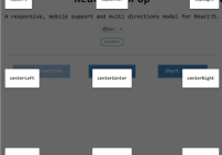
| align | string | Possible values are start, center, and end. If start is specified, the popover content's top or left location is aligned with its target's. With end specified, the content's bottom or right location is aligned with its target's. If center is specified, the popover content and target's centers are aligned. Defaults to center. | |
| onClickOutside | Function | If react-tiny-popover detects a click event outside of the target and outside of the popover, you may handle this event here, in the form of (e: MouseEvent) => void. | |
| disableReposition | boolean | If this property is enabled, rather than the popover content repositioning on a boundary collision, the popover content container will move beyond the window's bounds. You are, however, supplied with nudgedLeft and nudgedTop values, so you may choose to handle content overflow as you wish. | |
| transitionDuration | number | The length of the popover content's fade transition in seconds. Defaults to 0.35. | |
| containerStyle | object (CSSStyleDeclaration) | Your popover content is rendered to the DOM in a single container div. If you'd like to apply style directly to this container div, you may do so here! Be aware that as this div is a DOM element and not a React element, all style values must be strings. For example, 5 pixels must be represented as '5px', as you'd do with vanilla DOM manipulation in Javascript. | |
| containerClassName | string | If you'd like to apply styles to the single container div that your popover content is rendered within via stylesheets, you can specify a custom className for the container here. |
ArrowContainer
| Property | Type | Required | Description |
|---|---|---|---|
| position | string | The ArrowContainer needs to know its own position in relation to the target, so it can point in the correct direction! | |
| children | JSX.Element | You'll provide the ArrowContainer with a JSX.Element child to render as your popover content. | |
| targetRect | object | The ArrowContainer must know its target's bounding rect in order to position its arrow properly. This object is of type { width: number, height: number, top: number, left: number, right: number, bottom: number }. | |
| popoverRect | object | This allows the ArrowContainer to know its own bounding rect in order to position its arrow properly. This object is of type { width: number, height: number, top: number, left: number, right: number, bottom: number }. | |
| arrowSize | number | The size of the triangle arrow. Defaults to 10 or something like that. | |
| arrowColor | string | The color of the arrow! Exciting. | |
| arrowStyle | object | You may append to the arrow's style here. | |
| style | object | If you'd like to append to the style of the ArrowContainer itself, do so here. Rad. |
