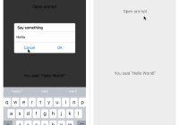
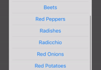
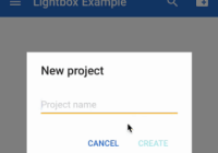
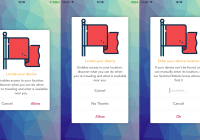
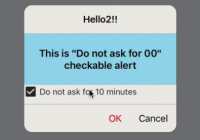
Material design dialog components for React Native. JavaScript-only, for iOS and Android.
Getting started
Step 1
If you're not using Expo, install react-native-vector-icons
Step 2
Install react-native-material-dialog
npm install react-native-material-dialog --save
Example
- Run the example app via Expo or check the code.
Included components
Roadmap
- Support for stacked action buttons.
- Dialog that holds a slider.
- Simple dialog component that accepts a string as content and styles it.
MaterialDialog
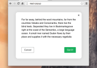
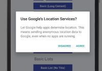
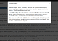
Basic and customizable dialog that can hold any component.
import { MaterialDialog } from 'react-native-material-dialog'; <MaterialDialog title="Use Google's Location Service?" visible={this.state.visible} onOk={() => this.setState({ visible: false })} onCancel={() => this.setState({ visible: false })}> <Text style={styles.dialogText}> Let Google help apps determine location. This means sending anonymous location data to Google, even when no apps are running. </Text> </MaterialDialog>;Props
| Name | Description | Default/Required | Type |
|---|---|---|---|
| visible | shows or hides the dialog | required | bool |
| children | element to be rendered in the content of the dialog | required | element |
| onCancel | callback when the dialog is closed or the cancel action is pressed | required | func |
| onOk | callback when the ok action is pressed | undefined | func |
| cancelLabel | label for the cancel action | 'CANCEL' | string |
| okLabel | label for the ok action | 'OK' | string |
| title | text for the dialog title | undefined | string |
| titleColor | color of the dialog title | 'rgba(0, 0, 0, 0.87)' | string |
| backgroundColor | color of the dialog background | '#FFFFFF' | string |
| colorAccent | color of the action text | '#51BC78' | string |
| scrolled | whether the form is in scrolled mode | false | bool |
| addPadding | automatically add paddings to the content | true | bool |
SinglePickerMaterialDialog
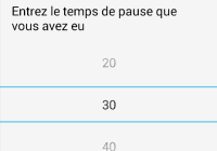
Ready to use dialog that allows to choose only one option from a list.
import { SinglePickerMaterialDialog } from 'react-native-material-dialog'; <SinglePickerMaterialDialog title={'Pick one element!'} items={LIST.map((row, index) => ({ value: index, label: row }))} visible={this.state.singlePickerVisible} selectedItem={this.state.singlePickerSelectedItem} onCancel={() => this.setState({ singlePickerVisible: false })} onOk={result => { this.setState({ singlePickerVisible: false }); this.setState({ singlePickerSelectedItem: result.selectedItem }); }} />;Props
| Name | Description | Default/Required | Type |
|---|---|---|---|
| visible | shows or hides the dialog | required | bool |
| items | list of options to choose from | required | array of objects with a 'label' and 'value' property |
| selectedItem | item that will be selected when opening the dialog | required | object with a 'label' and 'value' property |
| onCancel | callback when the dialog is closed or the cancel action is pressed | required | func |
| onOk | callback when the ok action is pressed | undefined | func |
| cancelLabel | label for the cancel action | 'CANCEL' | string |
| okLabel | label for the ok action | 'OK' | string |
| title | text for the dialog title | undefined | string |
| titleColor | color of the dialog title | 'rgba(0, 0, 0, 0.87)' | string |
| backgroundColor | color of the dialog background | '#FFFFFF' | string |
| colorAccent | color of the action text | '#51BC78' | string |
| scrolled | whether the form is in scrolled mode | false | bool |
MultiPickerMaterialDialog
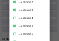
Ready to use dialog that allows to choose several options from a list.
import { MultiPickerMaterialDialog } from 'react-native-material-dialog'; <MultiPickerMaterialDialog title={'Pick some elements!'} colorAccent={this.props.colorAccent} items={LIST.map((row, index) => { return { value: index, label: row }; })} visible={this.state.multiPickerVisible} selectedItems={this.state.multiPickerSelectedItems} onCancel={() => this.setState({ multiPickerVisible: false })} onOk={result => { this.setState({ multiPickerVisible: false }); this.setState({ multiPickerSelectedItems: result.selectedItems }); }} />;Props
| Name | Description | Default/Required | Type |
|---|---|---|---|
| visible | shows or hides the dialog | required | bool |
| items | list of options to choose from | required | array of objects with a 'label' and 'value' property |
| selectedItems | items that will be selected when opening the dialog | required | array of objects with a 'label' and 'value' property |
| onCancel | callback when the dialog is closed or the cancel action is pressed | required | func |
| onOk | callback when the ok action is pressed | undefined | func |
| cancelLabel | label for the cancel action | 'CANCEL' | string |
| okLabel | label for the ok action | 'OK' | string |
| title | text for the dialog title | undefined | string |
| titleColor | color of the dialog title | 'rgba(0, 0, 0, 0.87)' | string |
| backgroundColor | color of the dialog background | '#FFFFFF' | string |
| colorAccent | color of the action text | '#51BC78' | string |
| scrolled | whether the form is in scrolled mode | false | bool |
