react-native-modal-overlay 


An overlay component built using native Modal which can be invoked from anywhere in the component hierarchy.

NPM URL- https://www.npmjs.com/package/react-native-modal-overlay
Features
- Unlike other modal/overlay components, it can be triggered from anywhere in the component hierarchy since it is using react-native Modal.
- Used react-native components. So no linking is required.
- Works out of the box for both Android and IOS.
- Can be customised by passing style props.
- Supports
closeOnTouchOutside.
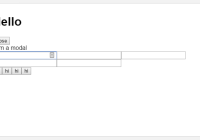
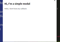
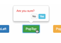
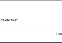
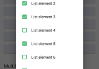
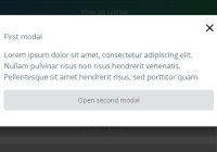
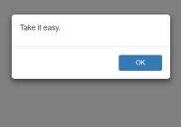
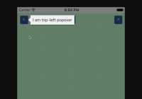
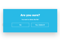
GIFs

Props
This module accepts the following props:
| Prop | Explanation | Default Value | Type |
|---|---|---|---|
animationType | Animation Type for modal/overlay. Can be any of the animations provided by react-native-animatable. Example: fadeInUp zoomIn, bounceIn, flipInX, lightSpeedIn, etc. | 'fadeIn' | string |
easing | Timing function for the animation provided by react-native-animatable | 'ease' | string |
visible | Sets modal visibility | false | Boolean |
closeOnTouchOutside | If modal should close on touching outside the child component | false | Boolean |
onClose | Function to be called on close. | noop | Function |
containerStyle | Style for the Overlay container. | {} | Object |
childrenWrapperStyle | Style for children container. | {} | Object |
accessible | Whether internal components should be declared as accessible. Useful for iOS XCUITest. | true | Boolean |
Installation
npm install react-native-modal-overlay --save or if you are using Yarn, yarn add react-native-modal-overlay
Examples:
Simple usage with default props
import React, { Component} from 'react'; import Overlay from 'react-native-modal-overlay'; export default class OverlayExample extends Component { state = { modalVisible: true, } onClose = () => this.setState({ modalVisible: false}); render() { return ( <Overlay visible={this.state.modalVisible} onClose={this.onClose} closeOnTouchOutside> <Text>Some Modal Content</Text> </Overlay> ); } }Complex usage with render props
Use case: For Example you have a cross button inside your modal and you want to close the modal when the button is pressed. This can be done by calling hideModal argument in the render props instead of calling onClose. Refer to the example below:
import React, { Component, Fragment} from 'react'; import Overlay from 'react-native-modal-overlay'; export default class OverlayExample extends Component { state = { modalVisible: true, } onClose = () => this.setState({ modalVisible: false}); render() { return ( <Overlay visible={this.state.modalVisible} onClose={this.onClose} closeOnTouchOutside animationType="zoomIn" containerStyle={{backgroundColor: 'rgba(37, 8, 10, 0.78)'}} childrenWrapperStyle={{backgroundColor: '#eee'}} animationDuration={500}> { (hideModal, overlayState) => ( <Fragment> <Text>Some Modal Content</Text> <Text onPress={hideModal}>Close</Text> </Fragment> ) } </Overlay> ); } }Note that the whole hideModal and internal state of the component is being passed as arguments to the render prop.
Example Project URL: https://github.com/rgabs/react-native-modal-overlay-example
Don’t forget to hit star if you like my work :)