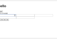
react-popconfirm


A popover confirm dialog for react, react-bootstrap and react-confirm are used with.
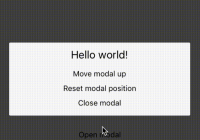
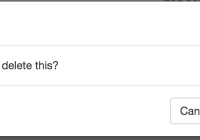
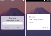
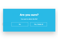
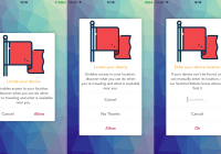
Usage
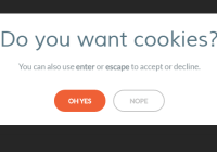
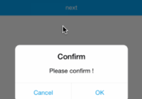
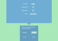
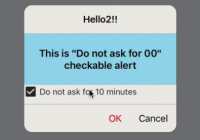
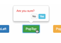
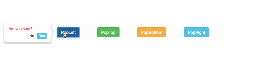
// import first import PopConfirm from 'react-popconfirm' // call it! /** * options: * { * element, // require * confirmation, // require * placement = 'top', // require * okLabbel = 'Yes', // optional (default 'Yes') * cancelLabel = 'No', // optional (default 'No') * positionLeft, // optional (auto calculate by element position and width,height) * positionTop, // optional (auto calculate by element position and width,height) * width = 160, // optional (default 160) * height = 70 // optional (default 70) * confirmationColor = '#e83f3f', // optional (default '#e83f3f') * okStyle = 'info', // optional (default 'info', available: default|primary|success|info|warning|danger|link) * cancelStyle = 'default' // optional (default 'default', available: default|primary|success|info|warning|danger|link) * } */ PopConfirm({ confirmation:'Are you sure?', okLabbel: 'Yes', cancelLabel: 'No', placement:'top', element:target // target is the element you clicked }).then( (result) => { // `proceed` callback console.log('proceed called'); }, (result) => { // `cancel` callback console.log('cancel called'); } ) // nothing will be called when `dismiss` is triggered.Try example
# run example, auto open browser and enable hot loader cd example npm install npm start # build npm run buildLicense
MIT