react-native-modal-popover
Pure JS popover component for react-native
About this module
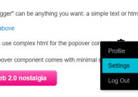
The original react-native-popover is now outdated, so I decided to publish my own module to avoid using github url in my package.json. Something got lost in the process of rewriting, but now it uses Modal and native animation drivers, and also has cool helper to use with Touchables. Thanks to @jeanregisser and to the authors of hanging PRs for their code.
Requirements
Previously (version 0.0.6) this module required react version >16.2.0 to work (which corresponds to react-native version >0.52.0).
Version 0.0.7 does not reqire React.Fragment anymore, so you can use with reasonably old versions of react and react-native.
Install
yarn add react-native-modal-popoverUsage
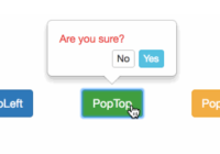
This module exports two react components, Popover and PopoverController. Popover works pretty much like original Popover, and PopoverController is a convenience component that uses React Render Props pattern.
Important this example uses React.Fragment to wrap children, but if you use react-native version older than 0.52, then you should reaplce React.Fragment with View
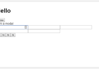
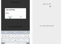
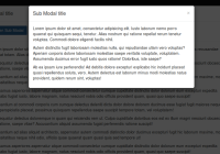
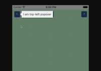
import React from 'react'; import { Button, StyleSheet, Text, View } from 'react-native'; import { Popover, PopoverController } from 'react-native-modal-popover'; const styles = StyleSheet.create({ app: { ...StyleSheet.absoluteFillObject, alignItems: 'center', justifyContent: 'center', backgroundColor: '#c2ffd2', }, content: { padding: 16, backgroundColor: 'pink', borderRadius: 8, }, arrow: { borderTopColor: 'pink', }, background: { backgroundColor: 'rgba(0, 0, 255, 0.5)' }, }); const App = () => ( <View style={styles.app}> <PopoverController> {({ openPopover, closePopover, popoverVisible, setPopoverAnchor, popoverAnchorRect }) => ( <React.Fragment> <Button title="Press me!" ref={setPopoverAnchor} onPress={openPopover} /> <Popover contentStyle={styles.content} arrowStyle={styles.arrow} backgroundStyle={styles.background} visible={popoverVisible} onClose={closePopover} fromRect={popoverAnchorRect} supportedOrientations={['portrait', 'landscape']} > <Text>Hello from inside popover!</Text> </Popover> </React.Fragment> )} </PopoverController> </View> ); export default App;Props
Popover
| Prop | Type | Optional | Default | Description |
|---|---|---|---|---|
| visible | bool | Yes | false | Show/Hide the popover |
| fromRect | Rect | No* | Rectangle at which to anchor the popover. Optional when used inside PopoverTouchable, required when used standalone. If you set this property, you should also change it when screen orientation changes. | |
| displayArea | Rect | Yes | Screen - 10px padding | Area where the popover is allowed to be displayed. Important note: if you use non-default value here and you want to handle screen orientation changes, it is your responsibility to change this value when screen orientation changes. |
| placement | string | Yes | 'auto' | How to position the popover - top | bottom | left | right | auto. When 'auto' is specified, it will determine the ideal placement so that the popover is fully visible within displayArea. |
| onClose | function | Yes | Callback to be fired when the user closes the popover | |
| onDismiss | function | Yes | Callback to be fired after the popup closes | |
| backgroundStyle | ViewStyle | Yes | Custom style to be applied to background overlay | |
| contentStyle | ViewStyle | Yes | Custom style to be applied to popover reactangle. Use it to set round corners, background color, etc. | |
| arrowStyle | ViewStyle | Yes | Custom style to be applied to popover arrow. Use borderTopColor to match content backgroundColor | |
| duration | number | Yes | 300 | Animation duration |
| easing | (show: boolean) => (value: number) => number | Yes | show => show ? Easing.out(Easing.back(1.70158)) : Easing.inOut(Easing.quad) | Function that returns easing function for show or hide animation, depending on show argument |
| useNativeDriver | bool | Yes | false | Defines if animations should use native driver |
| supportedOrientations | array of enum('portrait', 'portrait-upside-down', 'landscape', 'landscape-left', 'landscape-right') | Yes | This prop is passed to react-native Modal, see react-native docs. Set this to ['portrait', 'landscape'] if you want your popover to resprect screen orientation. |
PopoverController
PopoverController accepts function as children. This function is called with one argument of type PopoverControllerRenderProps and returns react element. The children of this element are your UI handle to open popover (Button, Toggle, whatever) and Popover element itself. Pass properties to you handle and Popover, and PopoverController will make them work together behind the scenes. All the props are required to make controller work.
PopoverControllerRenderProps:
| Prop | Type | Description |
|---|---|---|
| openPopover | () => void | Call this function when you want to open popover, e.g. pass to onPress of a Button |
| closePopover | () => void | Call this function when you want to close popover. Typically you pass this as onClose prop of Popover, which will make popover close when tapped outside. If you have a button inside popover which should close the popover, pass this function to this button. |
| popoverVisible | boolean | Pass this to visible prop of Popover component |
| setPopoverAnchor | ref function | Pass this as ref to popover UI handle. This will bind popover display position to the position of this UI handle. |
| popoverAnchorRect | Rect | Pass this as fromRect prop of Popover component |
Rect
Rect is an object with the following properties: {x: number, y: number, width: number, height: number}
Using without PopoverController
In this case you have to handle refs, measure UI handle and manage popover visibility manually:
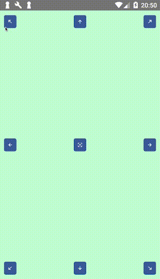
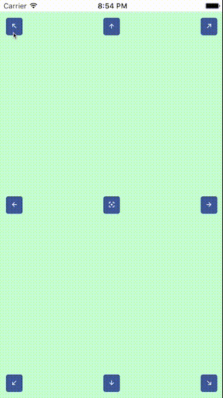
import React from 'react'; import {findNodeHandle, NativeModules, StyleSheet, Text, View} from 'react-native'; import Button from './Button'; import Popover from './popover'; const styles = StyleSheet.create({ app: { ...StyleSheet.absoluteFillObject, padding: 10, backgroundColor: '#c2ffd2', alignItems: 'center', }, }); export default class App2 extends React.Component { state = { showPopover: false, popoverAnchor: { x: 0, y: 0, width: 0, height: 0 }, }; setButton = (e) => { const handle = findNodeHandle(this.button); if (handle) { NativeModules.UIManager.measure(handle, (x0, y0, width, height, x, y) => { this.setState({ popoverAnchor: { x, y, width, height } }); }); } }; openPopover = () => { this.setState({ showPopover: true }) }; closePopover = () => this.setState({ showPopover: false }); render() { return ( <View style={styles.app}> <Button ref={r => {this.button = r}} icon="arrow-up" onPress={this.openPopover} onLayout={this.setButton}/> <Popover visible={this.state.showPopover} fromRect={this.state.popoverAnchor} onClose={this.closePopover} placement="bottom" > <Text>Hi</Text> </Popover> </View> ); } }Contributing
If you want to add some features, feel free to submit PR.