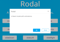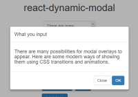
react-dynamic-modal

Dynamically generated modal dialog component for ReactJS. It is stateless and can be rendered only when needed.
Why react-dynamic-modal ?
Most of modal dialog components for React have a common shortcoming : you have to take care of the state (open or closed) for the modal,and you have to render it in your component event if you don't need it to be shown.So why don't we make it stateless and render it only when we need it to be shown ? this is how react-dynamic-modal comes.
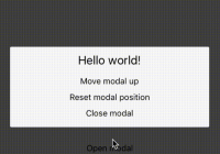
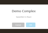
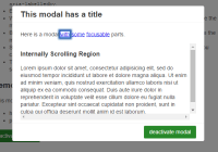
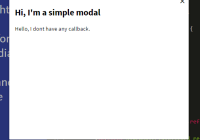
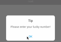
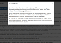
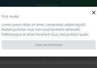
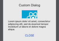
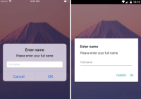
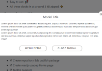
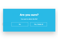
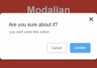
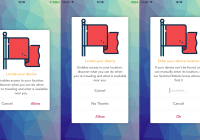
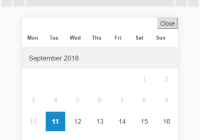
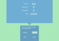
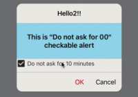
Demos
Install
npm install --save react-dynamic-modal
Usage
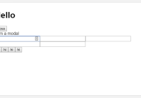
import React,{Component} from 'react'; import ReactDOM from 'react-dom'; import { Modal,ModalManager,Effect} from 'react-dynamic-modal'; class MyModal extends Component{ render(){ const { text,onRequestClose } = this.props; return ( <Modal onRequestClose={onRequestClose} effect={Effect.Newspaper}> <h1>What you input : {text}</h1> <button onClick={ModalManager.close}>Close Modal</button> </Modal> ); } } class App extends Component{ openModal(){ const text = this.refs.input.value; ModalManager.open(<MyModal text={text} onRequestClose={() => true}/>); } render(){ return ( <div> <div><input type="text" placeholder="input something" ref="input" /></div> <div><button type="button" onClick={this.openModal.bind(this)}>Open Modal </button> </div> </div> ); } } ReactDOM.render(<App />,document.getElementById('main')); Effect
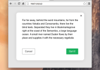
react-dynamic-modal provides many ways of showing modal using CSS3 transitions and animations,including SCALE,SLIDE,FALL,3D FLIP and so on.You can find them in Effect.
Also,you can make custom modal window effect.Here is the source code from Effect.ScaleUp.you can write your own effect code similar to that.
Note that you need not have to add vendor prefixes for styles,react-dynamic-modal will do that for you
const ScaleUp = { transition : { // transition for the modal window property : 'all', duration : 300, // millisecond timingfunction : 'linear' }, begin : { //beginning style of transition 'transform': 'scale(0.7)', 'opacity': 0 }, end : { // end style of transition 'transform': 'scale(1)', 'opacity': 1 } }Styles
Here is the default styles for the modal.And you can modify the styles,just pass styles to the component Modal. Styles passed to the modal are merged in with the default styles and applied to their respective elements.
Again : you need not have to add vendor prefixes for styles,react-dynamic-modal will do that for you
{ overlay: { position : 'fixed', top : 0, left : 0, right : 0, bottom : 0, zIndex : 99999999, overflow : 'hidden', perspective : 1300, backgroundColor : 'rgba(0, 0, 0, 0.3)' }, content: { position : 'relative', margin : '15% auto', width : '60%', border : '1px solid rgba(0, 0, 0, .2)', background : '#fff', overflow : 'auto', borderRadius : '4px', outline : 'none', boxShadow : '0 5px 10px rgba(0, 0, 0, .3)', } }