React Component & Image Lightbox
See it in action on gitconnected - The Developer Community
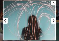
A lightbox for React components or images. String passed as arguments are assumed to be the src for an image. Otherwise, it will check if the argument is able to be rended as a child React component of the lightbox.
Originally forked from fritz-c's library
Features
- Keyboard shortcuts (with rate limiting)
- Image Zoom
- Flexible rendering using src values assigned on the fly
- Image preloading for smoother viewing
- Mobile friendly, with pinch to zoom and swipe (Thanks, @webcarrot!)
- No external CSS
Example
import React, { Component } from 'react'; import Lightbox from 'lightbox-react'; import 'lightbox-react/style.css'; // This only needs to be imported once in your app import VideoIframe from 'components/video'; const images = [ VideoIframe, '//placekitten.com/1500/500', '//placekitten.com/4000/3000', '//placekitten.com/800/1200', '//placekitten.com/1500/1500', ]; export default class LightboxExample extends Component { constructor(props) { super(props); this.state = { photoIndex: 0, isOpen: false, }; } render() { const { photoIndex, isOpen } = this.state; return ( <div> <button type="button" onClick={() => this.setState({ isOpen: true })}> Open Lightbox </button> {isOpen && ( <Lightbox mainSrc={images[photoIndex]} nextSrc={images[(photoIndex + 1) % images.length]} prevSrc={images[(photoIndex + images.length - 1) % images.length]} onCloseRequest={() => this.setState({ isOpen: false })} onMovePrevRequest={() => this.setState({ photoIndex: (photoIndex + images.length - 1) % images.length, }) } onMoveNextRequest={() => this.setState({ photoIndex: (photoIndex + 1) % images.length, }) } /> )} </div> ); } }Deprecation Notice
All unprefixed classes (listed below) will be removed in v4.0.0. Use their ril- prefixed alternatives instead. close, closing, download-blocker, image-current, image-next, image-prev, inner, next-button, not-loaded, outer, prev-button, toolbar, toolbar-left, toolbar-right, zoom-in, zoom-out
Options
| Property | Type | Default | Required | Description |
|---|---|---|---|---|
| mainSrc | string | yes | Main display image url or React component | |
| prevSrc | string | Previous display image url or component (displayed to the left). If left undefined, onMovePrevRequest will not be called, and the button not displayed | ||
| nextSrc | string | Next display image url or component (displayed to the right). If left undefined, onMoveNextRequest will not be called, and the button not displayed | ||
| mainSrcThumbnail | string | Thumbnail image url corresponding to props.mainSrc. Displayed as a placeholder while the full-sized image loads. | ||
| prevSrcThumbnail | string | Thumbnail image url corresponding to props.prevSrc. Displayed as a placeholder while the full-sized image loads. | ||
| nextSrcThumbnail | string | Thumbnail image url corresponding to props.nextSrc. Displayed as a placeholder while the full-sized image loads. | ||
| onCloseRequest | func | yes | Close window event. Should change the parent state such that the lightbox is not rendered | |
| onMovePrevRequest | func | empty function | Move to previous image event. Should change the parent state such that props.prevSrc becomes props.mainSrc, props.mainSrc becomes props.nextSrc, etc. | |
| onMoveNextRequest | func | empty function | Move to next image event. Should change the parent state such that props.nextSrc becomes props.mainSrc, props.mainSrc becomes props.prevSrc, etc. | |
| onImageLoadError | func | empty function | Called when an image fails to load.<code>(imageSrc: string, srcType: string, errorEvent: object): void</code> | |
| discourageDownloads | bool | false | Enable download discouragement (prevents [right-click -> Save Image As...]) | |
| animationDisabled | bool | false | Disable all animation | |
| animationOnKeyInput | bool | false | Disable animation on actions performed with keyboard shortcuts | |
| animationDuration | number | 300 | Animation duration (ms) | |
| keyRepeatLimit | number | 180 | Required interval of time (ms) between key actions (prevents excessively fast navigation of images) | |
| keyRepeatKeyupBonus | number | 40 | Amount of time (ms) restored after each keyup (makes rapid key presses slightly faster than holding down the key to navigate images) | |
| imageTitle | node | Image title (Descriptive element above image) | ||
| imageCaption | node | Image caption (Descriptive element below image) | ||
| toolbarButtons | node[] | Array of custom toolbar buttons | ||
| reactModalStyle | Object | {} | Set z-index style, etc., for the parent react-modal (react-modal style format) | |
| imagePadding | number | 10 | Padding (px) between the edge of the window and the lightbox | |
| clickOutsideToClose | bool | true | When true, clicks outside of the image close the lightbox | |
| enableZoom | bool | true | Set to false to disable zoom functionality and hide zoom buttons |
Browser Compatibility
| Browser | Works? |
|---|---|
| Chrome | Yes |
| Firefox | Yes |
| Safari | Yes |
| IE >= 10 | Yes |
| IE 9 | Everything works, but no animations |
Contributing
After cloning the repository and running npm install inside, you can use the following commands to develop and build the project.
# Starts a webpack dev server that hosts a demo page with the lightbox. # It uses react-hot-loader so changes are reflected on save. npm start # Lints the code with eslint and my custom rules. npm run lint # Lints and builds the code, placing the result in the dist directory. # This build is necessary to reflect changes if you're # `npm link`-ed to this repository from another local project. npm run buildPull requests are welcome!
License
MIT


