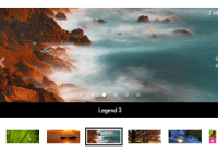
React Carousel Image Gallery

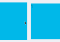
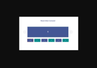
Live Demo (try it on mobile for swipe support)
Live demo: linxtion.com/demo/react-image-gallery

React image gallery is a React component for building image galleries and carousels
Features of react-image-gallery
- Mobile Swipe Gestures
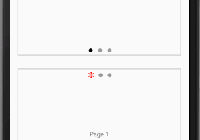
- Thumbnail Navigation
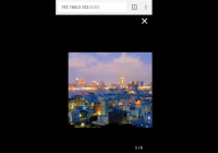
- Fullscreen Support
- Custom Rendered Slides
- Responsive Design
- Tons of customization options (see props below)
- Lightweight ~8kb (gzipped, excluding react)
Getting started
npm install react-image-gallery Style import
# SCSS @import "node_modules/react-image-gallery/styles/scss/image-gallery.scss"; # CSS @import "node_modules/react-image-gallery/styles/css/image-gallery.css"; # Webpack import "react-image-gallery/styles/css/image-gallery.css"; # Stylesheet with no icons node_modules/react-image-gallery/styles/scss/image-gallery-no-icon.scss node_modules/react-image-gallery/styles/css/image-gallery-no-icon.css Example
Need more example? See example/app.js
import ImageGallery from 'react-image-gallery'; class MyComponent extends React.Component { render() { const images = [ { original: 'http://lorempixel.com/1000/600/nature/1/', thumbnail: 'http://lorempixel.com/250/150/nature/1/', }, { original: 'http://lorempixel.com/1000/600/nature/2/', thumbnail: 'http://lorempixel.com/250/150/nature/2/' }, { original: 'http://lorempixel.com/1000/600/nature/3/', thumbnail: 'http://lorempixel.com/250/150/nature/3/' } ] return ( <ImageGallery items={images} /> ); } }Props
-
items: (required) Array of objects, see example above,- Available Properties
original- image src urlthumbnail- image thumbnail src urloriginalClass- custom image classthumbnailClass- custom thumbnail classrenderItem- Function for custom renderer (see renderItem below)renderThumbInner- Function for custom thumbnail renderer (see renderThumbInner below)originalAlt- image altthumbnailAlt- thumbnail image altoriginalTitle- image titlethumbnailTitle- thumbnail image titlethumbnailLabel- label for thumbnaildescription- description for imageimageSet- array of<source>using<picture>element (seeapp.jsfor example)srcSet- image srcset (html5 attribute)sizes- image sizes (html5 attribute)bulletClass- extra class for the bullet of the itembulletOnClick-callback({item, itemIndex, currentIndex})- A function that will be called upon bullet click.
- Available Properties
-
infinite: Boolean, defaulttrue- infinite sliding
-
lazyLoad: Boolean, defaultfalse -
showNav: Boolean, defaulttrue -
showThumbnails: Boolean, defaulttrue -
thumbnailPosition: String, defaultbottom- available positions:
top, right, bottom, left
- available positions:
-
showFullscreenButton: Boolean, defaulttrue -
useBrowserFullscreen: Boolean, defaulttrue- if false, fullscreen will be done via css within the browser
-
useTranslate3D: Boolean, defaulttrue- if false, will use
translateinstead oftranslate3dcss property to transition slides
- if false, will use
-
showPlayButton: Boolean, defaulttrue -
isRTL: Boolean, defaultfalse- if true, gallery's direction will be from right-to-left (to support right-to-left languages)
-
showBullets: Boolean, defaultfalse -
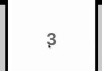
showIndex: Boolean, defaultfalse -
autoPlay: Boolean, defaultfalse -
disableThumbnailScroll: Boolean, defaultfalse- disables the thumbnail container from adjusting
-
disableArrowKeys: Boolean, defaultfalse- disables keydown listener for left and right keyboard arrow keys
-
disableSwipe: Boolean, defaultfalse -
defaultImage: String, defaultundefined- an image src pointing to your default image if an image fails to load
- handles both slide image, and thumbnail image
-
indexSeparator: String, default' / ', ignored ifshowIndexis false -
slideDuration: Number, default450- transition duration during image slide in milliseconds
-
swipingTransitionDuration: Number, default0- transition duration while swiping in milliseconds
-
slideInterval: Number, default3000 -
slideOnThumbnailOver: Boolean, defaultfalse -
flickThreshold: Number (float), default0.4- Determines the max velocity of a swipe before it's considered a flick (lower = more sensitive)
-
swipeThreshold: Number, default30- A percentage of how far the offset of the current slide is swiped to trigger a slide event. e.g. If the current slide is swiped less than 30% to the left or right, it will not trigger a slide event.
-
stopPropagation: Boolean, defaultfalse- Automatically calls stopPropagation on all 'swipe' events.
-
preventDefaultTouchmoveEvent: Boolean, defaultfalse- An option to prevent the browser's touchmove event (stops the gallery from scrolling up or down when swiping)
-
startIndex: Number, default0 -
onImageError: Function,callback(event)- overrides defaultImage
-
onThumbnailError: Function,callback(event)- overrides defaultImage
-
onThumbnailClick: Function,callback(event, index) -
onImageLoad: Function,callback(event) -
onSlide: Function,callback(currentIndex) -
onScreenChange: Function,callback(fullscreenElement) -
onPause: Function,callback(currentIndex) -
onPlay: Function,callback(currentIndex) -
onClick: Function,callback(event) -
onTouchMove: Function,callback(event) on gallery slide -
onTouchEnd: Function,callback(event) on gallery slide -
onTouchStart: Function,callback(event) on gallery slide -
onMouseOver: Function,callback(event) on gallery slide -
onMouseLeave: Function,callback(event) on gallery slide -
additionalClass: String,- Additional class that will be added to the root node of the component.
-
renderCustomControls: Function, custom controls rendering- Use this to render custom controls or other elements on the currently displayed image (like the fullscreen button)
_renderCustomControls() { return <a href='' className='image-gallery-custom-action' onClick={this._customAction.bind(this)}/> }
-
renderItem: Function, custom item rendering- On a specific item
[{thumbnail: '...', renderItem: this.myRenderItem}]or - As a prop passed into
ImageGalleryto completely override_renderItem, see source for reference
- On a specific item
-
renderThumbInner: Function, custom thumbnail rendering- On a specific item
[{thumbnail: '...', renderThumbInner: this.myRenderThumbInner}]or - As a prop passed into
ImageGalleryto completely override_renderThumbInner, see source for reference
- On a specific item
-
renderLeftNav: Function, custom left nav component- Use this to render a custom left nav control
- Passes
onClickcallback that will slide to the previous item anddisabledargument for when to disable the nav
renderLeftNav(onClick, disabled) { return ( <button className='image-gallery-custom-left-nav' disabled={disabled} onClick={onClick}/> ) }
-
renderRightNav: Function, custom right nav component- Use this to render a custom right nav control
- Passes
onClickcallback that will slide to the next item anddisabledargument for when to disable the nav
renderRightNav(onClick, disabled) { return ( <button className='image-gallery-custom-right-nav' disabled={disabled} onClick={onClick}/> ) }
-
renderPlayPauseButton: Function, play pause button component- Use this to render a custom play pause button
- Passes
onClickcallback that will toggle play/pause andisPlayingargument for when gallery is playing
renderPlayPauseButton: (onClick, isPlaying) => { return ( <button type='button' className={ `image-gallery-play-button${isPlaying ? ' active' : ''}`} onClick={onClick} /> ); }
-
renderFullscreenButton: Function, custom fullscreen button component- Use this to render a custom fullscreen button
- Passes
onClickcallback that will toggle fullscreen andisFullscreenargument for when fullscreen is active
renderFullscreenButton: (onClick, isFullscreen) => { return ( <button type='button' className={ `image-gallery-fullscreen-button${isFullscreen ? ' active' : ''}`} onClick={onClick} /> ); },
Functions
play(): plays the slidespause(): pauses the slidesfullScreen(): activates full screenexitFullScreen(): deactivates full screenslideToIndex(index): slides to a specific indexgetCurrentIndex(): returns the current index
Contributing
- Follow eslint provided
- Comment your code
- Describe your feature/implementation in the pullrequest
- Write clean code
Build the example locally
git clone https://github.com/xiaolin/react-image-gallery.git cd react-image-gallery npm install npm start Then open localhost:8001 in a browser.
License
MIT