react-native-modal-picker
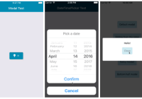
A cross-platform (iOS / Android), selector/picker component for React Native that is highly customizable and supports sections.
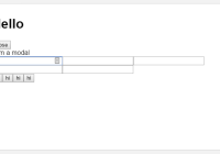
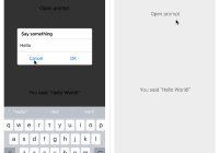
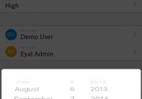
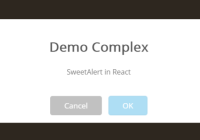
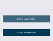
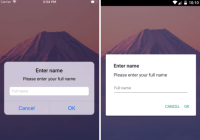
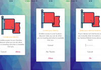
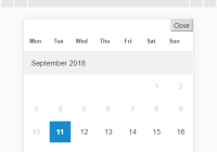
Demo
Install
npm i react-native-modal-picker --saveUsage
You can either use this component as an wrapper around your existing component or use it in its default mode. In default mode a customizable button is rendered.
See SampleApp for an example how to use this component.
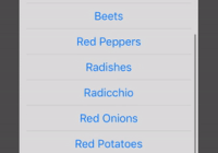
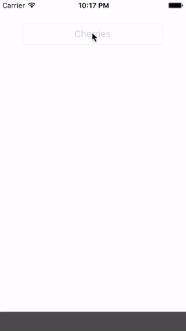
import ModalPicker from 'react-native-modal-picker' [..] class SampleApp extends Component { constructor() { super(); this.state = { textInputValue: '' } } render() { let index = 0; const data = [ { key: index++, section: true, label: 'Fruits' }, { key: index++, label: 'Red Apples' }, { key: index++, label: 'Cherries' }, { key: index++, label: 'Cranberries' }, { key: index++, label: 'Pink Grapefruit' }, { key: index++, label: 'Raspberries' }, { key: index++, section: true, label: 'Vegetables' }, { key: index++, label: 'Beets' }, { key: index++, label: 'Red Peppers' }, { key: index++, label: 'Radishes' }, { key: index++, label: 'Radicchio' }, { key: index++, label: 'Red Onions' }, { key: index++, label: 'Red Potatoes' }, { key: index++, label: 'Rhubarb' }, { key: index++, label: 'Tomatoes' } ]; return ( <View style={{flex:1, justifyContent:'space-around', padding:50}}> <ModalPicker data={data} initValue="Select something yummy!" onChange={(option)=>{ alert(`${option.label} (${option.key}) nom nom nom`) }} /> <ModalPicker data={data} initValue="Select something yummy!" onChange={(option)=>{ this.setState({textInputValue:option.label})}}> <TextInput style={{borderWidth:1, borderColor:'#ccc', padding:10, height:30}} editable={false} placeholder="Select something yummy!" value={this.state.textInputValue} /> </ModalPicker> </View> ); } }Props
data - []required, array of objects with a unique key and labelstyle - objectoptional, style definitions for the root elementonChange - functionoptional, callback function, when the users has selected an optioninitValue - stringoptional, text that is initially shown on the buttoncancelText - stringoptional, text of the cancel buttonselectStyle - objectoptional, style definitions for the select element (available in default mode only!)selectTextStyle - objectoptional, style definitions for the select element (available in default mode only!)overlayStyle - objectoptional, style definitions for the overly/background elementsectionStyle - objectoptional, style definitions for the section elementsectionTextStyle - objectoptional, style definitions for the select text elementoptionStyle - objectoptional, style definitions for the option elementoptionTextStyle - objectoptional, style definitions for the option text elementcancelStyle - objectoptional, style definitions for the cancel elementcancelTextStyle - objectoptional, style definitions for the cancel text element