tg-modal
Introduction
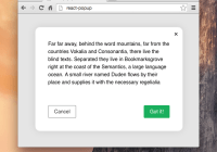
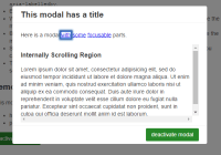
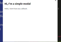
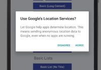
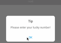
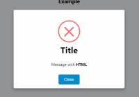
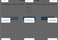
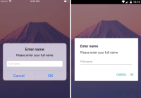
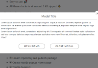
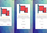
tg-modal is a react component for Modals. It aims to provide a standalone Modal without the need of adding a big UI library to your dependencies.
Installation
npm install tg-modalImport
import Modal from 'tg-modal';Styles
To get the actual modal working (it might be invisible without styles), one should import default styles to your own assets. The default styles are available as:
CSS:
node_modules/dist/default.cssSCSS:tg-modal/dist/default.scss
Custom styles
To use your own styles, the current recommendation is importing the default styles, and customizing them.
Usage
Assuming you have included the style-sheet, you can render a simple modal like this:
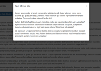
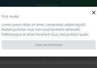
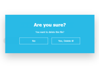
// Import the modal import Modal from 'tg-modal'; <Modal isOpen={true} title="First modal" isStatic> Modal body... </Modal>This will render a static modal, which cannot be hidden by the user.
PropTypes
Modal
| Property | Type | Description |
|---|---|---|
| onCancel | func | Called when the user cancels the modal (Close button, backdrop click or ESC pressed). function (event, keyboard) {} |
| onConfirm | func | Called after confirming the modal (Currently only by pressing ENTER) function () {} |
| isOpen | bool | Should the modal be visible |
| title | node | When set, Modal will render this as child of Modal.Header element. |
| isStatic | bool | Is the modal Static (backdrop click won't trigger onCancel) |
| isBasic | bool | Is the modal Basic (backdrop only, best for confirms) |
| keyboard | bool? | Should the modal listen to keyboard events (ENTER or ESCAPE press) [default: isOpen] |
| autoWrap | bool | If true, children will be wrapped inside Modal.Body [default: false] |
| onToggle | func | Function called after the modal is toggled. function (isOpen, props) { } |
| transitionName | string | Name of animation to use for open/close (to see how to define custom ones, see default styles) [default: tg-modal-fade] |
| transitionDuration | int | Duration of the transition in milliseconds [default: 300] |
| className | string | Extra classnames to use for modal [default: ``] |
| dialogClassName | string | Classname to use for ModalDialog [default: tg-modal-dialog] |
| wrapperClassName | string | Extra classnames to use for modal wrapper [default: ``] |
Props not specified here are considered internal, and are prone to change.
Modal.Header
| Property | Type | Description |
|---|---|---|
| children | node | Contents |
| className | string | Class name to add to the wrapper div [default: tg-modal-header] |
| isStatic | bool | If true, the close button won't trigger onCancel |
| addClose | bool | Show the close button [default: true] |
| onCancel | func | Callback to trigger when the close button is clicked |
Modal.Body
| Property | Type | Description |
|---|---|---|
| children | node | Contents |
| className | string | Class name to add to the wrapper div [default: tg-modal-body] |
Examples
Examples are available here.
Troubleshooting
If you encounter a problem, please file an issue.
License
MIT © Thorgate


