Make beautiful material design dialogs for both Android and IOS with lots of configurations to suit your need
$ npm install react-native-md-dialog --save
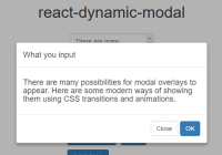
[![Exponent Button][2]][1] [1]: https://getexponent.com/@ahmedlhanafy/MaterialDesignDialogExample [2]: https://raw.githubusercontent.com/ahmedlhanafy/react-native-md-dialog/master/imgs/run_with_exp.png
Android IOS
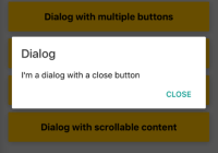
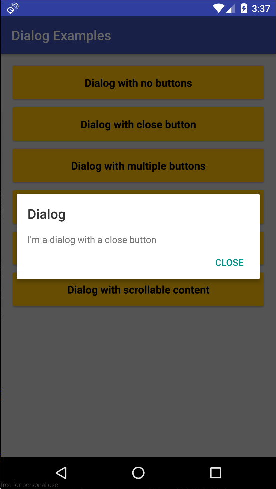
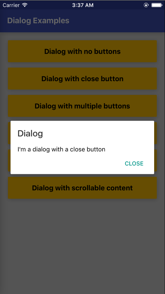
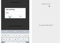
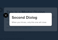
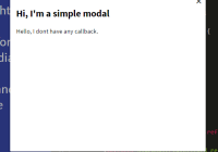
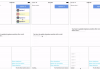
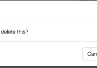
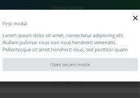
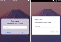
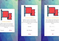
import Dialog , { DialogButton } from ' react-native-md-dialog' ... <Dialog actions = { [<DialogButton text = ' CLOSE' onPress = { () => this . refs . dialog . close ()} position = ' right' } ref = ' dialog' View style = { styles . dialogConatiner } > <Text > I'm a dialog with a close button </Text > </View > </Dialog > Android IOS
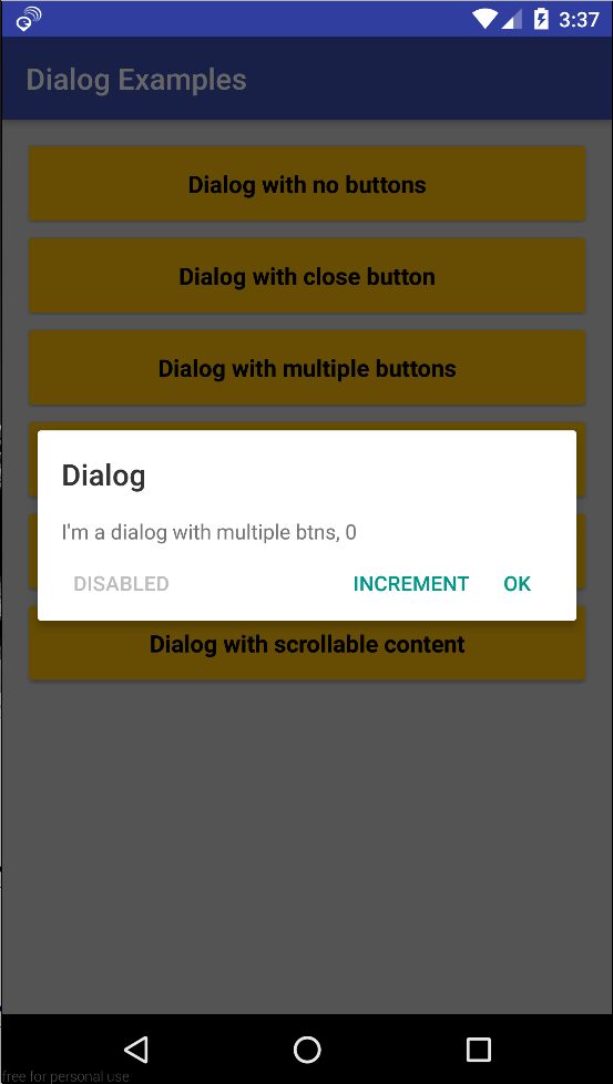
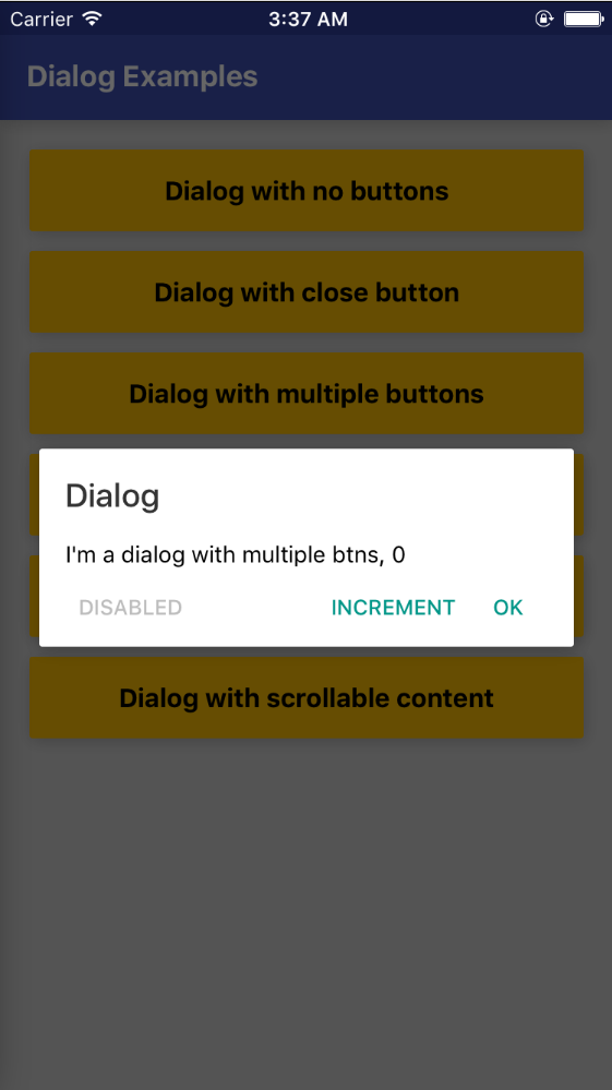
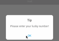
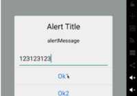
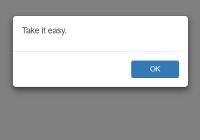
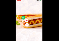
import Dialog , { DialogButton } from ' react-native-md-dialog' ... <Dialog actions = { [ <DialogButton text = ' INCREMENT' onPress = { () => this . setState ({ numberOfClicks :this . state . numberOfClicks + 1 })} />, <DialogButton text = ' OK' onPress = { () => this . refs . dialog . close ()} />, <DialogButton text = ' DISABLED' disabled = { true } position = ' left' } ref = ' dialog' View style = { styles . dialogConatiner } > <Text > I'm a dialog with multiple btns, { this . state . numberOfClicks } </Text > </View > </Dialog > Android IOS
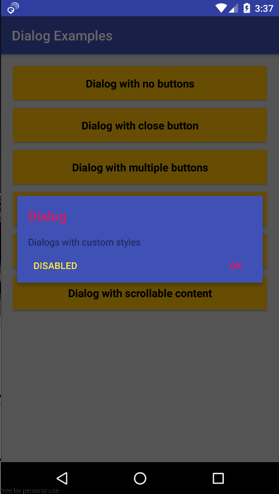
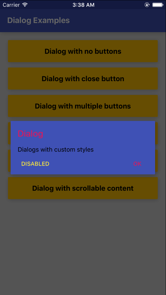
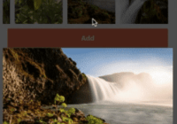
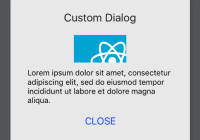
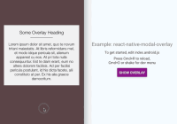
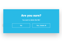
import Dialog , { DialogButton } from ' react-native-md-dialog' ... <Dialog backgroundColor = ' #3f51b5' titleColor = ' #d81b60' actions = { [ <DialogButton text = ' DISABLED' disabled = { true } position = ' left' color = ' #ffeb3b' DialogButton text = ' OK' onPress = { () => this . refs . dialog . close ()} color = ' #d81b60' } ref = ' dialog' View style = { styles . dialogConatiner } > <Text >Dialogs with custom styles</Text > </View > </Dialog > Android IOS
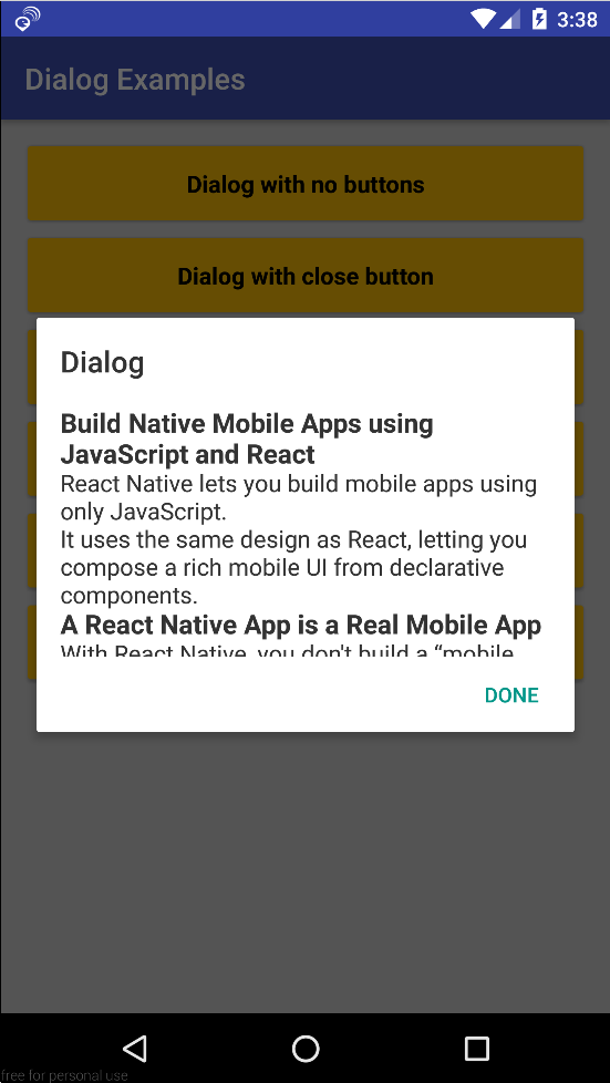
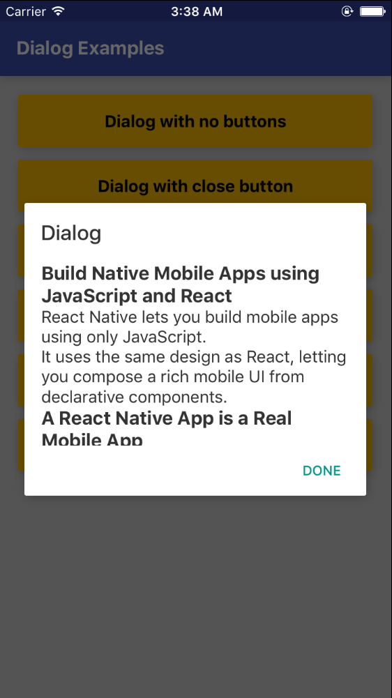
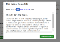
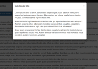
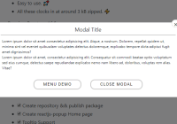
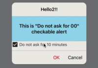
import Dialog , { DialogButton } from ' react-native-md-dialog' ... <Dialog actions = { [ <DialogButton text = ' DONE' onPress = { () => this . refs . dialog . close ()} /> ]} ref = ' dialog' maxHeight = { 280 } > <ScrollView > <View style = { styles . dialogConatiner } > <Text style = { { color :' rgba(0,0,0,0.8)' fontSize :16 }} > ... </Text > </View > </ScrollView > </Dialog ><Dialog/> props Prop Description Type Default actions Array of <DialogButton/> components PropTypes.arrayNone style React Native style object `PropTypes.object title Dialog's tilte. PropTypes.stringDialog titleColor Color of dialog's tilte. PropTypes.stringrgba(0,0,0,0.8) backgroundColor Dialog's background color. PropTypes.stringwhite dismissable Determines if clicking outside the dialog closes the dialog or not. PropTypes.boolfalse animationDuration Duration of closing and opening the dialog. PropTypes.number200 width Dialog's width. PropTypes.numberdeviceWidth - 48 maxHeight Dialog's max height. PropTypes.number420
<DialogButton/> props Prop Description Type Default text Button's text PropTypes.stringNone disabled Determines whether the button is enabled or not PropTypes.boolfalse onPress Determines the action when button is pressed PropTypes.funcNone color Text color of the button PropTypes.string#009688 position Determines where to put the button PropTypes.stringright
Name Description open()Opens the dialog close()Closes the dialog


