react-modal
Accessible modal dialog component for React.JS


Table of Contents
Installation
To install, you can use npm or yarn:
$ npm install react-modal $ yarn add react-modal API documentation
The primary documentation for react-modal is the reference book, which describes the API and gives examples of its usage.
Examples
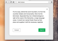
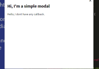
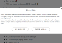
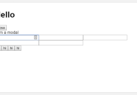
Here is a simple example of react-modal being used in an app with some custom styles and focusable input elements within the modal content:
import React from 'react'; import ReactDOM from 'react-dom'; import Modal from 'react-modal'; const customStyles = { content : { top : '50%', left : '50%', right : 'auto', bottom : 'auto', marginRight : '-50%', transform : 'translate(-50%, -50%)' } }; // Make sure to bind modal to your appElement (http://reactcommunity.org/react-modal/accessibility/) Modal.setAppElement('#yourAppElement') class App extends React.Component { constructor() { super(); this.state = { modalIsOpen: false }; this.openModal = this.openModal.bind(this); this.afterOpenModal = this.afterOpenModal.bind(this); this.closeModal = this.closeModal.bind(this); } openModal() { this.setState({modalIsOpen: true}); } afterOpenModal() { // references are now sync'd and can be accessed. this.subtitle.style.color = '#f00'; } closeModal() { this.setState({modalIsOpen: false}); } render() { return ( <div> <button onClick={this.openModal}>Open Modal</button> <Modal isOpen={this.state.modalIsOpen} onAfterOpen={this.afterOpenModal} onRequestClose={this.closeModal} style={customStyles} contentLabel="Example Modal" > <h2 ref={subtitle => this.subtitle = subtitle}>Hello</h2> <button onClick={this.closeModal}>close</button> <div>I am a modal</div> <form> <input /> <button>tab navigation</button> <button>stays</button> <button>inside</button> <button>the modal</button> </form> </Modal> </div> ); } } ReactDOM.render(<App />, appElement);You can find more examples in the examples directory, which you can run in a local development server using npm start or yarn run start.
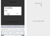
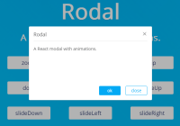
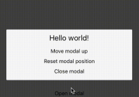
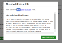
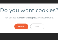
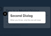
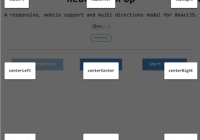
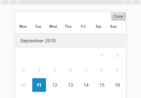
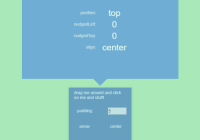
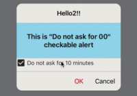
Demos
There are several demos hosted on CodePen which demonstrate various features of react-modal: