react-confirm-bootstrap
Confirm Dialog for react with Bootstrap Modal.
Example

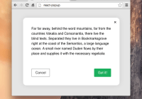
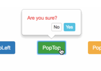
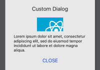
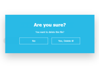
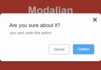
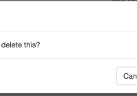
var Confirm = require('react-confirm-bootstrap'); var ConfirmAction = React.createClass({ onConfirm() { // Preform your action. }, render() { return ( <Confirm onConfirm={this.onConfirm} body="Are you sure you want to delete this?" confirmText="Confirm Delete" title="Deleting Stuff"> <button>Delete Stuff</button> </Confirm> ) }, });Props
body: React.PropTypes.any.isRequired
Body text for the modal.
buttonText: React.PropTypes.node
Options text for the initial button. Is only used if children are not passed.
cancelText: React.PropTypes.node
Text for the cancel button in the modal.
confirmBSStyle: React.PropTypes.string
Bootstrap style.
Options: 'primary', 'success', 'info', 'warning', 'danger', 'link'.
Default: 'danger'
confirmText: React.PropTypes.node
Text for the confirm button in the modal.
onClose: React.PropTypes.func
Function to be called once closed.
onConfirm: React.PropTypes.func.isRequired
Function to be called once confirmed.
title: React.PropTypes.node.isRequired
Title text for the modal
visible: React.PropTypes.bool
Optional initial state if the modal should start open.
children: React.PropTypes.any
Node to listen to clicks for. react-confirm-bootstrap render a react-bootstrap button by default.