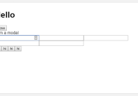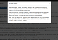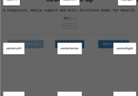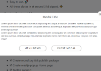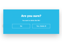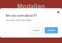
react-awesome-modal

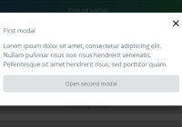
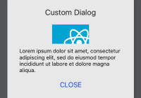
This is a Customizable Modal.
http://shibe97.github.io/react-awesome-modal/

Usage
import React, { Component } from 'react'; import Modal from 'react-awesome-modal'; export default class Examples extends Component { constructor(props) { super(props); this.state = { visible : false } } openModal() { this.setState({ visible : true }); } closeModal() { this.setState({ visible : false }); } render() { return ( <section> <h1>React-Modal Examples</h1> <input type="button" value="Open" onClick={() => this.openModal()} /> <Modal visible={this.state.visible} width="400" height="300" effect="fadeInUp" onClickAway={() => this.closeModal()}> <div> <h1>Title</h1> <p>Some Contents</p> <a href="javascript:void(0);" onClick={() => this.closeModal()}>Close</a> </div> </Modal> </section> ); } }Props
| Attribute | Required | Type | description | example |
|---|---|---|---|---|
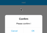
| visible | required | Boolean | to show or hide the dialog | false |
| effect | option | String | to set how to pop-up | fadeInUp, fadeInDown, etc... |
| width | option | String | to set modal width (px or %) | 500, 500px, 80% |
| height | option | String | to set modal height (px or %) | 400, 400px, 50% |
| onClickAway | option | Function | to set actions when the user click the mask | - |
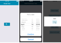
Effect
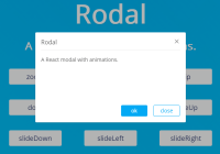
- fadeInDown [default]
- fadeInUp
- fadeInLeft
- fadeInRight
How To Develop
Setup
$ npm install Build
$ npm run build Watch and auto build
$ npm run watch Test
$ npm test Docs
$ npm run docs License
MIT