react-native-dialog
A pure JavaScript React-Native dialog that follows closely the UI of its native counterpart while expanding its features.
Features
- Support for iOS and Android (JavaScript API)
- A flexible declarative API
- Follows closely the UI of a native dialog/alert
- Can be used both as an alert and as an input prompt
- Can be injected with any component
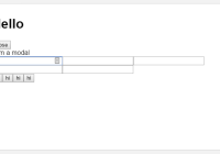
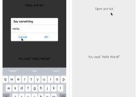
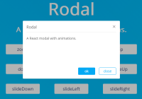
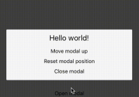
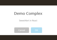
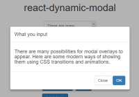
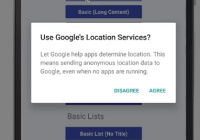
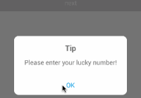
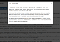
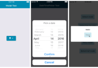
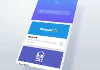
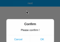
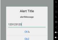
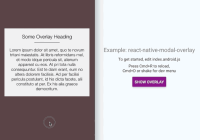
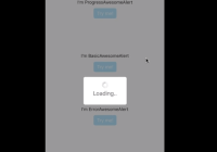
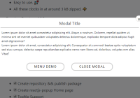
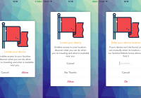
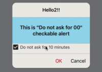
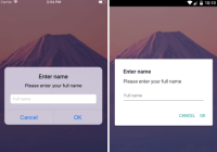
Demo


Setup
Install the library using npm or yarn:
# using npm $ npm install react-native-dialog --save # using yarn $ yarn add react-native-dialogUsage
React-native-dialog exposes a set of components that can be used to build the UI of the dialog:
- Dialog.Container: This component is the root component of the dialog and all the other components should be nested inside it.
- Dialog.Title: A
Textcomponent styled as a native dialog title. - Dialog.Description: A
Textcomponent styled as a native dialog description. - Dialog.Button: A component styled as a native dialog button.
- Dialog.Input: A
TextInputcomponent styled as a native dialog input. - Dialog.Switch: A native
Switchcomponent with an optional label.
- Import react-native-dialog:
import Dialog from "react-native-dialog";- Create a dialog and nest its content inside of it:
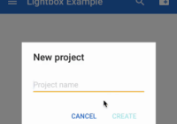
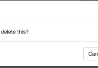
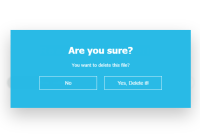
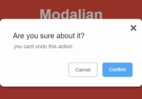
render () { return ( <View> <Dialog.Container> <Dialog.Title>Account delete</Dialog.Title> <Dialog.Description> Do you want to delete this account? You cannot undo this action. </Dialog.Description> <Dialog.Button label="Cancel" /> <Dialog.Button label="Delete" /> </Dialog.Container> </View> ) }- Then simply show it by setting the
visibleprop to true:
render () { return ( <View> <Dialog.Container visible={true}> <Dialog.Title>Account delete</Dialog.Title> <Dialog.Description> Do you want to delete this account? You cannot undo this action. </Dialog.Description> <Dialog.Button label="Cancel" /> <Dialog.Button label="Delete" /> </Dialog.Container> </View> ) }The visible prop is the only prop you'll really need to make the dialog work: you should control this prop value by saving it in your state and setting it to true or false when needed.
A complete example
The following example consists in a component (DialogTester) with a button and a dialog. The dialog is controlled by the dialogVisible state variable and it is initially hidden, since its value is false. Pressing the button sets dialogVisible to true, making the dialog visible. Inside the dialog there are two button that, when pressed, sets dialogVisible to false, hiding the dialog.
import React, { Component } from "react"; import { Text, TouchableOpacity, View } from "react-native"; import Dialog from "react-native-dialog"; export default class DialogTester extends Component { state = { dialogVisible: false }; showDialog = () => { this.setState({ dialogVisible: true }); }; handleCancel = () => { this.setState({ dialogVisible: false }); }; handleDelete = () => { // The user has pressed the "Delete" button, so here you can do your own logic. // ...Your logic this.setState({ dialogVisible: false }); }; render() { return ( <View> <TouchableOpacity onPress={this.showDialog}> <Text>Show Dialog</Text> </TouchableOpacity> <Dialog.Container visible={this.state.dialogVisible}> <Dialog.Title>Account delete</Dialog.Title> <Dialog.Description> Do you want to delete this account? You cannot undo this action. </Dialog.Description> <Dialog.Button label="Cancel" onPress={this.handleCancel} /> <Dialog.Button label="Delete" onPress={this.handleDelete} /> </Dialog.Container> </View> ); } }Available props
Dialog.Button props
| Name | Type | Default | Description |
|---|---|---|---|
| label | string | REQUIRED | The label text |
| color | string | #007ff9 on iOS, #169689 on Android | The label color |
| bold | bool | false | Show the label with a bold font weight? |
| disabled | bool | false | Disable the button? |
| onPress | func | REQUIRED | Called when the button is pressed |
Dialog.Description props
| Name | Type | Default | Description |
|---|---|---|---|
| children | string | REQUIRED | The description text |
Dialog.Container props
| Name | Type | Default | Description |
|---|---|---|---|
| blurComponentIOS | node | A low-opacity | The blur component used in iOS |
| visible | bool | REQUIRED | Show the dialog? |
| children | node | REQUIRED | The dialog content |
| contentStyle | any | undefined | Extra style applied to the dialog content |
| headerStyle | any | undefined | Extra style applied to the dialog header |
| footerStyle | any | undefined | Extra style applied to the dialog footer |
| buttonSeparatorStyle | any | undefined | Extra style applied to the dialog button separator |
Dialog.Input props
| Name | Type | Default | Description |
|---|---|---|---|
| label | string | undefined | The input floating label |
| wrapperStyle | any | undefined | The style applied to the input wrapper View |
Dialog.Input also accepts all the React-Native's TextInput component props.
Dialog.Title props
| Name | Type | Default | Description |
|---|---|---|---|
| children | string | REQUIRED | The title text |
Dialog.Title also accepts all the React-Native's Text component props.
Dialog.Switch props
| Name | Type | Default | Description |
|---|---|---|---|
| label | string | undefined | The switch description text |
Dialog.Switch also accepts all the React-Native's Switch component props.
TODO
- Handle the UI for more than 2 iOS buttons
- Add even more components (a
Pickerfor example) - Add a documentation for implementing expo's
BlurView - Try to get as close as possible to the native dialogs
Frequently Asked Questions
How can I use a custom blur component as the dialog background on iOS?
To achieve a look even closer to the native iOS dialog you can provide your own component in the blurComponentIOS prop of a Dialog.Container and it will be injected in the dialog to be used as a background. The blurComponentIOS can be useful for example if you want to apply native blur effect to the dialog. Here is an example using react-native-blur:
render() { const blurComponentIOS = ( <BlurView style={StyleSheet.absoluteFill} blurType="xlight" blurAmount={50} /> ) return ( <View style={styles.container}> <Dialog.Container visible={this.state.dialogVisible} blurComponentIOS={blurComponentIOS} > <Dialog.Title>Account delete</Dialog.Title> <Dialog.Description> Do you want to delete this account? You cannot undo this action. </Dialog.Description> <Dialog.Button label="Cancel" onPress={this.handleCancel} /> <Dialog.Button label="Delete" onPress={this.handleConfirm} /> </Dialog.Container> </View> ); }How can I add a 'tap outside dialog' callback?
react-native-dialog uses react-native-modal for the backdrop and any properties you add to Dialog.Container are mapped through to the modal. react-native-modal has an onBackdropPress property that can be used to register clicks on the backdrop.
Below is an example on how you can close the dialog by tapping outside.
render() { const { onCancel, visible } = this.props; const reactNativeModalProps = { onBackdropPress: onCancel, }; return ( <Dialog.Container visible={visible} {...reactNativeModalProps}> <Dialog.Title>{'title'}</Dialog.Title> <Dialog.Button label="cancel" onPress={onCancel} /> </Dialog.Container> ); } onCancel() { this.setState({ visible: false, }) }Acknowledgments
Thanks to the user @honaf who has kindly offered the react-native-dialog namespace. Also thanks to the user @leecade who offered the namespace react-native-alert (which has not been used since "Dialog" seems to suit better this component).