react-native-popup

This is a custom component for React Native, a simple popup, compatible with ios and android.
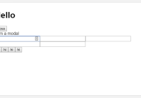
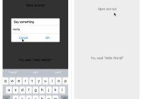
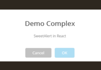
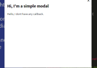
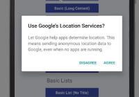
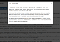
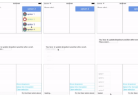
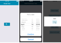
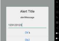
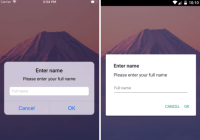
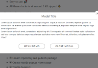
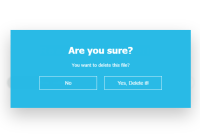
###Demo 
###Props
- isOverlay bool -
default true - isOverlayClickClose bool -
default true
###static
- alert(
message: string|number, [...])
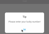
e.g. this.popup.alert(1); this.popup.alert(1, 'two', '10 messages at most');- tip({
title: string,content: string|number|array<string|number>isRequired,btn: {title: stringdefault 'OK',callback: function}, })
e.g. this.popup.tip({ content: 'come on!', }); this.popup.tip({ title: 'TipTip', content: 'come on!', }); this.popup.tip({ content: ['come on!', 'go!'], btn: { text: 'OKOK', style: { color: 'red' }, callback: () => { this.popup.alert('over!'); }, }, });- confirm({
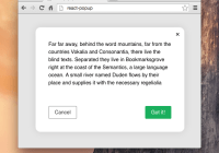
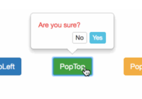
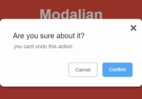
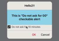
title: string,content: string|number|array<string|number>isRequired,ok: {title: stringdefault 'OK',callback: function},cancel: {title: stringdefault 'Cancel',callback: function}, })
e.g. this.popup.confirm({ content: 'Are you ready?', }); this.popup.confirm({ content: 'Are you ready?', ok: { callback: () => { this.popup.alert('Very good!'); }, }, }); this.popup.confirm({ title: 'title', content: ['come on!', 'go!'], ok: { text: 'Y', style: { color: 'red' }, callback: () => { this.popup.alert('Good!'); }, }, cancel: { text: 'N', style: { color: 'blue' }, callback: () => { this.popup.alert('Hurry up!'); }, }, });###Usage ####Step 1 - install
npm install react-native-popup --save ####Step 2 - import and use in project
import Popup from 'react-native-popup'; class App extends React.Component{ onPressHandle() { // alert this.popup.alert(1); }, render() { return ( <View style={styles.container}> <Text style={styles.btn} onPress={this.onPressHandle.bind(this)}>click me !</Text> {/** Popup component */} <Popup ref={popup => this.popup = popup }/> {/** or <Popup ref={popup => this.popup = popup } isOverlay={false} isOverlayClickClose={false}/> */} </View> ); }, };