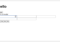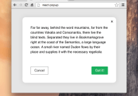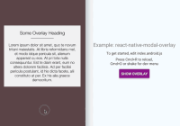
react-responsive-modal


A simple responsive and accessible react modal compatible with React 16 and ready for React 17.
- Focus trap inside the modal.
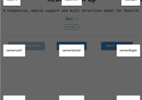
- Centered modals.
- Scrolling modals.
- Multiple modals.
- Easily customizable via props.
Documentation
Installation
With npm: npm install react-responsive-modal --save
Or with yarn: yarn add react-responsive-modal
Usage

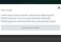
import React from 'react'; import ReactDOM from 'react-dom'; import Modal from 'react-responsive-modal'; export default class App extends React.Component { state = { open: false, }; onOpenModal = () => { this.setState({ open: true }); }; onCloseModal = () => { this.setState({ open: false }); }; render() { const { open } = this.state; return ( <div> <button onClick={this.onOpenModal}>Open modal</button> <Modal open={open} onClose={this.onCloseModal} center> <h2>Simple centered modal</h2> </Modal> </div> ); } } ReactDOM.render(<App />, document.getElementById('app'));Props
Modal
| Name | Type | Default | Description |
|---|---|---|---|
| closeOnEsc | bool | true | Is the modal closable when user press esc key. |
| closeOnOverlayClick | bool | true | Is the modal closable when user click on overlay. |
| onEntered | func | undefined | Callback fired when the Modal is open and the animation is finished. |
| onExited | func | undefined | Callback fired when the Modal has exited and the animation is finished. |
| onClose* | func | Callback fired when the Modal is requested to be closed by a click on the overlay or when user press esc key. | |
| onEscKeyDown | func | undefined | Callback fired when the escape key is pressed. |
| onOverlayClick | func | undefined | Callback fired when the overlay is clicked. |
| open* | bool | Control if the modal is open or not. | |
| classNames | object | An object containing classNames to style the modal, can have properties 'overlay' (classname for overlay div), 'modal' (classname for modal content div), 'closeButton' (classname for the button that contain the close icon), 'closeIcon' (classname for close icon svg). You can customize the transition with 'transitionEnter', 'transitionEnterActive', 'transitionExit', 'transitionExitActive' | |
| styles | object | An object containing the styles objects to style the modal, can have properties 'overlay', 'modal', 'closeButton', 'closeIcon'. | |
| children | node | null | The content of the modal. |
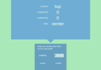
| center | bool | false | Should the dialog be centered. |
| showCloseIcon | bool | true | Show the close icon. |
| closeIconSize | number | 28 | Close icon size. |
| closeIconSvgPath | node | <path d="M28.5 9.62L26.38 7.5 18 15.88 9.62 7.5 7.5 9.62 15.88 18 7.5 26.38l2.12 2.12L18 20.12l8.38 8.38 2.12-2.12L20.12 18z" /> | A valid svg path to show as icon. |
| animationDuration | number | 500 | Animation duration in milliseconds. |
| container | object | You can specify a container prop which should be of type Element. The portal will be rendered inside that element. The default behavior will create a div node and render it at the at the end of document.body. | |
| blockScroll | bool | true | Whether to block scrolling when dialog is open |
| focusTrapped | bool | true | When the modal is open, trap focus within it |
| focusTrapOptions | object | Options to be passed to the focus trap, details available at https://github.com/davidtheclark/focus-trap#focustrap--createfocustrapelement-createoptions | |
| overlayId | string | undefined | id attribute for overlay |
| modalId | string | undefined | id attribute for modal |
| closeIconId | string | undefined | id attribute for close icon |
| role | string | 'dialog' | ARIA role for modal |
| ariaLabelledby | string | undefined | ARIA label for modal |
| ariaDescribedby | string | undefined | ARIA description for modal |
License
MIT © Léo Pradel