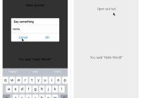
React Modal Dialog
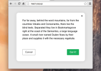
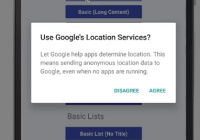
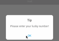
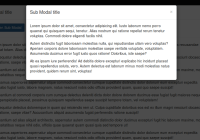
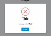
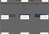
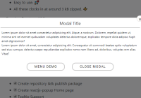
React modal dialog is an idiomatic way to represent modal dialogs in react. It is nested inside the components that require them, and can themselves nest other dialogs. There are no global switches or state, and the contents of the dialog are defined where you need it.
Design Considerations
React modal dialog was built with a few fundamental assumptions and constraints in mind:
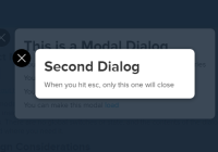
- When you have two dialogs, the ESC key will only close the top level one (there is an event manager implemented like a stack)
- The package needs to support dialogs that bounce in with a spring animation (not just standard ease-in, ease-out), but still be flexible enough for other designs
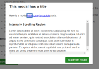
- Dialogs that are too long will scroll in their viewport
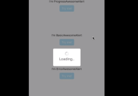
- Dialogs need to be able to show a loading spinner, that means the background and the content need to be separate components
Idiomatic Syntax
From the very beginning, the goal was a syntax very similar to the one below, where the modal component is held within a button or the view with the closest common ancestor of two buttons.
class Button extends React.Component { state = { isShowingModal: false, } handleClick = () => this.setState({isShowingModal: true}) handleClose = () => this.setState({isShowingModal: false}) render() { return <a onClick={this.handleClick}> <span>Button Text</span> { this.state.isShowingModal && <ModalComponentHere onClose={this.handleClose}/> } </a>; } }Actual Usage
This is how react-modal-dialog works. You can create a component that wraps ModalContainer and ModalDialog into one CustomDialog, but the reason I have separated is so that I can add a loading spinner above the background but below the dialog.
import React, {PropTypes} from 'react'; import {ModalContainer, ModalDialog} from 'react-modal-dialog'; class View extends React.Component { state = { isShowingModal: false, } handleClick = () => this.setState({isShowingModal: true}) handleClose = () => this.setState({isShowingModal: false}) render() { return <div onClick={this.handleClick}> { this.state.isShowingModal && <ModalContainer onClose={this.handleClose}> <ModalDialog onClose={this.handleClose}> <h1>Dialog Content</h1> <p>More Content. Anything goes here</p> </ModalDialog> </ModalContainer> } </div>; } }Loading Spinners
import React, {PropTypes} from 'react'; import {ModalContainer, ModalDialog} from 'react-modal-dialog'; import ReactSpinner from 'react-spinjs'; class View extends React.Component { static propTypes = { // This view takes a isLoading property isLoading: PropTypes.bool, } state = { isShowingModal: false, } handleClick = () => this.setState({isShowingModal: true}) handleClose = () => this.setState({isShowingModal: false}) render() { const { props: { isLoading, }, } = this; return <div onClick={this.handleClick}> { this.state.isShowingModal && <ModalContainer onClose={this.handleClose}> { isLoading ? <ReactSpinner/> : <ModalDialog onClose={this.handleClose}> <h1>Dialog Content</h1> <p>More Content. Anything goes here</p> </ModalDialog> } </ModalContainer> } </div>; } }Styles (CSS and Images)
In version 4.0+ react-modal-dialog has finally shifted to using narcissus, narcissus makes inline css styles sane, and also works in pure javascript so you don't have to spend time requiring css files awkwardly with NPM and packaging them in webpack with custom loaders yourself.
For a similar reason of not having to deal with external dependencies or awkward loaders/hacked require statements, starting in 4.0+, react-modal-dialog uses hand-written svg for the one "image" that comes with the package, the close button.
For Your Own Implementation
For now, I recommend you check out the source code of this project, as it is quite simple, to really get an understanding of how this dialog works. I've spent a lot of time trying many paradigms (you can read about all that here), and I've settled on this one for good reasons.
The hardest part about dialogs is their architecture, not the UI or specific implementation. Feel free to swap out your own ModalDialog class into my existing ModalContainer, or disassemble ModalContainer into your own portal and background class.
To get the esc key to only close the top dialog when there are two modal dialogs, I employed the use of an event controller. However, you may find this to be peculiar or you may want to attach your dialogs to your own event controller. If that's true, you may want to branch this project to edit the code in componentDidMount and componentWillUnmount of ModalPortal.
Contributing
Feel free to send pull requests, or help document this project more.
A Note on package.json
package.json points to src/index.js, so that it is easy to develop against. However, this folder does not exist in the npm distribution, so the whole thing falls back to the /index.js at the root, which points to the compiled /lib/index.js.
