React Bootstrap Dialog

The React component library for alert or dialog based on react-bootstrap's <Modal />. Configurable and easy to use alternative for window.alert, window.confirm, or window.prompt in your React application.
You can use with react-bootstrap v3 or v4. (v4 since react-bootstrap-dialog v0.11.0)
Index:
Screenshots
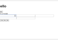
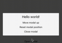
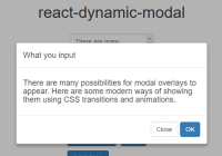
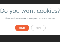
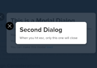
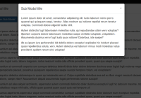
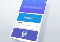
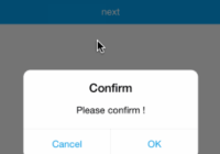
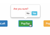
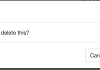
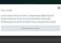
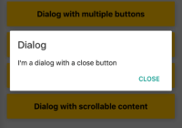
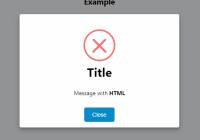
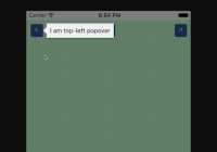
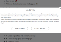
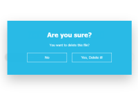
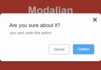
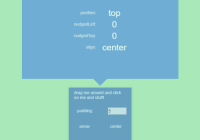
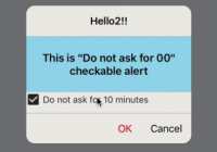
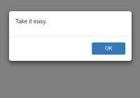
| Default Alert | Default Dialog |
|---|---|
Alternative for window.alert | Alternative for window.confirm |
 |  |
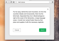
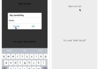
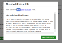
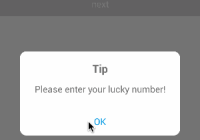
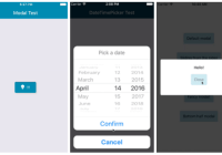
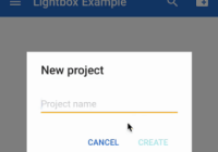
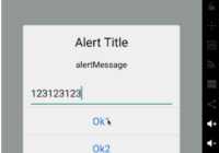
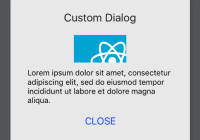
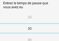
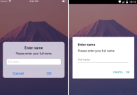
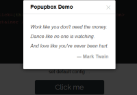
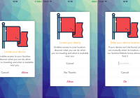
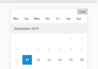
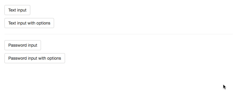
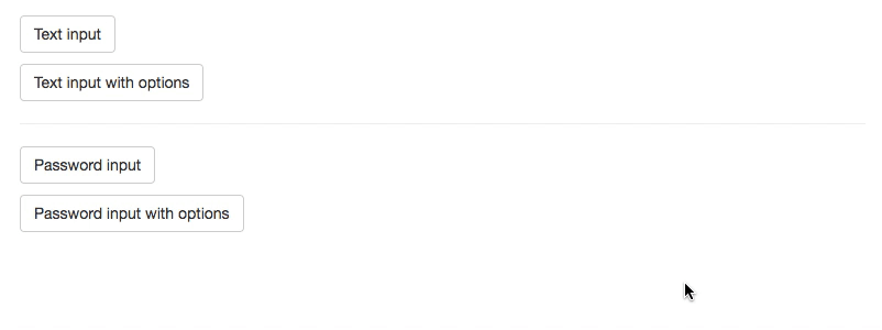
| Text Prompt | Password Prompt |
|---|---|
Alternative for window.prompt | Easy password input |
 |  |
Demo and Sample
- See Demos on storybook
- The sample codes are in /src/stories/samples
Usage
Install
npm i react-bootstrap-dialog --saveor
yarn add react-bootstrap-dialogQuick start
Step 1. Import package.
import Dialog from 'react-bootstrap-dialog'Step 2. Write jsx in render method.
<Dialog ref={(el) => { this.dialog = el }} />Step 3. Call showAlert method or show method.
this.dialog.showAlert('Hello Dialog!')Full sample:
import React from 'react' import {Button} from 'react-bootstrap' import Dialog from 'react-bootstrap-dialog' export default class SampleCode extends React.Component { constructor () { super() this.onClick = this.onClick.bind(this) } onClick () { this.dialog.showAlert('Hello Dialog!') } render () { return ( <div> <Button onClick={this.onClick}>Show alert</Button> <Dialog ref={(component) => { this.dialog = component }} /> </div> ) } } Documents
Index:
Dialog
setOptions(options)
Set default options for applying to all dialogs
options: [Object] The parameters for default options.defaultOkLabel: [String, Node] The default label for OK button. Default is'OK'.defaultCancelLabel: [String, Node] The default label for Cancel button. Default is'Cancel'.primaryClassName: [String] The class name for primary button. Default is'btn-primary'defaultButtonClassName: [String] The class name for ordinary button. Default is'btn-default btn-outline-secondary'- Notice: The default value includes v3 and v4 classes.
Example
Dialog.setOptions({ defaultOkLabel: 'Yes! Yes! Yes!', defaultCancelLabel: 'Noooooooo!!', primaryClassName: 'btn-success', defaultButtonClassName: 'btn-link' })resetOptions()
Reset default options to presets.
Example
Dialog.resetOptions()<Dialog />
show(options)
Show dialog with choices. This is similar to window.confirm.
options: [Object] The parameters for options.title: [String, Node] The title of dialog.body: [String, Node] The body of message.actions: [Array[DialogAction]] The choices for presenting to user. See DialogAction generators.bsSize: [String] The width size for dialog.- with react-bootstrap v3: You can choose from [null, 'medium', 'large', 'small'].
- with react-bootstrap v4: You can choose from [null, 'medium', 'lg', 'sm'].
onHide: [Function] The method to call when the dialog was closed by clicking background.prompt: [DialogPrompt] The prompt to get user input. See DialogPrompt generators.
Example
this.dialog.show({ title: 'Greedings', body: 'How are you?', actions: [ Dialog.CancelAction(), Dialog.OKAction() ], bsSize: 'small', onHide: (dialog) => { dialog.hide() console.log('closed by clicking background.') } })showAlert(body, bsSize = undefined)
Show message dialog This is similar to window.alert.
body: [String, Node] The body of message.bsSize: [String] The width size for dialog. You can choose in [null, 'medium', 'large', 'small'].
Example
this.dialog.showAlert('Hello world!')hide()
Hide this dialog.
Example
this.dialog.hide()DialogAction generators
Dialog.Action(label, func, className)
The customized choice for options.actions in dialog.show.
label: [String, Node] The label for the button.func: [Function] The method to call when the button is clicked.className: The class name for the button.
Example
Dialog.Action( 'Hello', () => console.log('Hello!'), 'btn-info' )Dialog.DefaultAction(label, func, className)
The default choice for options.actions in dialog.show.
label: [String, Node] The label for the button.func: [Function] The method to call when the button is clicked.className: The class name for the button. (Default is'btn-primary')
Example
Dialog.DefaultAction( 'Remove', () => { console.log('Remove action will be executed!') }, 'btn-danger' )Dialog.OKAction(func)
The OK choice for options.actions in dialog.show. It uses default ok label ('OK') and default primary class ('btn-primary').
func: [Function] The method to call when the button is clicked.
Example
Dialog.OKAction(() => { console.log('OK was clicked!') })Dialog.CancelAction(func)
The Cancel choice for options.actions in dialog.show. It uses default cancel label ('Cancel').
func: [Function] The method to call when the button is clicked.
Example 1
Dialog.CancelAction(() => { console.log('Cancel was clicked!') })Example 2
// Do nothing. Dialog.CancelAction()DialogPrompt generators
Dialog.TextPrompt(options = {})
The prompt settings to show text input for options.prompt in dialog.show.
options: [Object] The parameters for options.initialValue: [String] The initial value for the prompt.placeholder: [String] The placeholder for the prompt.
Example
Dialog.TextPrompt() // or Dialog.TextPrompt({initialValue: '[email protected]', placeholder: 'your email'})Dialog.PasswordPrompt(options = {})
The prompt settings to show password input for options.prompt in dialog.show.
options: [Object] The parameters for options.initialValue: [String] The initial value for the prompt.placeholder: [String] The placeholder for the prompt.
Example
Dialog.PasswordPrompt() // or Dialog.PasswordPrompt({initialValue: 'previous~pa$sw0rd', placeholder: 'your password'})