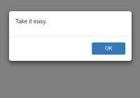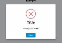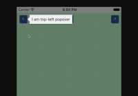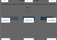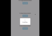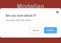


React Native Popup Dialog
React Native Popup Dialog for iOS & Android.
Another similar dialog component: react-native-dialog-component the main difference is style.
Pull request are welcomed. Please follow Airbnb JS Style Guide
How to thank me ?
Just click on

BREAKING CHANGE
Has a lot of backward incompatible changes in v0.16.0. Please, Read the Docs before upgrading to v0.16.0
Installation
npm install --save react-native-popup-dialog # OR yarn add react-native-popup-dialog Exposed Modules
- Dialog
- Overlay
- DialogButton
- DialogContent
- DialogTitle
- DialogFooter
- Animation
- FadeAnimation
- ScaleAnimation
- SlideAnimation
- DialogProps
- DialogFooterProps
- DialogButtonProps
- DialogTitleProps
- DialogContentProps
- OverlayProps
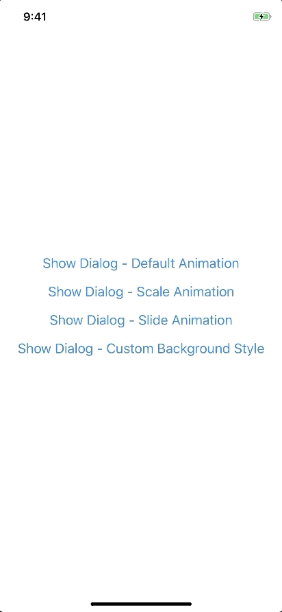
Examples
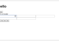
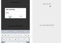
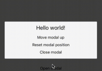
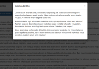
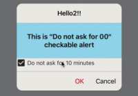
Basic Usage
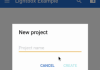
import Dialog, { DialogContent } from 'react-native-popup-dialog'; import { Button } from 'react-native' <View style={styles.container}> <Button title="Show Dialog" onPress={() => { this.setState({ visible: true }); }} /> <Dialog visible={this.state.visible} onTouchOutside={() => { this.setState({ visible: false }); }} > <DialogContent> {...} </DialogContent> </Dialog> </View>Usage - Animation
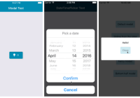
import Dialog, { SlideAnimation, DialogContent } from 'react-native-popup-dialog'; <View style={styles.container}> <Dialog visible={this.state.visible} dialogAnimation={new SlideAnimation({ slideFrom: 'bottom', })} > <DialogContent> {...} </DialogContent> </Dialog> </View>Usage - Dialog Dialog Title
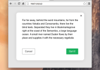
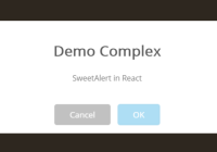
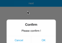
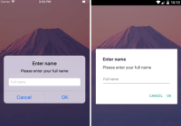
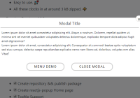
import Dialog, { DialogTitle, DialogContent } from 'react-native-popup-dialog'; <View style={styles.container}> <Dialog visible={this.state.visible} dialogTitle={<DialogTitle title="Dialog Title" />} > <DialogContent> {...} </DialogContent> </Dialog> </View>Usage - Dialog Action
import Dialog, { DialogFooter, DialogButton, DialogContent } from 'react-native-popup-dialog'; <View style={styles.container}> <Dialog visible={this.state.visible} footer={ <DialogFooter> <DialogButton text="CANCEL" onPress={() => {}} /> <DialogButton text="OK" onPress={() => {}} /> </DialogFooter> } > <DialogContent> {...} </DialogContent> </Dialog> </View>Props
Dialog
| Prop | Type | Default | Note |
|---|---|---|---|
visible | boolean | false | |
rounded | boolean | true | |
useNativeDriver | boolean | true | |
children | any | ||
dialogTitle? | React Element | You can pass a DialogTitle component or pass a View for customizing titlebar | |
width? | Number | Your device width | The Width of Dialog, you can use fixed width or use percentage. For example 0.5 it means 50% |
height? | Number | 300 | The Height of Dialog, you can use fixed height or use percentage. For example 0.5 it means 50% |
dialogAnimation? | FadeAnimation | animation for dialog | |
dialogStyle? | any | ||
containerStyle? | any | null | For example: { zIndex: 10, elevation: 10 } |
animationDuration? | Number | 200 | |
overlayPointerEvents? | String | Available option: auto, none | |
overlayBackgroundColor? | String | #000 | |
overlayOpacity? | Number | 0.5 | |
hasOverlay? | Boolean | true | |
onShow? | Function | You can pass shown function as a callback function, will call the function when dialog shown | |
onDismiss? | Function | You can pass onDismiss function as a callback function, will call the function when dialog dismissed | |
onTouchOutside? | Function | () => {} | |
onHardwareBackPress? | Function | () => true | Handle hardware button presses |
footer? | React Element | null | for example: <View><Button text="DISMISS" align="center" onPress={() => {}}/></View> |
DialogTitle
| Prop | Type | Default | Note |
|---|---|---|---|
title | String | ||
style? | any | null | |
textStyle? | any | null | |
align? | String | center | Available option: left, center, right |
hasTitleBar? | Bool | true |
DialogContent
| Prop | Type | Default | Note |
|---|---|---|---|
children | any | ||
style? | any | null |
DialogFooter
| Prop | Type | Default | Note |
|---|---|---|---|
children | DialogButton | ||
bordered? | Boolean | true | |
style? | any | null |
DialogButton
| Prop | Type | Default | Note |
|---|---|---|---|
text | String | ||
onPress | Function | ||
align? | String | center | Available option: left, center, right |
style? | any | null | |
textStyle? | any | null | |
activeOpacity? | Number | 0.6 | |
disabled? | Boolean | false | |
bordered? | Boolean | false |
Overlay
| Prop | Type | Default | Note |
|---|---|---|---|
visible | Boolean | ||
opacity | Number | 0.5 | |
onPress? | Function | ||
backgroundColor? | string | #000 | |
animationDuration? | Number | 200 | |
pointerEvents? | String | null | Available option: auto, none |
useNativeDriver? | Boolean | true |
Animation
Params for (*)Animation
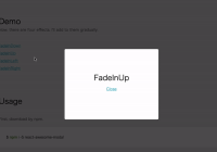
FadeAnimation
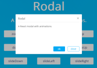
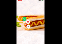
Preview:
Example:
new FadeAnimation({ initialValue: 0, // optional animationDuration: 150, // optional useNativeDriver: true, // optional })| Param | Type | Default | Note |
|---|---|---|---|
initialValue | Number | 0 | |
animationDuration? | Number | 150 | |
useNativeDriver? | Boolean | true |
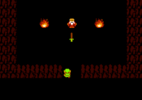
ScaleAnimation
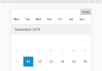
Preview:
Example:
new ScaleAnimation({ initialValue: 0, // optional useNativeDriver: true, // optional })| Param | Type | Default | Note |
|---|---|---|---|
initialValue | Number | 0 | |
useNativeDriver | Boolean | true |
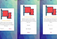
SlideAnimation
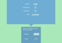
Preview:
Example:
new SlideAnimation({ initialValue: 0, // optional slideFrom: 'bottom', // optional useNativeDriver: true, // optional })| Param | Type | Default | Note |
|---|---|---|---|
initialValue | Number | 0 | |
slideFrom | String | bottom | Available option: top, bottom, left, right |
useNativeDriver | Boolean | true |
Create your custom animation
Example:
import { Animated } from 'react-native'; import { Animation } from 'react-native-popup-dialog'; class CustomAnimation extends Animation { in(onFinished) { Animated.spring(this.animate, { toValue: 1, useNativeDriver: this.useNativeDriver, }).start(onFinished); } out(onFinished) { Animated.spring(this.animate, { toValue: 0, useNativeDriver: this.useNativeDriver, }).start(onFinished); } getAnimations() { return { transform: [{ translateY: this.animate.interpolate({ inputRange: [0, 1], outputRange: [800, 1], }), }], }; } }Development
yarn
yarn run build
yarn test