react-confirm-alert
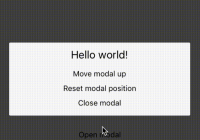
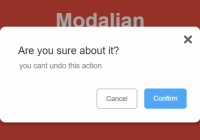
react component confirm dialog. Live demo
Document for v.1.x.x see
Getting started
Install with NPM:
$ npm install react-confirm-alert --save Options
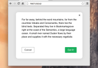
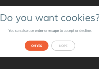
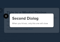
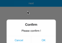
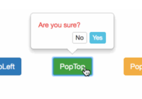
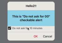
const options = { title: 'Title', message: 'Message', buttons: [ { label: 'Yes', onClick: () => alert('Click Yes') }, { label: 'No', onClick: () => alert('Click No') } ], childrenElement: () => <div />, customUI: ({ onClose }) => <div>Custom UI</div>, closeOnEscape: true, closeOnClickOutside: true, willUnmount: () => {}, onClickOutside: () => {}, onKeypressEscape: () => {} }; confirmAlert(options);Use with function:
import { confirmAlert } from 'react-confirm-alert'; // Import import 'react-confirm-alert/src/react-confirm-alert.css'; // Import css class App extends React.Component { submit = () => { confirmAlert({ title: 'Confirm to submit', message: 'Are you sure to do this.', buttons: [ { label: 'Yes', onClick: () => alert('Click Yes') }, { label: 'No', onClick: () => alert('Click No') } ] }); }; render() { return ( <div className='container'> <button onClick={this.submit}>Confirm dialog</button> </div> ); } }Custom UI Component
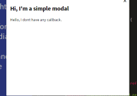
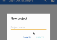
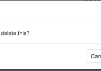
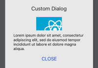
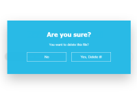
confirmAlert({ customUI: ({ onClose }) => { return ( <div className='custom-ui'> <h1>Are you sure?</h1> <p>You want to delete this file?</p> <button onClick={onClose}>No</button> <button onClick={() => { this.handleClickDelete(); onClose(); }} > Yes, Delete it! </button> </div> ); } });