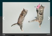
React Image Lightbox


A flexible lightbox component for displaying images in a React project.
Features
- Keyboard shortcuts (with rate limiting)
- Image Zoom
- Flexible rendering using src values assigned on the fly
- Image preloading for smoother viewing
- Mobile friendly, with pinch to zoom and swipe (Thanks, @webcarrot!)
- No external CSS
Example
import React, { Component } from 'react'; import Lightbox from 'react-image-lightbox'; import 'react-image-lightbox/style.css'; // This only needs to be imported once in your app const images = [ '//placekitten.com/1500/500', '//placekitten.com/4000/3000', '//placekitten.com/800/1200', '//placekitten.com/1500/1500', ]; export default class LightboxExample extends Component { constructor(props) { super(props); this.state = { photoIndex: 0, isOpen: false, }; } render() { const { photoIndex, isOpen } = this.state; return ( <div> <button type="button" onClick={() => this.setState({ isOpen: true })}> Open Lightbox </button> {isOpen && ( <Lightbox mainSrc={images[photoIndex]} nextSrc={images[(photoIndex + 1) % images.length]} prevSrc={images[(photoIndex + images.length - 1) % images.length]} onCloseRequest={() => this.setState({ isOpen: false })} onMovePrevRequest={() => this.setState({ photoIndex: (photoIndex + images.length - 1) % images.length, }) } onMoveNextRequest={() => this.setState({ photoIndex: (photoIndex + 1) % images.length, }) } /> )} </div> ); } }Play with the code on the example on CodeSandbox
Options
| Property | Type | Description |
|---|---|---|
| mainSrc (required) | string | Main display image url |
| prevSrc | string | Previous display image url (displayed to the left). If left undefined, onMovePrevRequest will not be called, and the button not displayed |
| nextSrc | string | Next display image url (displayed to the right). If left undefined, onMoveNextRequest will not be called, and the button not displayed |
| mainSrcThumbnail | string | Thumbnail image url corresponding to props.mainSrc. Displayed as a placeholder while the full-sized image loads. |
| prevSrcThumbnail | string | Thumbnail image url corresponding to props.prevSrc. Displayed as a placeholder while the full-sized image loads. |
| nextSrcThumbnail | string | Thumbnail image url corresponding to props.nextSrc. Displayed as a placeholder while the full-sized image loads. |
| onCloseRequest (required) | func | Close window event. Should change the parent state such that the lightbox is not rendered |
| onMovePrevRequest | func | Move to previous image event. Should change the parent state such that props.prevSrc becomes props.mainSrc, props.mainSrc becomes props.nextSrc, etc. |
| onMoveNextRequest | func | Move to next image event. Should change the parent state such that props.nextSrc becomes props.mainSrc, props.mainSrc becomes props.prevSrc, etc. |
| onImageLoad | func | Called when an image loads.(imageSrc: string, srcType: string, image: object): void |
| onImageLoadError | func | Called when an image fails to load.(imageSrc: string, srcType: string, errorEvent: object): void |
| imageLoadErrorMessage | node | What is rendered in place of an image if it fails to load. Centered in the lightbox viewport. Defaults to the string "This image failed to load". |
| onAfterOpen | func | Called after the modal has rendered. |
| discourageDownloads | bool | When true, enables download discouragement (preventing [right-click -> Save Image As...]). Defaults to false. |
| animationDisabled | bool | When true, image sliding animations are disabled. Defaults to false. |
| animationOnKeyInput | bool | When true, sliding animations are enabled on actions performed with keyboard shortcuts. Defaults to false. |
| animationDuration | number | Animation duration (ms). Defaults to 300. |
| keyRepeatLimit | number | Required interval of time (ms) between key actions (prevents excessively fast navigation of images). Defaults to 180. |
| keyRepeatKeyupBonus | number | Amount of time (ms) restored after each keyup (makes rapid key presses slightly faster than holding down the key to navigate images). Defaults to 40. |
| imageTitle | node | Image title (Descriptive element above image) |
| imageCaption | node | Image caption (Descriptive element below image) |
| imageCrossOrigin | string | crossorigin attribute to append to img elements (MDN documentation) |
| toolbarButtons | node[] | Array of custom toolbar buttons |
| reactModalStyle | Object | Set z-index style, etc., for the parent react-modal (react-modal style format) |
| reactModalProps | Object | Override props set on react-modal (https://github.com/reactjs/react-modal) |
| imagePadding | number | Padding (px) between the edge of the window and the lightbox. Defaults to 10. |
| clickOutsideToClose | bool | When true, clicks outside of the image close the lightbox. Defaults to true. |
| enableZoom | bool | Set to false to disable zoom functionality and hide zoom buttons. Defaults to true. |
| wrapperClassName | string | Class name which will be applied to root element after React Modal |
| nextLabel | string | aria-label set on the 'Next' button. Defaults to 'Next image'. |
| prevLabel | string | aria-label set on the 'Previous' button. Defaults to 'Previous image'. |
| zoomInLabel | string | aria-label set on the 'Zoom In' button. Defaults to 'Zoom in'. |
| zoomOutLabel | string | aria-label set on the 'Zoom Out' button. Defaults to 'Zoom out'. |
| closeLabel | string | aria-label set on the 'Close Lightbox' button. Defaults to 'Close lightbox'. |
Browser Compatibility
| Browser | Works? |
|---|---|
| Chrome | Yes |
| Firefox | Yes |
| Safari | Yes |
| IE 11 | Yes |
Contributing
After cloning the repository and running npm install inside, you can use the following commands to develop and build the project.
# Starts a webpack dev server that hosts a demo page with the lightbox. # It uses react-hot-loader so changes are reflected on save. npm start # Lints the code with eslint and my custom rules. npm run lint # Lints and builds the code, placing the result in the dist directory. # This build is necessary to reflect changes if you're # `npm link`-ed to this repository from another local project. npm run buildPull requests are welcome!
License
MIT