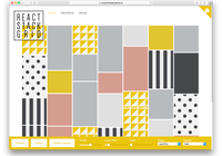
react-splitter-layout


A simple split layout for React and modern browsers.
Dependencies
React-splitter-layout depends on React and prop-types. See package.json for more details.
Installation
$ npm install --save react-splitter-layoutTesting
To start example server, execute example script with npm.
$ npm run exampleTo run tests, execute test command with npm.
$ npm testTo run coverage tests, execute coverage script with npm.
$ npm run coverageIntegration
-
Add
react-splitter-layoutdependency to your code.$ npm install --save react-splitter-layout
-
Include the library into your code and use it.
import React from 'react'; import SplitterLayout from 'react-splitter-layout'; import 'react-splitter-layout/lib/index.css'; class YourComponent extends React.Component { render() { return ( <SplitterLayout> <div>Pane 1</div> <div>Pane 2</div> </SplitterLayout> ); } } export default YourComponent;
Note: From version 4.0.0, you need to import CSS files or handle it in your favorite way explicitly.
Usage
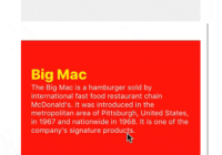
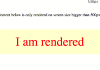
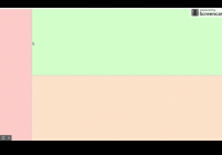
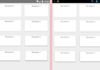
Write two parts of the layout as direct children of your SplitterLayout element. SplitterLayout renders the first 2 direct children only if it has more than 2 direct children. SplitterLayout does not render splitter when it has only 1 direct children, and the only direct children occupies all available space.
The SplitterLayout component supports the following props.
-
customClassName: PropTypes.stringCustom CSS class name applied to the layout
div. You can use this to customize layout style. Refers to the original stylesheet to see what you can customize. -
vertical: PropTypes.boolDetermine whether the layout should be a horizontal split or a vertical split. The default value is
false. -
percentage: PropTypes.boolDetermine whether the width of each pane should be calculated in percentage or by pixels. The default value is
false, which means width is calculated in pixels. -
primaryIndex: PropTypes.numberIndex of the primary pane. Since
SplitterLayoutsupports at most 2 children, only0or1is allowed. The default value is0.A primary pane is used to show users primary content, while a secondary pane is the other pane. When window size changes and
percentageis set tofalse, primary pane's size is flexible and secondary pane's size is kept unchanged. However, when the window size is not enough for showing both minimal primary pane and minimal secondary pane, the primary pane's size is served first. -
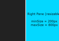
primaryMinSize: PropTypes.numberMinimal size of primary pane. The default value is 0.
When
percentageis set tofalse, this value is pixel size (25 means 25px). Whenpercentageis set totrue, this value is percentage (25 means 25%). -
secondaryMinSize: PropTypes.numberMinimal size of secondary pane.
-
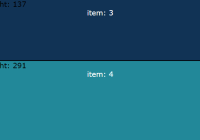
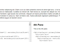
secondaryInitialSize: PropTypes.numberInitial size of secondary pane when page loads.
If this prop is not defined,
SplitterLayouttries to split the layout with equal sizes. (Note: equal size may not apply when there are nested layouts.) -
onDragStart: PropTypes.funcCalled when dragging is started.
No parameter will be passed to event handlers.
-
onDragEnd: PropTypes.funcCalled when dragging finishes.
No parameter will be passed to event handlers.
-
onSecondaryPaneSizeChange: PropTypes.funcCalled when the size of secondary pane is changed.
Event handlers will be passed with a single parameter of
numbertype representing new size of secondary pane. Whenpercentageis set tofalse, the value is in pixel size. Whenpercentageis set totrue, the value is in percentage.
Release History
- 4.0.0
- Stylesheets are no longer integrated by default. It has to be handled in your favorite way explicitly.
- 3.0.0
- Add dragging and size change events.
- Drop support of React earlier than 15.5.0.
- 100% code coverage test!
- 0.2.1
- Fix an incorrect layout when nesting a horizontal splitter inside a vertical one, and now root element of the splitter is absolutely positioned.
- 0.1.0
- First proper release.