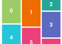
react-ui-cards

Various stylish card components for React. Focused on being ready to use with little modifications. Supply your data and you're good to go.
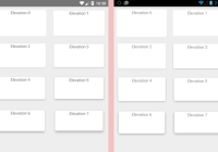
Live demo
https://nukeop.github.io/react-ui-cards/
npm
https://www.npmjs.com/package/react-ui-cards
Installation
$ npm install --save react-ui-cardsDevelopment
Getting started
After cloning the repo, run the following commands to start the project in development mode with hot reload:
$ npm install $ npm run devContributing
All contributions are welcome. You can either add something to existing cards, or create a completely new card type.
Card types
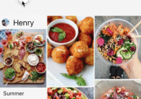
User cards
Cards representing users or people.
| attribute | type | description |
|---|---|---|
| cardClass | string | additional CSS classes you might want to apply to the Card. Putting 'float' here will enable an on-hover animation. |
| href | string/null | optional url the card will link to when clicked |
| header | string | url to the image that will be displayed in the upper part of the card |
| avatar | string | url to the image that will be displayed in the center of the card |
| name | string | user's name |
| positionName | string | user's role |
| stats | array/null | an optional array of objects with attributes 'name' and 'value' - this is displyed in the card's footer |

Product cards
Cards representing products available for purchase.
| attribute | type | description |
|---|---|---|
| photos | array | array of urls to photos of the product |
| price | string | the price that will be displayed in the upper lefthand corner |
| productName | string | name of the product |
| description | string | a short description of the product |
| rating | integer | rating of the product (0-5). Not implemented yet. |
| url | string | url the button will link to |
| buttonText | string/null | optional button text |

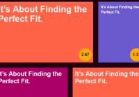
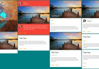
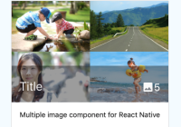
Tagged content cards
Cards showcasing any content that can be described with a single thumbnail and a list of tags.
| attribute | type | description |
|---|---|---|
| href | string/null | optional url the card will link to when clicked |
| thumbnail | string | url to the image that will be displayed in the center part of the card and as the background |
| title | string | title of the card |
| description | string | short description of the content, try to not exceed one line |
| tags | array/null | an array of strings that will be converted to pill-style tags and displayed in the lower righthand corner of the card |

Flipping card
A card with a front and back side. Flips over on hover. Any React component can be displayed on either side.
This card is a bit different than the other ones - it has no attributes. To define it, you have to create a nested structure and pass your content as children:
<FlippingCard> <FlippingCardBack> Content that will be displayed on the back of the card </FlippingCardBack> <FlippingCardFront> Content that will be displayed on the front of the card </FlippingCardFront> </FlippingCard>See demo page for an example in action.
Recipe card
Cards you can use to show dishes' names, time they take to cook and how big the portions are. Heart sign can be used as "Add to favorite" button.
| attribute | type | description |
|---|---|---|
| href | string/null | optional url the card will link to when clicked |
| thumbnail | string | url to the image that will be displayed at the top of other elements |
| title | string | name of the dish |
| time | string | amount of time it will take to prepare the dish |
| servings | string | estimation of portions' size |

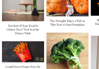
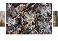
News header card
Cards you can use on the news site, shows the title, author and date it was published. Click on image to see the exact news.
| attribute | type | description |
|---|---|---|
| href | string/null | optional url the card will link to when clicked |
| thumbnail | string | url to the image that will be displayed in the background |
| author | string | author of aricle linked in href |
| date | string | date of publishing |
| tags | string | optional. array of string to be rendered as tags |

Cryptocurrency card
Cards that show cryptocurrency-related data, including a chart. Can be used for showing other data, such as fiat currency or stock market prices.
| attribute | type | description |
|---|---|---|
| currencyName | string | Name of the cryptocurrency |
| currencyPrice | string | Current price, displayed as provided, which means you have to format it yourself |
| icon | node | Icon representing the currency, it's displayed at 24x24 px |
| currencyShortName | string | Symbol such as BTC, ETH, etc |
| trend | string | Recent price change. Just as with the price, no formatting is performed |
| trendDirection | integer(-1, 0, 1) | Indicates whether the trend is positive, negative, or if there's no change |
| chartColor | string | Color of the line on the chart |
| chartData | array[integer] | An array of integer values to be displayed on the chart |

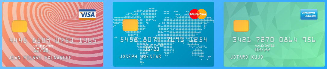
Payment card
Card that represents a credit card, a debit card, or other similar cards. Flips on hover to reveal the back.
| attribute | type | description |
|---|---|---|
| background | string | Valid CSS background string. If not provided, a default background is used. |
| backgroundPattern | string/null | Lets you select one of the patterns to display in the background. Can be either "worldMap", "triangles", or "spiral". Null results in no pattern being displayed |
| issuerIcon | string/element | Card issuer icon. Either a link to the image with an icon, or a React element to render |
| number | string | Payment card number |
| date | string | The "valid thru" date |
| name | string | Name displayed on the card |
| cvv | string | CVV code displayed on the back of the card |