React Native Responsive


The power of Media Queries now in your React Native project (ios and android) !
This library allows you to manage layouts between different sizes and displays: Responsive Design can now be easily managed.
A set of apis, components and decorators helps you to implement and build responsive applications easily and as fast as possible.
For more details, see Demonstration Application Documentation || For corresponding code, see Demonstration Application Source Code
Table of Contents
Installation
-
Go to your root project folder
-
Install react-native-responsive from npm repository:
npm install react-native-responsive --save -
You are now good to go !
General Usage
Introduction
Before anything else, some definitions:
- Responsive Design is the practice of using tools to progressively enhance a content for different viewing contexts
- Media Query is a CSS tool to help adapting content rendering following conditions
For this, react-native-responsive library introduces 3 ways to implement media queries:
- A component based way: MediaQuery
- A decorator based way: MediaQueryDecorator
- A functional api based way: MediaQueryStyleSheet
MediaQuery (Component approach)
A MediaQuery component like any other React component with props describing common media query device rules. If a rule is valid, all views stored inside corresponding MediaQuery are displayed. Else, they will be hidden. Given it component nature, you can nest it and do all the normal things that you can do with regular React components.
Props:
deviceWidth number optional
Describes the width of the rendering surface of the output device.
minDeviceWidth number optional
Describes the minimum width of the rendering surface of the output device.
maxDeviceWidth number optional
Describes the maximum width of the rendering surface of the output device.
deviceHeight number optional
Describes the height of the rendering surface of the output device.
minDeviceHeight number optional
Describes the minimum height of the rendering surface of the output device.
maxDeviceHeight number optional
Describes the maximum height of the rendering surface of the output device.
devicePixelRatio number optional
Describes the resolution in physical pixels per CSS pixel.
minDevicePixelRatio number optional
Describes the minimum resolution in physical pixels per CSS pixel.
maxDevicePixelRatio number optional
Describes the maximum resolution in physical pixels per CSS pixel.
debug boolean optional, default = false
Enables console debugging.
MediaQueryDecorator (Decorator approach)
An ES2016 syntactic sugar to describe and build media queries (a higher order component is created and responsible for that task):
@MediaQueryDecorator(MediaFeaturesObject, debug) //debug is optional and allows console debugging class Example extends React.Component { ... }Prerequisites
In order to allow Babel transpiler to parse decorator syntax, you need to enable transform-decorators plugin.
For this:
- Go to your root project folder
- If not, create
.babelrcfile - Add the following lines to your
.babelrcfile:
{ "extends": "react-native/packager/react-packager/rn-babelrc.json", "plugins": ["transform-decorators-legacy"] } Valid Object Keys
deviceWidth number optional
Describes the width of the rendering surface of the output device.
minDeviceWidth number optional
Describes the minimum width of the rendering surface of the output device.
maxDeviceWidth number optional
Describes the maximum width of the rendering surface of the output device.
deviceHeight number optional
Describes the height of the rendering surface of the output device.
minDeviceHeight number optional
Describes the minimum height of the rendering surface of the output device.
maxDeviceHeight number optional
Describes the maximum height of the rendering surface of the output device.
devicePixelRatio number optional
Describes the resolution in physical pixels per CSS pixel.
minDevicePixelRatio number optional
Describes the minimum resolution in physical pixels per CSS pixel.
maxDevicePixelRatio number optional
Describes the maximum resolution in physical pixels per CSS pixel.
MediaQueryStyleSheet (Functional Api approach)
Apis
MediaQueryStyleSheet.create(baseStylesObject, mediaRulesObject);
It's similar to React Native StyleSheet.create(obj) api except that it takes one more argument:
mediaRulesObject (optional) stores media query rules as keys (corresponding styles are affected as values).
Rules are written like regular css media query rules.
MediaQueryStyleSheet.debug();
Enables console debugging.
Valid Media Features Keys
device-width number optional
Describes the width of the rendering surface of the output device.
min-device-width number optional
Describes the minimum width of the rendering surface of the output device.
max-device-width number optional
Describes the maximum width of the rendering surface of the output device.
device-height number optional
Describes the height of the rendering surface of the output device.
min-device-height number optional
Describes the minimum height of the rendering surface of the output device.
max-device-height number optional
Describes the maximum height of the rendering surface of the output device.
device-pixel-ratio number optional
Describes the resolution in physical pixels per CSS pixel.
min-device-pixel-ratio number optional
Describes the minimum resolution in physical pixels per CSS pixel.
max-device-pixel-ratio number optional
Describes the maximum resolution in physical pixels per CSS pixel.
Examples
Practical Use Case
If you want to apply to your application a common CSS media query like this:
.container { display: flex; flex-direction: row; background-color: red; } @media (min-device-width: 320) and (max-device-height: 720) { .container { flex-direction: column; } }With React Native Responsive, you would write:
- Through the component MediaQuery:
... import { MediaQuery } from "react-native-responsive"; const Example = (props) => { return ( <MediaQuery minDeviceWidth={320} maxDeviceHeight={720}> <View style={{ flex: 1, flexDirection: "column", backgroundColor: "red" }}> <Text> Test </Text> </View> </MediaQuery> <MediaQuery maxDeviceWidth={319} minDeviceHeight={721}> <View style={{ flex: 1, flexDirection: "row", backgroundColor: "red" }}> <Text> Test </Text> </View> </MediaQuery> ); };
- Through the class decorator MediaQueryDecorator:
... import { MediaQueryDecorator } from "react-native-responsive"; @MediaQueryDecorator({ minDeviceWidth: 320, maxDeviceHeight: 720 }); class Example1 extends React.Component { ... } @MediaQueryDecorator({ maxDeviceWidth: 319, minDeviceHeight: 721 }); class Example2 extends React.Component { ... }
- Through the functional api MediaQueryStyleSheet (more concise since css properties are automatically merged):
... import { MediaQueryStyleSheet } from "react-native-responsive"; const styles = MediaQueryStyleSheet.create( //Base styles: { container: { flex: 1, flexDirection: "row", backgroundColor: "red" } }, //Media Queries styles: { "@media (min-device-width: 320) and (max-device-height: 720)": { container: { flexDirection: "column" } } } );
Tips for DRY Media Queries
Much like SCSS and other preprocessed libraries, you can create a variable to reuse common queries.
In scss you might do:
$xsUp: "@media all and (min-width: 320px)";With ES6 you might do:
const IPHONE_7_AND_UP = `@media (min-device-width: 320) and (min-device-height: 720)`;For further DRY-ness, create a seperate file with all of your media query breakpoints and export for use throughout your application.
const IPHONE_WIDTH = 320; const IPHONE_7_HEIGHT = 720; export const IPHONE_7_AND_UP = `@media (min-device-width: ${IPHONE_WIDTH) and (min-device-height: ${IPHONE_7_HEIGHT)`;Altogether that would look like:
import {IPHONE_7_AND_UP} from '../styles/breakpoints'; ... const styles = MediaQueryStyleSheet.create( //Base styles: { container: { flex: 1, flexDirection: "row", backgroundColor: "red" } }, //Media Queries styles: { [IPHONE_7_AND_UP]: { container: { flexDirection: "column" } } } );Demonstration Application
If you want an overview of this library, it's interesting to try the demonstration code located inside ./example folder.
Prerequisites
To build and test this demo, just follow these steps:
- Connect your device or launch your Android emulator
- Clone this repository
- Go to the example folder:
cd ./example - Install npm dependencies:
npm install - Build and deploy the demonstration application by running:
- If you develop on an ios device:
npm run cli run-ios - If you develop on an android device:
npm run cli run-android
- If you develop on an ios device:
- Enjoy the demonstration !
Screenshot output
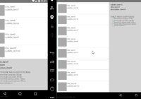
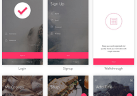
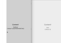
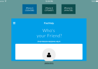
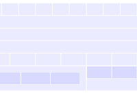
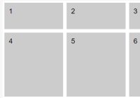
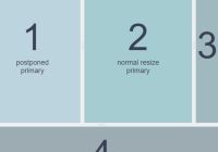
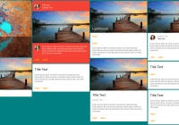
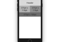
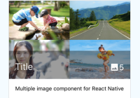
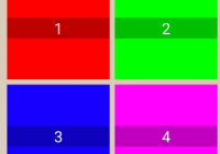
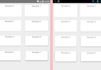
Here's different layouts managed by React Native Responsive module (Nexus 5 smartphone vs Nexus 10 tablet):
For corresponding code, see Source Code
Misc
Unit Of Measurement
All Media Queries (like all React Native Css properties) are expressed in CSS pixels (<=> dip/dp: density independant pixel) (a CSS pixel may not be the same as a hardware pixel especially on high-density displays).
Typically:
cssPixel (in dip/dp) = hardwarePixel (in px) / pixelRatio You must take in account this while writing your media rules. For example, for a device with a width of 1920 pixels, a height of 1080 pixels and a pixel ratio of 3, you would write instead 640 dp (=1920/3) for width and 360 dp (=1080/3) for height.
See mydevice.io for some units mapping according to devices
MediaQueryDebug (Debug Component)
If you want some information regarding to hardware specifications of your device, there is a component dedicated to this: MediaQueryDebug:
import { MediaQueryDebug } from "react-native-responsive"; const Example = (props) => { return ( <MediaQueryDebug style={{ flex: 1 }} styleText={{ fontSize: 10 }}/> ); };Props
View props...
styleText object optional
Customizes text debugging styles.
Output Example
Important note concerning size debugging outputs
On Android, a device can have screen decoration (such as a navigation bar) along the edges of the display that reduce the amount of application space available from the size returned here. React Native Responsive computes device constraints accordingly to window available space and not to hardware screen size (due to React Native Dimensions api).
For example, a LG Nexus 5 has:
Hardware view = 640 x 360 dp Content view = 592 x 360 dp (due to 48 dp of navigation bar) TODOs
- Replace React Native Dimensions.get("window") api (dependent from initial orientation screen) by a custom ios/android native module independent from initial device orientation
- Add more features:
- Orientation (needs to create android and ios orientation event handler native dependencies)
- Platform ios/android (checks from React Native Platform api)
- Allow nested media rules through MediaQueryStyleSheet.create() api
