React Inline Grid
A predictable gird layout based on flexbox for React applications using inline styles.

Install
npm install react-inline-grid --save
API
Sample Usage
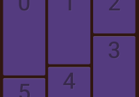
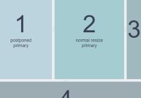
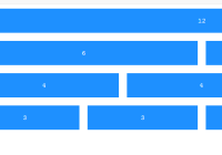
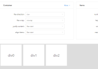
import React from 'react'; import ReactDOM from 'react-dom'; import { Grid, Row, Cell } from 'react-inline-grid'; const Layout = React.createClass({ render() { return ( <Grid> <Row is="center"> <Cell is="3 tablet-4 phone-4"><div>content_a</div></Cell> <Cell is="3 tablet-4 phone-4"><div>content_b</div></Cell> </Row> </Grid> ); } }); ReactDOM.render(<Layout />, document.body);The library exports Grid, Row and Cell.
<Grid />
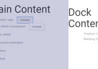
Grid wrap inner components with React Redux <Provider>.
Using Redux, Grid's inner components can react to store update. Here Redux is used to handle MediaQueryList changes and update components style property:
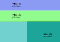
// phone <div style="...; width: calc(100% - 16px);"><div> // tablet <div style="...; width: calc(50% - 16px);"><div> // desktop <div style="...; width: calc(25% - 16px);"><div>Grid exposes the property options allowing you to define custom grid settings.
options shape:
{ columns: number // default = 12 - Columns size for the bigger media. gutter: number // default = 16 - Gutter size in pixel. margin: number // default = 16 - Margin size in pixel. deaf: bool // default = false - Ignore MediaQueryList updates. list: [ // default = [...] - List of target media. { name: string // required - Media name. query: string // required - Media query to test. gutter: number // default = options -> gutter - Media gutter size in pixel. margin: number // default = options -> margin - Media margin size in pixel. } ] }If options is not provided, or invalid, it will be fixed to apply values inspired by Google Material Design Lite grid layout:
// options -> list [ { name: 'phone', gutter: 16, margin: 16, columns: 4, query: '(max-width: 479px)' }, { name: 'tablet', gutter: 16, margin: 16, columns: 8, query: '(min-width: 480px) and (max-width: 839px)' }, { name: 'desktop', gutter: 16, margin: 16, columns: 12, query: '(min-width: 840px)' } ]If no media match the queries, Grid will define the first options -> list -> value as default current media in order to match the "popular" mobile first approch.
<Row />
Exposes the property is (string) to update the following default style object:
{ display: 'flex', flexFlow: 'row wrap', alignItems: 'stretch' }is specify the justify-content style property as:
startcenterendaroundbetween
<Row is="center phone-end"> <Cell> <div>Content</div> </Cell> </Row> // not phone <div style="...; justify-content:center;"> <Cell> <div>Content</div> </Cell> </div> // phone <div style="...; justify-content:flex-end;"> <Cell> <div>Content</div> </Cell> </div> <Cell />
Exposes the property is (string) to update the following default style object:
{ boxSizing: 'border-box' }is specify cell size and align-self style property as:
<value><media name?>-<value><media name?>-offset-<value>topmiddlebottomstretch
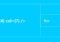
<Row> <Cell is="middle 4 tablet-2 offset-1"> <div>Content</div> </Cell> </Row> // desktop <Row> <div style="...; width:calc(33.33...% - 16px);align-self:center;margin-left:calc(8.33...% - 8px);"> <div>Content</div> </div> </Row> // tablet <Row> <div style="...; width:calc(12.5% - 16px);align-self:center;margin-left:calc(25% - 8px);"> <div>Content</div> </div> </Row> // phone <Row> <div style="...; width:calc(25% - 16px);align-self:center;margin-left:calc(100% - 8px);"> <div>Content</div> </div> </Row>For both <Row /> and <Cell />, is property ask for an "already defined" values, the last one is used:
<Cell is="3 2 1"> <div>Content</div> </Cell> // will be defined as <Cell is="1"> <div>Content</div> </Cell>Examples
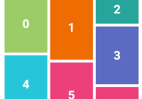
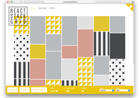
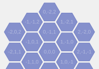
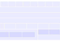
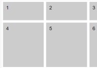
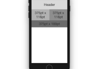
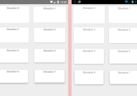
The gh-pages page of this repository use some patterns as examples, but feel free to play and test your layouts using the examples folder.
Run the gh-pages example:
git clone https://github.com/broucz/react-inline-grid.git cd react-inline-grid npm install cd examples/react-transform-boilerplate npm install npm start open http://localhost:3000/ Thanks
- Redux I learned a lot from package evolution, author @gaearon, contributors, and related discussions.
- React for the fun.
- React Redux to make it easier.