React Masonry Component
IE8 support
if you wish to have IE8 support, v2 with React 0.14 is the highest version available.
Table of contents
Introduction:
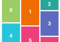
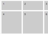
A React.js Masonry component. (Also available as a mixin if needed)
Live demo:
Usage:
-
The component is bundled with Masonry, so no additional dependencies needed!
-
You can optionally include Masonry as a script tag if there should be any reason for doing so
<script src='//cdnjs.cloudflare.com/ajax/libs/masonry/3.1.5/masonry.pkgd.min.js' /> -
To use the component just require the module.
Basic usage
npm install --save react-masonry-component
import * as React from 'react'; import Masonry from 'react-masonry-component'; const masonryOptions = { transitionDuration: 0 }; const imagesLoadedOptions = { background: '.my-bg-image-el' } class Gallery extends React.Component { render() { const childElements = this.props.elements.map(function(element){ return ( <li className="image-element-class"> <img src={element.src} /> </li> ); }); return ( <Masonry className={'my-gallery-class'} // default '' elementType={'ul'} // default 'div' options={masonryOptions} // default {} disableImagesLoaded={false} // default false updateOnEachImageLoad={false} // default false and works only if disableImagesLoaded is false imagesLoadedOptions={imagesLoadedOptions} // default {} > {childElements} </Masonry> ); } } export default Gallery;ES6-style modules are also supported, just use:
import Masonry from 'react-masonry-component';Custom props
You can also include your own custom props - EG: inline-style and event handlers.
import * as React from 'react'; import Masonry from 'react-masonry-component'; const masonryOptions = { transitionDuration: 0 }; const style = { backgroundColor: 'tomato' }; class Gallery extends React.Component { handleClick() {} render() { return ( <Masonry className={'my-gallery-class'} style={style} onClick={this.handleClick} > {...} </Masonry> ); } } export default Gallery;Accessing Masonry instance
Should you need to access the instance of Masonry (for example to listen to masonry events) you can do so by using refs.
import * as React from 'react'; import Masonry from 'react-masonry-component'; class Gallery extends React.Component { handleLayoutComplete() { }, componentDidMount() { this.masonry.on('layoutComplete', this.handleLayoutComplete); }, componentWillUnmount() { this.masonry.off('layoutComplete', this.handleLayoutComplete); }, render() { return ( <Masonry ref={function(c) {this.masonry = this.masonry || c.masonry;}.bind(this)} > {...} </Masonry> ); } } export default Gallery;Images Loaded Options
React Masonry Component uses Desandro's imagesloaded library to detect when images have loaded. Should you want to pass options down to it then you need to populate the imagesLoadedOptions property on React Masonry Component.
This will most commonly be used when the elements in your gallery have CSS background images and you want to capture their load event. More info availabe on the imagesloaded website.
eg:
import * as React from 'react'; import Masonry from 'react-masonry-component'; class Gallery extends React.Component { render() { const imagesLoadedOptions = { background: '.my-bg-image-el' } return ( <Masonry className={'my-gallery-class'} elementType={'ul'} options={masonryOptions} imagesLoadedOptions={imagesLoadedOptions} > <div className="my-bg-image-el"></div> </Masonry> ); } } export default Gallery;Events
onImagesLoaded- triggered when all images are loaded or after each image is loaded whenupdateOnEachImageLoadis set totrueonLayoutComplete- triggered after a layout and all positioning transitions have completed.onRemoveComplete- triggered after an item element has been removed
class Gallery extends React.Component { componentDidMount() { this.hide(); }, handleImagesLoaded(imagesLoadedInstance) { this.show(); }, render() { return ( <Masonry onImagesLoaded={this.handleImagesLoaded} onLayoutComplete={laidOutItems => this.handleLayoutComplete(laidOutItems)} onRemoveComplete={removedItems => this.handleRemoveComplete(removedItems)} > {...} </Masonry> ) } }


