Rebass Grid
Responsive React grid system built with styled-system, with support for styled-components and emotion (previously called grid-styled)
Getting Started
npm i @rebass/gridimport React from 'react' import { Flex, Box } from '@rebass/grid' const App = () => ( <Flex> <Box width={1/2} px={2}> Half width </Box> <Box width={1/2} px={2}> Half width </Box> </Flex> )Emotion
Or for emotion , import @rebass/grid/emotion (uses v10 @emotion/styled)
import { Flex, Box } from '@rebass/grid/emotion'Box
The Box component handles width, margin and padding.
// Different widths at different breakpoints <Box width={[ 1/2, 1/3, 1/4, 1/6 ]} /> // Fixed pixel width <Box width={256} /> // CSS value width <Box width='40em' />// Padding <Box p={2} /> // Padding top <Box pt={2} /> // Padding bottom <Box pb={2} /> // Padding left <Box pl={2} /> // Padding right <Box pr={2} /> // x-axis padding (left and right) <Box px={2} /> // y-axis padding (top and bottom) <Box py={2} />// Margin <Box m={2} /> // Margin top <Box mt={2} /> // Margin bottom <Box mb={2} /> // Margin left <Box ml={2} /> // Margin right <Box mr={2} /> // x-axis margin (left and right) <Box mx={2} /> // y-axis margin (top and bottom) <Box my={2} />// margin auto <Box m='auto' /> // negative margins <Box mx={-2} />Props
All @rebass/grid components use styled-system for style props, which pick up values from a theme and allow for responsive styles to be passed as array values.
width (number|string|array)
Sets width, where numbers 0-1 are percentage values, larger numbers are pixel values, and strings are raw CSS values with units. Pass an array to set different widths at different breakpoints for responsive styles.
Margin and Padding Props
Both margin and padding props accept numbers, strings, and arrays as values. Using a number from 0-8 (i.e. an index of theme.space) will reference a step on the spacing scale. Larger numbers are converted to pixel values. Negative Numbers can be used to set negative margins and compensate for grid gutters. Strings are passed directly for other valid CSS values.
Use array values to set different margin or padding values per breakpoint for responsive styles.
Margin and padding props follow a shorthand syntax for specifying direction.
m: marginmt: margin-topmr: margin-rightmb: margin-bottomml: margin-leftmx: margin-left and margin-rightmy: margin-top and margin-bottomp: paddingpt: padding-toppr: padding-rightpb: padding-bottompl: padding-leftpx: padding-left and padding-rightpy: padding-top and padding-bottom
flex (string|array)
Sets the flex property.
<Box flex='1 1 auto' />order (number|string|array)
Sets the order property.
<Box order={2} />alignSelf (string|array)
Sets the align-self property.
<Box alignSelf='flex-end' />css (string|object)
Pass styles to styled-components or emotion. This is useful as an escape hatch for one-off styles or as a way to extend Rebass Grid components.
<Box bg='blue' css={{ borderRadius: '4px' }} />Flex
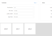
The Flex component extends the Box component and sets display flex.
import React from 'react' import { Flex, Box } from '@rebass/grid' const App = props => <Flex> <Box>Flex</Box> <Box>Box</Box> </Flex>In addition to the Box component props, Flex also includes the following:
alignItems(string|array) setsalign-itemsjustifyContent(string|array) setsjustify-contentflexDirection(string|array) setsflex-directionflexWrap(string|array) setsflex-wrap: wrap
Responsive Styles
Rebass Grid props accept arrays as values for mobile-first responsive styles, where the first value is for all breakpoints, then each value after is for a min-width media query from that breakpoint and up.
// 100% below the smallest breakpoint, // 50% from the next breakpoint and up, // and 25% from the next breakpoint and up <Box width={[ 1, 1/2, 1/4 ]} /> // responsive margin <Box m={[ 1, 2, 3, 4 ]} /> // responsive padding <Box p={[ 1, 2, 3, 4 ]} />Extending Components
Component can be extended with React or using styled-components or emotion.
InlineFlex
import React from 'react' import { Flex } from '@rebass/grid' const InlineFlex = props => <Flex {...props} css={{ display: 'inline-flex' }} />// styled-components example import styled from 'styled-components' import { Flex } from '@rebass/grid' const InlineFlex = styled(Flex)` display: inline-flex; `Max-Width Container
import React from 'react' import { Box } from '@rebass/grid' const Container = props => <Box {...props} mx='auto' css={{ maxWidth: '1024px' }} />// styled-components example import styled from 'styled-components' import { Box } from '@rebass/grid' const Container = styled(Box)` max-width: 1024px; ` Container.defaultProps = { mx: 'auto' }Auto Grid
This example creates components for a grid with set gutters where the columns expand to fill in the space.
// Example import React from 'react' import { Flex, Box } from '@rebass/grid' const Row = props => ( <Flex {...props} mx={-3} /> ) const Column = props => ( <Box {...props} px={3} flex='1 1 auto' /> )Changing the HTML element
Rebass Grid is intended for use with styled-components v4. To change the underlying HTML element, use the styled-components as prop.
<Box as='header' />Note: Previous versions of grid-styled supported an is prop, which has been deprecated in favor of the styled-components as prop.
Theming
Rebass Grid uses smart defaults, but to customize the values, use the ThemeProvider component from styled-components or emotion.
import React from 'react' import { ThemeProvider } from 'styled-components' import { Box } from '@rebass/grid' const theme = { space: [ 0, 6, 12, 18, 24 ], breakpoints: [ '32em', '48em', '64em' ] } const App = () => ( <ThemeProvider theme={theme}> <div> <Box width={[1, 1/2, 1/4]} px={2}>Box with custom spacing scale and breakpoints</Box> </div> </ThemeProvider> )Breakpoints
The Flex and Box components use a mobile-first responsive approach, where any value set works from that breakpoint and wider. Breakpoints are hard-coded to the following min-widths: 40em, 52em, 64em.
To customize, provide an array of string values that will be converted to media queries.
Spacing Scale
Rebass Grid components' margin and padding props use a 4 step spacing scale to help keep things aligned and keep layouts consistent.
The default scale is based on an 8px/powers-of-two grid: [ 0, 4, 8, 16, 32, 64, 128, 256, 512 ], which helps keep spacing consistent and elements aligned even when nesting components.
Styled Space
Rebass Grid also works with the optional Rebass Space package.
import React from 'react' import { Flex, Box } from '@rebass/grid' import Space from '@rebass/space' const App = () => ( <Flex> <Space mx={3}> <h1>Hello</h1> <Box>Beep</Box> </Space> </Flex> )