


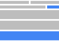
 Nice React Layout
A set of React components to create complex flexbox-based layouts without knowing what flexbox is. https://ekros.github.io/nice-react-layout/
Installation
yarn add nice-react-layoutMotivation
The aim of this project is to have a reduced set of components to create flexbox-based layouts abstracting the knowledge needed to understand how flexbox works. This library is very useful for web apps with lots of panels.
Features
- Easy to learn: Just combine layouts and panels.
- Create collapsible sidebars with ease.
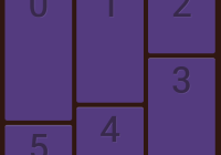
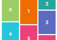
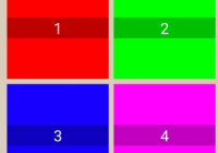
- Automagically colorize panels with random colors to speed-up prototyping.
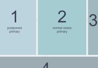
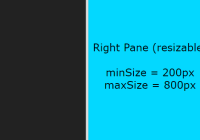
- Resizable panels. Just add separators to your layouts.
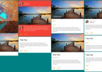
- Swap panels position using Drag and drop!


Basic Usage
Components can be imported using ES6 modules syntax:
import { HorizontalLayout, VerticalLayout, Panel, Separator, Spacer, View } from "nice-react-layout";Creating a simple layout is as easy as this:
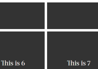
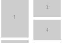
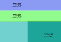
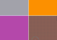
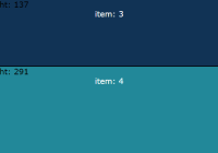
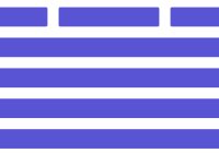
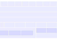
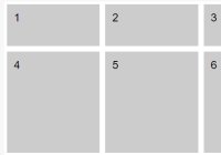
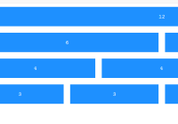
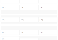
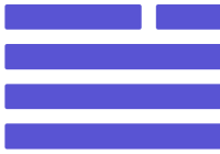
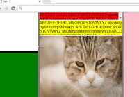
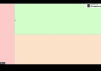
<HorizontalLayout mockup> <Panel /> <Panel /> </HorizontalLayout>It renders an horizontal layout with two panels of the same size (they have proportion=1 by default). Thanks to the 'mockup' prop it paints every panel with a random color, easing the layout prototyping process. Layouts get all the available space by default (in the parent element). If you want your layout to fill the viewport you can use the component. Like this:
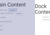
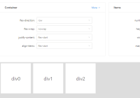
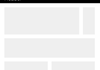
<View> <HorizontalLayout mockup> <Panel /> <Panel /> </HorizontalLayout> </View>In both horizontal and vertical layouts add the prop 'proportion' with the proportional part it takes from the available space. This example creates a typical sidebar + content layout:
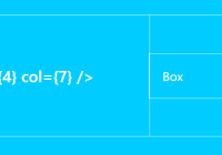
<HorizontalLayout mockup> <Panel proportion={1} /> <Panel proportion={4} /> </HorizontalLayout>Do you want to add a separator between both panels? Use the Separator component:
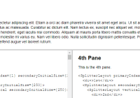
<HorizontalLayout mockup> <Panel proportion={1} /> <Separator /> <Panel proportion={4} /> </HorizontalLayout>You can nest layouts. Let's add a vertical layout, with its own Separator, inside the right panel:
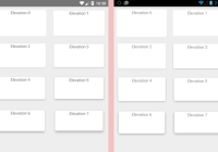
<HorizontalLayout mockup> <Panel proportion={1} /> <Separator /> <Panel proportion={4}> <VerticalLayout mockup> <Panel /> <Separator /> <Panel /> </VerticalLayout> </Panel> </HorizontalLayout>To enable drag-and-drop feature, use the draggable and droppable props:
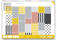
<HorizontalLayout mockup> <Panel draggable droppable /> <Panel draggable droppable /> </HorizontalLayout>For a complete example with every feature, see the src/demo/App.js file. Or just run yarn start.
Components
View
The top-level component. It gets all the available viewport space. Use it if you want your layout to fill the viewport or pass width / height props.
Props
| Prop | Description |
|---|---|
| width | view width (100vw by default) |
| height | view height (100vh by default) |
HorizontalLayout
It creates an horizontal layout. This is shorthand component for:
<Layout orientation="horizontal" />VerticalLayout
It creates vertical layout layout. This is a shorthand component for:
<Layout orientation="vertical" />Layout
Creates a layout.
Props
| Prop | Description |
|---|---|
| className | Top-level element class name |
| collapseSize | Collapsible panels size when collapsed |
| customCss | Custom layout CSS object |
| mockup | Render in mockup mode |
| onResize | Returns (layout, collapsedPanels) on resize |
| orientation | 'vertical' or 'horizontal' |
| reverse | Render layout in reverse order |
Panel
Here is where your content goes. If you are familiar with flexbox, this is like a "flex item" with a flex value of 1 by default. If not, don't worry, you don't need to know that :)
Props
| Prop | Description |
|---|---|
| centered | Center panel content |
| className | Top-level element class name |
| collapsible | The panel can be collapsed |
| collapsed | Is the panel collapsed? |
| collapseButtonClass | Adds a class to the collapse button |
| collapseButtonContent | A String or element |
| collapseButtonCollapsedContent | A String or element |
| collapseButtonStyle | Inject inline CSS to the collapse button |
| collapsePanel | Called when collapse button is clicked |
| collapseSwitch | Custom collapse element (renders button if not provided) |
| columns | Number of columns (uses CSS multiple columns) |
| customCss | Custom panel CSS object (injects it as an inline style) |
| draggable | Enable dragging |
| droppable | Other panels can be dropped here |
| minHeight | Minimum panel height |
| minWidth | Minimum panel width |
| mockup | Render in mockup mode |
| orientation | 'vertical' or 'horizontal' |
| proportion | Proportion it uses from the available space (default = 1) |
| reverse | Render layout in reverse order |
| showSize | Show panel size while dragging adjacent separators |
| sidebar | Don't do much by it self. It is a requirement for sidebar props like 'collapsible' |
Separator
It separates panels and allows them to be resized. This is optional.
Props
| Prop | Description |
|---|---|
| customCss | Custom separator CSS object (injects it as an inline style) |
| defaultDblClickPos | Position where the separator goes when double-clicked |
| disabled | Is disabled? |
| onSeparatorDoubleClick | Action called when the separator is double-clicked |
| onSeparatorMouseDown | Action called when the mouse is over the separator |
Spacer
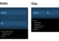
It renders a blank space. Useful when you need to leave spaces between panels.
Props
| Prop | Description |
|---|---|
| size | Separator size in pixels |
Like this project? ★ us on Github :)