react-native-gridview
A flexible grid view based on React Native's ListView component.

Introduction
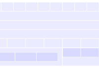
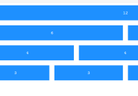
React Native's ListView can be customized to render in a grid layout, but suffers from some issues:
- Does not allow specifying a number of items per row, requiring fixing or calculating the width of your items for consistent row layouts
- If your items have variable heights, the item containers will not flex to match each other
react-native-gridview seeks to solve these issues, along with giving you some additional functionality for grid-based layouts.
Install
npm install react-native-gridview --save
Basic Usage
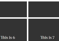
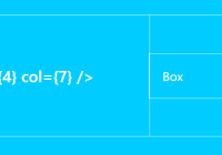
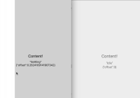
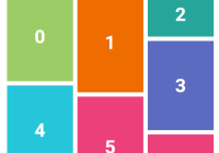
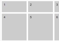
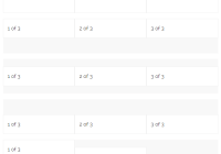
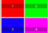
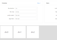
import React from 'react'; import { Text, View } from 'react-native'; import GridView from 'react-native-gridview'; const itemsPerRow = 3; // Use data from an array... const data = Array(20) .fill(null) .map((item, index) => index + 1); // ...or create your own data source. // This will randomly allocate 1-3 items per row, and will be used // if the `randomizeRows` prop is `true`. const randomData = []; for (let i = 0; i < data.length; i) { const endIndex = Math.max(Math.round(Math.random() * itemsPerRow), 1) + i; randomData.push(data.slice(i, endIndex)); i = endIndex; } const dataSource = new GridView.DataSource({ rowHasChanged: (r1, r2) => r1 !== r2, }).cloneWithRows(randomData); export default function MyGrid(props) { return ( <GridView data={data} dataSource={props.randomizeRows ? dataSource : null} itemsPerRow={itemsPerRow} renderItem={(item, sectionID, rowID, itemIndex, itemID) => { return ( <View style={{ flex: 1, backgroundColor: '#8F8', borderWidth: 1 }}> <Text>{`${item} (${sectionID}-${rowID}-${itemIndex}-${itemID})`}</Text> </View> ); }} /> ); }Check out the gridview project in the examples folder for advanced usage.
Properties
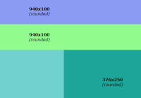
- ...ListView.props
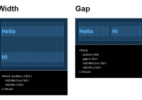
data(Array:Object) - The raw array or object (for sectioned grids) data source. TheGridViewwill create and manage its ownGridView.DataSource.dataSource(GridView.DataSource) - AGridView.DataSource(wrapper forListView.DataSource) can be provided in place of, or override, thedataproperty.itemsPerRowdoes not apply to this data source, and the data structure must be[[item1, ...], [item1, ...]]or{ 'Section 1': [item1, ...], 'Section 2': [item1, ...] }. Since you control the data source structure, you can have a variable number of items per row by configuring your data source appropriately.fillMissingItems(Boolean) - Fills in spots in the last row of your grid if there aren't enough items remaining. Setting totruewill give uniform widths to grid items, whilefalsewill flex the items to fill the full row width. Defaults totrue.itemsPerRow(Integer) - The number of items to render per row.itemsPerRowLandscape/itemsPerRowPortrait(Integer) - Provide one or both of these to overrideitemsPerRowin the specified orientation. If one or both are provided, whenGridViewfires theonLayoutevent it will determine the orientation (using height/width check based onDimensions.get('window')) and rebind thedataproperty to cause the grid content to re-render.itemStyle(View.propTypes.style) - The style(s) applied to the item container after the default style of{ flex: 1 }.renderItem(Function) - Render function called for each item in the data source.rowStyle(View.propTypes.style) - The style(s) applied to the row container after the default style of{ flexDirection: 'row' }.