react-native-masonry
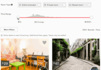
🙌 An easy to use, pure JS react-native component to render a masonry~ish layout for remote images
react-native-masonry is built with the following features and functionalities baked in
- Dynamic Column Rendering
- Progressive Item Loading
- Device Rotation
- On-press Handlers
- Custom Headers & Captions
- Optimized to Rendering Large List
- Support for Third-Party Image components
- Automatic Sizing Based on Available Space
Usage
- Install the repository
$ npm install --save react-native-masonry
- Add an import to the top of your file
import Masonry from 'react-native-masonry';
- At a minimal, declare the component in the render method prividing data for bricks
<Masonry sorted // optional - Default: false columns={4} // optional - Default: 2 bricks={[ { uri: 'http://image1.jpg' }, { uri: 'http://image2.jpg' }, { uri: 'http://image3.jpg' } ]} />
- Still a bit confused
😖 , or want to see it in action? No worries, run the example application on your local machine to examine how to get started or try it out on Expo.io.
Component Props
| Props | Type | Description | Default |
|---|---|---|---|
| bricks | array | A list of Object:Bricks to be passed into the row renderer. I.E:,bricks=[{id: 1, uri: 'https://image.jpg', onPress: (brick) => this.redirect(brick.id)}, {id: 2, uri: 'https://hyper.jpg'}] | [] |
| columns | num | Desired number of columns | 2 |
| sorted | bool | Whether to sort bricks according to their index position or allow bricks to fill in as soon as the uri is ready. | false |
| imageContainerStyle | object | The styles object which is added to the Image component | {} |
| customImageComponent | React.Component | Use a custom component to be rendered for the Image. This will work properly, as long as the component follows the standard interface of the react-native image component. | n/a |
| customImageProps | object | Pass along additional properties to a props.customImageComponent. | n/a |
| spacing | num | Gutter size of the column. The spacing is a multiplier of 1% of the available view. | 1 |
| refreshControl | React.Component | A component to be used as a refresh element for the Masonry component | n/a |
Brick Properties
"Bricks" are the basic building block of the masonry and are passed into the props.bricks. They essentially represent the items within each column and require a uri property at a minimum. However, you can freely add additional properties to the data property if you need access to certain data within your brick.onPress handler and footer/header renderer. The following properties are available.
| Property | Type | Required | Description | Example |
|---|---|---|---|---|
| uri | string | The uri of the image location. | http://test.com/i.jpeg | |
| key | string | Optional item key. By default, uri is used as the key for each item. It's recommended to set a unique key here, but it is not required. The key is required if you need to have image with the same uri more than once in your list. | image01 | |
| onPress | func (brick.data) | A function handler when the brick is pressed. The function will be called with the instance of the brick, which provides it's dimensions, columns, as well as any user defined properties passed into the bricks prop. An image will be wrapped by a TouchableHighlight. | onPress: (data) => goTo(data.id) | |
| renderHeader | func (brick.data) | A function that is executed ABOVE the brick image, this function must return a React Component. renderHeader() is passed brick.data to allow dynamic content rendering of components. | Figure 1 | |
| renderFooter | func (brick.data) | A function that is executed BELOW the brick image renderFooter() is passed brick.data to allow dynamic content rendering of components. | Figure 2 |
Usage Examples
ℹ️ Figure 1: Brick with renderHeaderAccomplishing a top bar indicating the user's avatar and name
{ // User defined data data: { user: { name: 'Henry', profilePic: 'https://user.jpeg' } } uri: 'https://example.com/mainImage.jpeg', renderHeader: (data) => { return ( <View> <Image source={{ uri: data.user.profilePic }} style={{ width: 50, height: 50}}> <Text>{data.user.name}</Text> </View> ); } }
ℹ️ Figure 2: Brick with .renderFooterCreating a bottom bar to include additional metadata
{ data: { caption: 'Summer Recipies' }, uri: 'https://example.com/mainImage.jpeg', renderFooter: (data) => { return ( <View> <Text>{data.caption}</Text> </View> ); } }
ℹ️ Figure 3: Using Third-Party Image ComponentsHow to leverage third-party components like
<FastImage>and apply unique properties across all images
import FastImage from 'react-native-fast-image'; const fastProps = { onProgress: { e => console.log(e.nativeEvent.loaded / e.nativeEvent.total) }, resizeMode: FastImage.resizeMode.contain }; // ... Where Masonry is called <Masonry bricks={data} customImageComponent={FastImage} customImageProps={fastProps} />Contribute
👷🏽👷🏻♀️🐕
Pull requests are welcomed, just abide by rules listed within contributing.json.
Beginners
Not sure where to start, or a beginner? Take a look at the issues page for low-hanging or beginner-friendly labels as an easy ways to start contributing.
Contributors
Thank you to all the people who have already contributed to react-native-masonry!
License
MIT © Brandon Him


