react-native-slider


A pure JavaScript <Slider> component for react-native. This is still very much a work in progress, ideas and contributions are very welcome.
It is a drop-in replacement for Slider.
Install
npm i --save react-native-sliderNote: I try to maintain backward compatibility of this component with previous versions of React Native, but due to the nature of the platform, and the existence of breaking changes between releases, it is possible that you need to use a specific version of this component to support the exact version of React Native you are using. See the following table:
| React Native version(s) | Supporting react-native-slider version(s) |
|---|---|
| <0.25.0 | <0.7.0 |
| v0.25.x | v0.7.x |
| v0.26.0+ | v0.8.x |
| v0.43.0+ | v0.10.x |
| v0.44.0+ | v0.11.x |
Usage
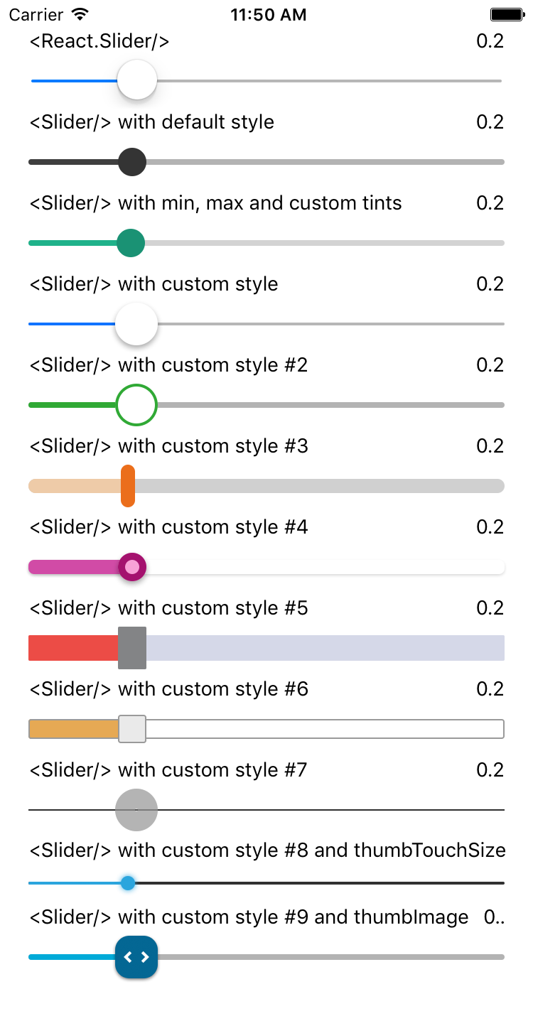
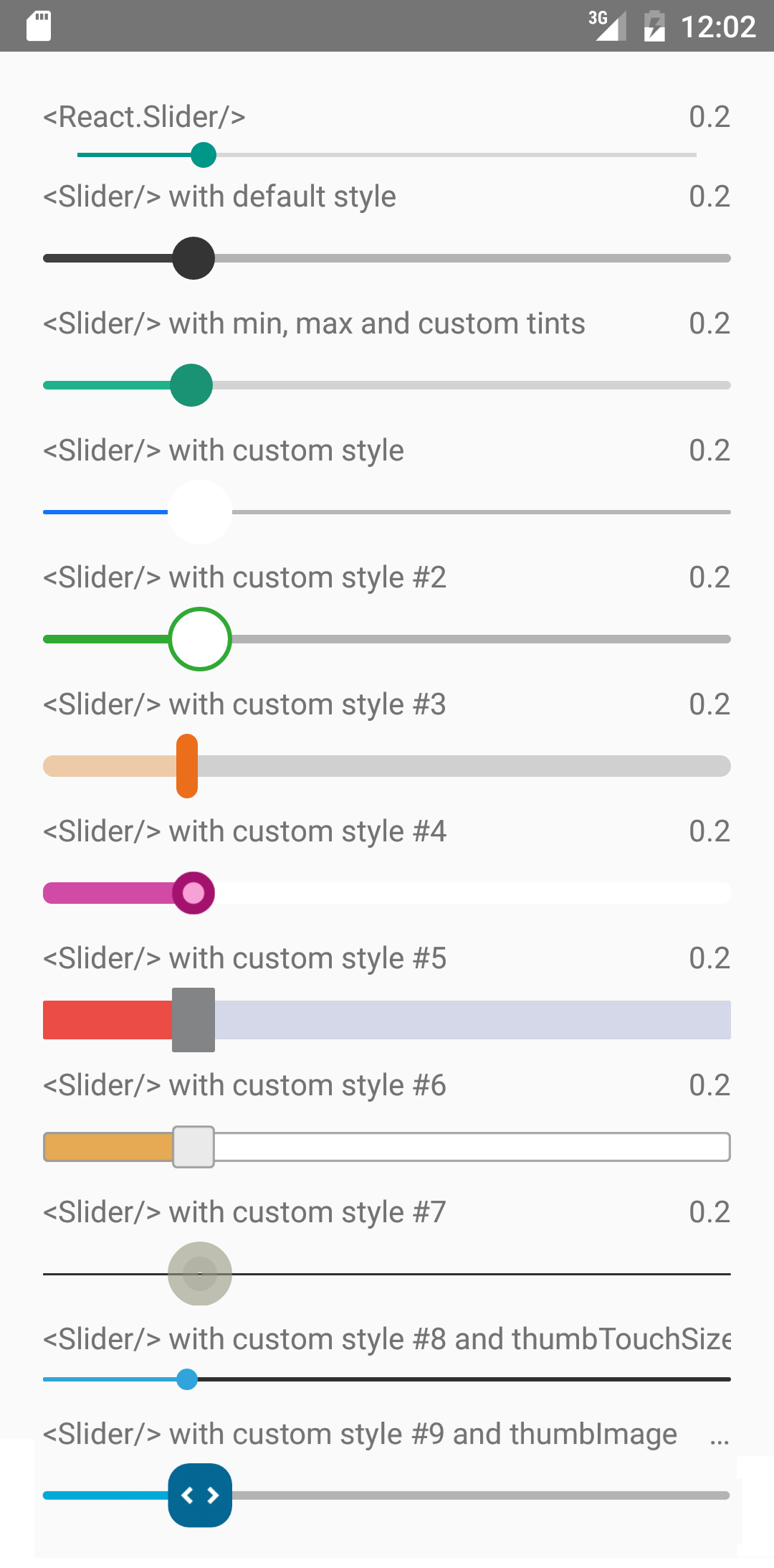
import React from "react"; import Slider from "react-native-slider"; import { AppRegistry, StyleSheet, View, Text } from "react-native"; class SliderExample extends React.Component { state = { value: 0.2 }; render() { return ( <View style={styles.container}> <Slider value={this.state.value} onValueChange={value => this.setState({ value })} /> <Text> Value: {this.state.value} </Text> </View> ); } } const styles = StyleSheet.create({ container: { flex: 1, marginLeft: 10, marginRight: 10, alignItems: "stretch", justifyContent: "center" } }); AppRegistry.registerComponent("SliderExample", () => SliderExample);Try this example live on Expo Snack.
Props
| Prop | Type | Optional | Default | Description |
|---|---|---|---|---|
| value | number | Yes | 0 | Initial value of the slider |
| disabled | bool | Yes | false | If true the user won't be able to move the slider |
| minimumValue | number | Yes | 0 | Initial minimum value of the slider |
| maximumValue | number | Yes | 1 | Initial maximum value of the slider |
| step | number | Yes | 0 | Step value of the slider. The value should be between 0 and maximumValue - minimumValue) |
| minimumTrackTintColor | string | Yes | '#3f3f3f' | The color used for the track to the left of the button |
| maximumTrackTintColor | string | Yes | '#b3b3b3' | The color used for the track to the right of the button |
| thumbTintColor | string | Yes | '#343434' | The color used for the thumb |
| thumbTouchSize | object | Yes | {width: 40, height: 40} | The size of the touch area that allows moving the thumb. The touch area has the same center as the visible thumb. This allows to have a visually small thumb while still allowing the user to move it easily. |
| onValueChange | function | Yes | Callback continuously called while the user is dragging the slider | |
| onSlidingStart | function | Yes | Callback called when the user starts changing the value (e.g. when the slider is pressed) | |
| onSlidingComplete | function | Yes | Callback called when the user finishes changing the value (e.g. when the slider is released) | |
| style | style | Yes | The style applied to the slider container | |
| trackStyle | style | Yes | The style applied to the track | |
| thumbStyle | style | Yes | The style applied to the thumb | |
| thumbImage | source | Yes | Sets an image for the thumb. | |
| debugTouchArea | bool | Yes | false | Set this to true to visually see the thumb touch rect in green. |
| animateTransitions | bool | Yes | false | Set to true if you want to use the default 'spring' animation |
| animationType | string | Yes | 'timing' | Set to 'spring' or 'timing' to use one of those two types of animations with the default animation properties. |
| animationConfig | object | Yes | undefined | Used to configure the animation parameters. These are the same parameters in the Animated library. |
MIT Licensed


