React Native Textinput Effects
I've come across with those beautiful text inputs created and blogged by Codrops and wanted to port them to react-native. Some of those text fields are now ready to use in iOS and android thanks to react-native.
There is also a native iOS library called TextFieldEffects which has built some of them in Swift.

Installation
The latest version of this project needs react-native >= 0.55(March 2018 release) due to createRef usage. Go with the latest version:
$ npm install react-native-textinput-effects --save
You can stick with version 0.4 if you have an older react-native version:
$ npm install [email protected] --save
You also need to install react-native-vector-icons if you'd like to use a TextInputEffect component with an icon. Please check out Installation section on that project.
How to use
Common Props
| Prop | Type | Description |
|---|---|---|
label | String | Displayed as placeholder string of the input. |
style | View Style Object | Applied to the root container of the input. |
labelStyle | View Style Object | Applied to the container of the label view. |
inputStyle | Text Style Object | Applied to the TextInput component. |
value | String | This value will be applied to the TextInput and change it's state on every render. Use this prop if you want a Controlled Component. |
defaultValue | String | If you want to initialize the component with a non-empty value, you can supply a defaultValue prop. This prop creates an Uncontrolled Component and is only used during initial render. |
You can also use default TextInput Props. They'll be passed into TextInput component. E.g., use TextInput's onChange prop to be notified on text changes.
<Sae onChangeText={(text) => { this.setState({textValue: text}) } />Props for TextInputEffects with an Icon
This component needs Icon component from react-native-vector-icons to operate with icons. You should import it before creating a TextInputEffects component.
import Icon from 'react-native-vector-icons/FontAwesome';
| Prop | Type | Description |
|---|---|---|
iconClass | Object | The Icon component class you've imported from react-native-vector-icons. |
iconName | String | Name of the icon that is passed to Icon component. |
iconColor | String | Applied to the Icon component. |
iconSize | Number | Applied to the Icon component. |
Example
See TextInputEffectsExample.js file.
Follow those steps to run the example:
- Clone the repo
git clone https://github.com/halilb/react-native-textinput-effects && cd react-native-textinput-effects/Example - Install dependencies `npm install``
- Follow official instructions to run the example project in a simulator or device.
You can also check out the example library without any installation on Appetize.io!
Input Types
Sae

import FontAwesomeIcon from 'react-native-vector-icons/FontAwesome'; import { Sae } from 'react-native-textinput-effects'; const saeInput = ( <Sae label={'Email Address'} iconClass={FontAwesomeIcon} iconName={'pencil'} iconColor={'white'} inputPadding={16} labelHeight={24} // active border height borderHeight={2} // TextInput props autoCapitalize={'none'} autoCorrect={false} /> );Fumi

import FontAwesomeIcon from 'react-native-vector-icons/FontAwesome'; import { Fumi } from 'react-native-textinput-effects'; const fumiInput = ( <Fumi label={'Course Name'} iconClass={FontAwesomeIcon} iconName={'university'} iconColor={'#f95a25'} iconSize={20} iconWidth={40} inputPadding={16} /> );Kohana

Kohana supports Animated Native Driver. You can use native driver by passing useNativeDriver.
import MaterialsIcon from 'react-native-vector-icons/MaterialIcons'; import { Kohana } from 'react-native-textinput-effects'; const kohanaInput = ( <Kohana style={{ backgroundColor: '#f9f5ed' }} label={'Line'} iconClass={MaterialsIcon} iconName={'directions-bus'} iconColor={'#f4d29a'} inputPadding={16} labelStyle={{ color: '#91627b' }} inputStyle={{ color: '#91627b' }} labelContainerStyle={{ padding: 20 }} iconContainerStyle={{ padding: 20 }} useNativeDriver /> );Makiko

import FontAwesomeIcon from 'react-native-vector-icons/FontAwesome'; import { Makiko } from 'react-native-textinput-effects'; const makikoInput = ( <Makiko label={'Comment'} iconClass={FontAwesomeIcon} iconName={'comment'} iconColor={'white'} inputPadding={16} inputStyle={{ color: '#db786d' }} /> );Note: Icon component expands and covers the input. So, the icon should not have any blank spaces for the animation experience. This is the limitation for Makiko.
Isao

import { Isao } from 'react-native-textinput-effects'; const isaoInput = ( <Isao label={'First Name'} // this is applied as active border and label color activeColor={'#da7071'} // active border height borderHeight={8} inputPadding={16} labelHeight={24} // this is applied as passive border and label color passiveColor={'#dadada'} /> );Hoshi

import { Hoshi } from 'react-native-textinput-effects'; const hoshiInput = ( <Hoshi label={'Town'} // this is used as active border color borderColor={'#b76c94'} // active border height borderHeight={3} inputPadding={16} // this is used to set backgroundColor of label mask. // please pass the backgroundColor of your TextInput container. backgroundColor={'#F9F7F6'} /> );Jiro

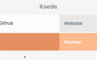
import { Jiro } from 'react-native-textinput-effects'; const jiroInput = ( <Jiro label={'Dog\'s name'} // this is used as active and passive border color borderColor={'#9b537a'} inputPadding={16} inputStyle={{ color: 'white' }} /> );Kaede

import { Kaede } from 'react-native-textinput-effects'; const kaedeInput = ( <Kaede label={'Website'} inputPadding={16} /> );Akira

import { Akira } from 'react-native-textinput-effects'; const akiraInput = ( <Akira label={'First Name'} // this is used as active and passive border color borderColor={'#a5d1cc'} inputPadding={16} labelHeight={24} labelStyle={{ color: '#ac83c4' }} /> );Madoka

import { Madoka } from 'react-native-textinput-effects'; const madokaInput = ( <Madoka label={'Frequency'} // this is used as active and passive border color borderColor={'#aee2c9'} inputPadding={16} labelHeight={24} labelStyle={{ color: '#008445' }} inputStyle={{ color: '#f4a197' }} /> );Hideo

import FontAwesomeIcon from 'react-native-vector-icons/FontAwesome'; import { Hideo } from 'react-native-textinput-effects'; const hideoInput = ( <Hideo iconClass={FontAwesomeIcon} iconName={'envelope'} iconColor={'white'} // this is used as backgroundColor of icon container view. iconBackgroundColor={'#f2a59d'} inputStyle={{ color: '#464949' }} /> );


