react-circular-input
React components for easily composing a circular range input
npm i react-circular-input
Example
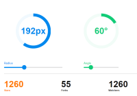
import { CircularInput, CircularTrack, CircularProgress, CircularThumb, } from 'react-circular-input' export default () => { const [value, setValue] = useState(0.25) return ( <CircularInput value={value} onChange={setValue}> <CircularTrack /> <CircularProgress /> <CircularThumb /> </CircularInput> ) }There's a lot more you can do with the library. From a simple gauge to a fully custom and animated circular input range.
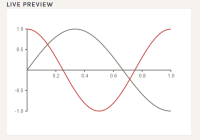
Play around with examples at CodeSandbox:

A declarative and composable approach means we have a lot of flexibility, check out the documentation for how to go further!
Documentation
Full documentation at react-circular-input.now.sh.
Enjoy!
Contributing | Code of Conduct | MIT License
Docs powered by tsx-docs


