react-base-table
BaseTable is a react table component to display large datasets with high performance and flexibility
Install
# npm npm install react-base-table --save # yarn yarn add react-base-tableUsage
import BaseTable, { Column } from 'react-base-table' import 'react-base-table/styles.css' ... <BaseTable data={data} width={600} height={400}> <Column key="col0" dataKey="col0" width={100} /> <Column key="col1" dataKey="col1" width={100} /> ... </BaseTable> ...Learn more at the website
width and height are required to display the table properly
In the examples we are using a wrapper const Table = props => <BaseTable width={700} height={400} {...props} /> to do that
If you want it responsive, you can use the AutoResizer to make the table fill the container, checkout the Auto Resize example
Browser Support
BaseTable is well tested on all modern browsers and IE11. You have to polyfill Array.prototype.findIndex to make it works on IE
The examples don't work on IE as they are powered by react-runner which is a react-live like library but only for modern browsers.
Advance
BaseTable is designed to be the base component to build your own complex table component
Styling
The simplest way is overriding the default styles (assuming you are using scss)
// override default variables for BaseTable $table-prefix: AdvanceTable; $table-font-size: $bim-font-size-small; $table-border-radius: 4px; $table-padding-left: 15px; $table-padding-right: 15px; $column-padding: 7.5px; ... $show-frozen-rows-shadow: false; $show-frozen-columns-shadow: true; @import '~react-base-table/es/_BaseTable.scss'; .#{$table-prefix} { &:not(.#{$table-prefix}--show-left-shadow) { .#{$table-prefix}__table-frozen-left { box-shadow: none; } } &:not(.#{$table-prefix}--show-right-shadow) { .#{$table-prefix}__table-frozen-right { box-shadow: none; } } ... }You can write your own styles from scratch or use CSS-in-JS solutions to achieve that
Custom components
<BaseTable classPrefix="AdvanceTable" components={{ TableCell: AdvanceTableCell, TableHeaderCell: AdvanceTableHeaderCell, ExpandIcon: AdvanceExpandIcon, SortIndicator: AdvanceSortIndicator, }} ... />Custom renderers & props
There are a lot of highly flexible props like xxxRenderer and xxxProps for you to build your own table component, please check the api and examples for more details
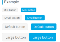
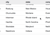
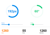
Example
We are using a advanced table component based on BaseTable internally, with much more features, including row selection, row grouping, data aggregation, column settings, column reordering, and column grouping, tooltip, inline editing.

Contributing
Please check guidelines for more details


