Reactabular - A framework for building the React table you need
Reactabular has been designed to be extensible. Rather than implementing a lot of functionality in its core, it provides extension points. You can, for instance, customize rendering on cell level. It is possible to implement functionality, such as search, pagination, sorting, and inline editing, through composition. The library includes a variety of utilities for this even though you may use third party ones as well.
By default Reactabular operates using a column and a data definition. It doesn't care where those come from. It just renders the table for you. This means Reactabular will fit right into your current data architecture. It doesn't constrain it in any manner.
The chosen approach pushes a lot of complexity out of the core. As a result it might take more code to achieve certain functionalities. This is the price of flexibility. And that's the primary design goal of Reactabular.
If you want to learn more about React, read SurviveJS - Webpack and React.
Example
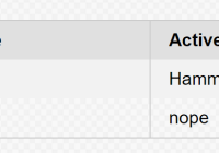
The following example illustrates the approach used by Reactabular:
/* import * as Table from 'reactabular-table'; */ const rows = [ { id: 100, name: 'John', tools: { hammer: true }, country: 'fi' }, { id: 101, name: 'Jack', tools: { hammer: false }, country: 'dk' } ]; const countries = { fi: 'Finland', dk: 'Denmark' }; const columns = [ { property: 'name', header: { label: 'Name', transforms: [ label => ({ onClick: () => alert(`clicked ${label}`) }) ] } }, { property: 'tools', header: { label: 'Active', transforms: [ label => ({ onClick: () => alert(`clicked ${label}`) }) ] }, cell: { formatters: [ tools => tools.hammer ? 'Hammertime' : 'nope' ] } }, { property: 'country', header: { label: 'Country', transforms: [ label => ({ onClick: () => alert(`clicked ${label}`) }) ] }, cell: { formatters: [ country => countries[country] ] } }, ]; <Table.Provider className="pure-table pure-table-striped" columns={columns} > <Table.Header /> <Table.Body rows={rows} rowKey="id" /> </Table.Provider>Available Packages
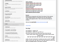
The following image shows roughly what packages are available. You will need to install them individually based on your needs. It is possible to use packages beyond these, but the ones listed below are maintained within the Reactabular organization:
Testimonials
If you've struggled with other React table components, you'll see why this one is the best! - Tim Dorr
It’s not a regular table component it’s a whole framework to work with tables: sorting, drag’n’drop, filtering, etc. And it’s easy to change every part if you need something specific. - Artem Sapegin
Great work with reactabular! Best grid library I've seen in React and tried many of them. - Piotr Zmudzinski
If you are using Reactabular and want to endorse it, let me know.
Sponsors
Become a sponsor and get your logo on our README on Github with a link to your site.
Backers
Become a backer and get your image on our README on Github with a link to your site.
License
MIT. See LICENSE for details.
