React Virtuoso is a simple, easy to use React virtualized list component that can render huge data sets. Out of the box, Virtuoso:
- Handles items with variable dynamic height; no manual measurements or hard-coding of item heights necessary;
- Supports grouping with sticky group headers (
GroupedVirtuoso); - Supports responsive grid layout (
VirtuosoGrid); - Automatically handles content resizing;
- Can render footer at the end of the list;
- Can pin the first
Nitems to the top of the list.
For live examples and documentation, check the website.
Get Started
Install the package in your React project:
npm install react-virtuosoOr, if yarn is your thing:
yarn add react-virtuosoThen, put the component somewhere in your tree:
import * as React from 'react' import * as ReactDOM from 'react-dom' import { Virtuoso } from 'react-virtuoso' const App = () => { return ( <Virtuoso style={{ width: '200px', height: '400px' }} totalCount={200} item={index => <div>Item {index}</div>} /> ) } ReactDOM.render(<App />, document.getElementById('root'))Grouping
The GroupedVirtuoso component is similar to the "flat" Virtuoso, with the following differences:
- Instead of
totalCount, the component acceptsgroupedCounts: number[], which specifies the amount of items in each group. For example, passing[20, 30]will render two groups with 20 and 30 items each; - In addition the
itemrender prop, the component requires an additionalgrouprender prop, which renders the group header. Thegroupcallback receives the zero-based group index as a parameter; - The
itemrender prop gets called with an additional second parameter,groupIndex: number.
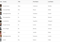
Check the grouped numbers, grouped by first letter and groups with load on demand examples.
Grid
The VirtuosoGrid component displays same sized items in multiple columns. The layout and item sizing is controlled through CSS class properties, which allows you to use media queries, min-width, percentage, etc.
Check the responsive grid columns example for a sample implementation.
Footer
The component accepts an optional footer render property, which is rendered after all items. The footer can be used to host a "load more" button or an indicator that the user has reached the end of the list.
Check the footer, press load more and endless scrolling examples for practical applications of the footer.
Pinned Items
The component accepts an optional topItems property, that specifies how many of the items to keep "pinned" at the top of the list. Check the top items example.
Documentation and Demos
For in-depth documentation and live examples of the supported features and live demos, check the website.
Author
Petyo Ivanov @petyosi
License
MIT License.


