Spectacle

ReactJS based Presentation Library
Spectacle Boilerplate MDX Spectacle Boilerplate
Looking for a quick preview of what you can do with Spectacle? Check out our live Demo Deck here.
Have a question about Spectacle? Submit an issue in this repository using the "Question" template.
Contents
- Getting Started
- Development
- Build & Deployment
- Presenting
- Controls
- Fullscreen
- PDF Export
- Basic Concepts
- FAQ
- Tag API
- Third Party Extensions
Getting Started
First, decide whether you want to use classic Spectacle, Spectacle MDX, which has all the same functionality but allows you to write your Spectacle presentation in markdown, or using only one HTML page.
Classic Spectacle
There are four ways to get started building your presentation.
-
Option #1: Run the following command in your terminal:
npx create-react-app my-presentation --scripts-version spectacle-scripts -
Option #2: Using the Spectacle Boilerplate.
-
Option #3: Following along the Spectacle Tutorial, which also involves downloading the Spectacle Boilerplate.
All three of the above ways will give you everything you'll need to get started, including a sample presentation in the presentation folder. You can change the props and tags as needed for your presentation or delete everything in presentation/index.js to start from scratch. From here you can go to Development to get started.
- Option #4: Run
npm install spectaclein your terminal and writing your own build configurations. We also provide full UMD builds (with aSpectacleglobal variable) of the library atdist/spectacle.jsanddist/spectacle.min.jsfor more general use cases. You could, for example, include the library via a script tag with:https://unpkg.com/spectacle@VERSION/dist/spectacle.min.js.
Spectacle MDX
Download the Spectacle MDX Boilerplate.
This repository will give you everything you'll need to get started, including a sample presentation in the presentation folder. You can change the props and tags as needed for your presentation or delete everything in the index.mdx file to start from scratch. From here you can go to Development to get started.
NOTE: We have webpack externals for react, react-dom, and prop-types, so you will need to provide them in your upstream build or something like linking in via script tags in your HTML page for all three libraries. This comports with our project dependencies which place these three libraries in peerDependencies.
One Page
To aid with speedy development we've provided a simple boilerplate HTML page with a bespoke script tag that contains your entire presentation. The rest of the setup will take care of transpiling your React/ESnext code, providing Spectacle, React, and ReactDOM libraries, and being raring to go with a minimum of effort.
We can start with this project's sample at one-page.html. It's the same presentation as the fully-built-from-source version, with a few notable exceptions:
-
There are no
imports orrequires. Everything must come from the global namespace. This includesSpectacle,React,ReactDOMand all the Spectacle exports from./src/index.js--Deck,Slide,themes, etc. -
The presentation must include exactly one script tag with the type
text/spectaclethat is a function. Presently, that function is directly inserted inline into a wrapper code boilerplate as a React Componentrenderfunction. The wrapper is transpiled. There should not be any extraneous content around it like outer variables or comments.Good examples:
<script type="text/spectacle"> () => ( <Deck>{/* SLIDES */}</Deck> ) </script>
<script type="text/spectacle"> () => { // Code-y code stuff in JS... return ( <Deck>{/* SLIDES */}</Deck> ); } </script>
Bad examples of what not to do:
<script type="text/spectacle"> // Outer comment (BAD) const outerVariable = "BAD"; () => ( <Deck>{/* SLIDES */}</Deck> ) </script>
-
If you want to create your own theme settings, you can use the following code snippet to change the themes default settings.
<script type="text/spectacle"> () => { const { themes: { defaultTheme } } = Spectacle; const theme = defaultTheme({ // Change default settings primary: "blue", secondary: "red" }, { primary: "Helvetica", }); return ( <Deck transition={['zoom']} theme={theme}> <Slide>some stuff</Slide> <Slide>other stuff</Slide> <Slide>some more stuff</Slide> </Deck> ); } </script>
... with those guidelines in mind, here's the boilerplate that you can copy-and-paste into an HTML file and start a Spectacle presentation that works from the get go!
<!DOCTYPE html> <html lang="en"> <head> <meta charset="UTF-8" /> <meta name="viewport" content="width=device-width initial-scale=1 user-scalable=no" /> <title>Spectacle</title> <link href="https://fonts.googleapis.com/css?family=Lobster+Two:400,700" rel="stylesheet" type="text/css" /> <link href="https://fonts.googleapis.com/css?family=Open+Sans+Condensed:300,700" rel="stylesheet" type="text/css" /> <link href="https://unpkg.com/normalize.css@7/normalize.css" rel="stylesheet" type="text/css" /> </head> <body> <div id="root"></div> <script src="https://unpkg.com/prop-types@15/prop-types.js"></script> <script src="https://unpkg.com/react@16/umd/react.production.min.js"></script> <script src="https://unpkg.com/react-dom@16/umd/react-dom.production.min.js"></script> <script src="https://unpkg.com/@babel/standalone/babel.js"></script> <script src="https://unpkg.com/spectacle@^5/dist/spectacle.js"></script> <script src="https://unpkg.com/spectacle@^5/lib/one-page.js"></script> <script type="text/spectacle"> () => { // Your JS Code goes here return ( <Deck> {/* Throw in some slides here! */} </Deck> ); } </script> </body> </html>Development
After downloading the boilerplate, run the following commands on the project's root directory...
npm install(you can also useyarn)rm -R .gitto remove the existing version controlnpm startto start up the local server or visit http://localhost:3000/#/
... and we are ready to roll
Build & Deployment
Building the dist version of the slides is as easy as running npm run build:dist
If you want to deploy the slideshow to surge, run npm run deploy
/dist/ directory while GitHub Pages requires the relative ./dist/ to find any embedded assets and/or images. A very hacky way to fix this is to edit one place in the produced bundle, as shown in this GitHub issue.
Presenting
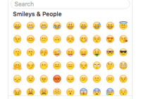
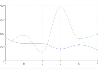
Spectacle comes with a built in presenter mode. It shows you a slide lookahead, current time and your current slide:

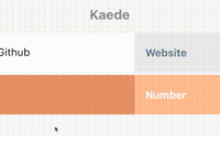
You also have the option of a stopwatch to count the elapsed time:

To present:
- Run
npm start. You will be redirected to a URL containing your presentation or visit http://localhost:3000/#/ - Open a second browser window on a different screen
- Add
?presenteror?presenter&timerimmediately after the/, e.g.: http://localhost:3000/#/0?presenter or http://localhost:3000/#/?presenter&timer - Give an amazingly stylish presentation
NOTE: Any windows/tabs in the same browser that are running Spectacle will sync to one another, even if you don't want to use presentation mode
Check it out:

You can toggle the presenter or overview mode by pressing respectively alt+p and alt+o.
Controls
| Key Combination | Function |
|---|---|
| Right Arrow | Next Slide |
| Left Arrow | Previous Slide |
| Space | Next Slide |
| Shift+Space | Previous Slide |
| Alt/Option + O | Toggle Overview Mode |
| Alt/Option + P | Toggle Presenter Mode |
| Alt/Option + T | Toggle Timer in Presenter Mode |
| Alt/Option + A | Toggle autoplay (if enabled) |
| Alt/Option + F | Toggle Fullscreen Mode |
Fullscreen
Fullscreen can be toggled via browser options, Alt/Option + F, or by pressing the button in the bottom right corner of your window.
Note: Right now, this works well when browser window itself is not full screen. When the browser is in fullscreen, there is an issue #654. This is because we use the browser's FullScreen API methods. It still works but has some inconstiency.
PDF Export
You can export a PDF from your Spectacle presentation either from the command line or browser:
CLI
- Run
npm install spectacle-renderer -g - Run
npm starton your project and wait for it to build and be available - Run
spectacle-renderer
A PDF is created in your project directory. For more options and configuration of this tool, check out:
https://github.com/FormidableLabs/spectacle-renderer
Browser
After running npm start and opening http://localhost:3000/#/ in your browser...
- Add
?exportafter the/on the URL of the page you are redirected to, e.g.: http://localhost:3000/#/?export - Bring up the print dialog
(ctrl or cmd + p) - Change destination to "Save as PDF", as shown below:

If you want a printer friendly version, repeat the above process but instead print from http://localhost:3000/#/?export&print.
If you want to export your slides with your notes included, repeat the above process but instead print from http://localhost:3000/#/?export¬es.
Query Parameters
Here is a list of all valid query parameters that can be placed after /#/ on the URL.
| Query | Description |
|---|---|
| 0, 1, 2, 3... etc. | Will take you to the corresponding slide, with 0 being the first slide in the presentation. |
| ?export | Creates a single-page overview of your slides, that you can then print. |
| ?export¬es | Creates a single-page overview of your slides, including any notes, that you can then print. |
| ?export&print | Creates a black & white single-page overview of your slides. |
| ?export&print¬es | Creates a black & white single-page overview of your slides, including any notes, that you can then print. |
| ?presenter | Takes you to presenter mode where you’ll see current slide, next slide, current time, and your notes. |
| ?presenter&timer | Takes you to presenter mode where you’ll see current slide, next slide, timer, and your notes. |
| ?overview | Take you to overview mode where you’ll see all your slides. |
NOTE: If you add a non-valid query parameter, you will be taken to a blank page. Removing or replacing the query parameter with a valid query parameter and refreshing the page will return you to the correct destination.
Basic Concepts
Main file
Your presentation files & assets will live in the presentation folder.
The main .js file you write your deck in is /presentation/index.js
Check it out here in the boilerplate.
// index.js import React, { Component } from 'react'; import { Appear, BlockQuote, Cite, CodePane, Code, Deck, Fill, Fit, Heading, Image, Layout, ListItem, List, Quote, Slide, Text } from 'spectacle'; export default class extends Component { render() { return ( <Deck> <Slide> <Text>Hello</Text> </Slide> </Deck> ); } }Here is where you can use the library's tags to compose your presentation. While you can use any JSX syntax here, building your presentation with the supplied tags allows for theming to work properly.
The bare minimum you need to start is a Deck element and a Slide element. Each Slide element represents a slide inside of your slideshow.
Themes
In Spectacle, themes are functions that return style objects for screen & print.
You can import the default theme from:
import createTheme from 'spectacle/lib/themes/default';Or create your own based upon the source.
index.js is what you would edit in order to create a custom theme of your own, using object based styles.
You will want to edit index.html to include any web fonts or additional CSS that your theme requires.
createTheme(colors, fonts)
Spectacle's functional theme system allows you to pass in color and font variables that you can use on your elements. The fonts configuration object can take a string for a system font or an object that specifies it‘s a Google Font. If you use a Google Font you can provide a styles array for loading different weights and variations. Google Font tags will be automatically created. See the example below:
const theme = createTheme( { primary: 'red', secondary: 'blue' }, { primary: 'Helvetica', secondary: { name: 'Droid Serif', googleFont: true, styles: ['400', '700i'] } } );The returned theme object can then be passed to the Deck tag via the theme prop, and will override the default styles.
FAQ
How can I easily style the base components for my presentation?
Historically, custom styling in Spectacle has meant screwing with a theme file, or using !important overrides. We fixed that. Spectacle is now driven by emotion, so you can bring your own styling library, whether it's emotion itself, or something like styled-components or glamorous. For example, if you want to create a custom Heading style:
import styled from 'react-emotion'; import { Heading } from 'spectacle'; const CustomHeading = styled(Heading)` font-size: 1.2em; color: papayawhip; `;Can I write my presentation in TypeScript?
Yes, you can! Type definitions are shipped with the library, so you can import Spectacle components into any .tsx presentation without additional installation steps.
Updated type definitions for the Spectacle API can be found at the root of this repository.
Tag API
In Spectacle, presentations are composed of a set of base tags. We can separate these into three categories: Main tags, Layout tags & Element tags.
Main Tags
Deck
The Deck tag is the root level tag for your presentation. It supports the following props:
| Name | PropType | Description | Default |
|---|---|---|---|
| autoplay | PropTypes.bool | Automatically advance slides. | false |
| autoplayDuration | PropTypes.number | Accepts integer value in milliseconds for global autoplay duration. | 7000 |
| autoplayLoop | PropTypes.bool | Keep slides in loop. | true |
| autoplayOnStart | PropTypes.bool | Start presentation with autoplay on/not paused (if autoplay is enabled). | true |
| controls | PropTypes.bool | Show control arrows when not in fullscreen. | true |
| contentHeight | PropTypes.numbers | Baseline content area height. | 700px |
| contentWidth | PropTypes.numbers | Baseline content area width. | 1000px |
| disableKeyboardControls | PropTypes.bool | Toggle keyboard control. | false |
| onStateChange | PropTypes.func | Called whenever a new slide becomes visible with the arguments (previousState, nextState) where state refers to the outgoing and incoming <Slide />'s state props, respectively. The default implementation attaches the current state as a class to the document root. | see description |
| history | PropTypes.object | Accepts custom configuration for history. | |
| progress | PropTypes.string | Accepts pacman, bar, number or none. To override the color, change the 'quaternary' color in the theme. | pacman |
| showFullscreenControl | PropTypes.bool | Show the fullscreen control button in bottom right of the screen. | true |
| theme | PropTypes.object | Accepts a theme object for styling your presentation. | |
| transition | PropTypes.array | Accepts slide, zoom, fade or spin, and can be combined. Sets global slide transitions. Note: If you use the 'scale' transition, fitted text won't work in Safari. | |
| transitionDuration | PropTypes.number | Accepts integer value in milliseconds for global transition duration. | 500 |
Slide (Base)
The slide tag represents each slide in the presentation. Giving a slide tag an id attribute will replace its number based navigation hash with the id provided. It supports the following props, in addition to any of the props outlined in the Base class props listing:
| Name | PropType | Description | Default |
|---|---|---|---|
| align | PropTypes.string | Accepts a space delimited value for positioning interior content. The first value can be flex-start (left), center (middle), or flex-end (right). The second value can be flex-start (top) , center (middle), or flex-end (bottom). | align="center center" |
| controlColor | PropTypes.string | Used to override color of control arrows on a per slide basis, accepts color aliases, or valid color values. | Set by Deck's control prop |
| goTo | PropTypes.number | Used to navigate to a slide for out-of-order presenting. Slide numbers start at 1. This can also be used to skip slides as well. | |
| id | PropTypes.string | Used to create a string based hash. | |
| notes | PropTypes.string | Text which will appear in the presenter mode. Can be HTML. | |
| onActive | PropTypes.func | Optional function that is called with the slide index when the slide comes into view. | |
| progressColor | PropTypes.string | Used to override color of progress elements on a per slide basis, accepts color aliases, or valid color values. | quaternary color set by theme |
| state | PropTypes.string | Used to indicate that the deck is in a specific state. Inspired by Reveal.js's data-state attribute | |
| transition | PropTypes.array | Used to override transition prop on a per slide basis, accepts slide, zoom, fade, spin, or a function, and can be combined. This will affect both enter and exit transitions. Note: If you use the 'scale' transition, fitted text won't work in Safari. | Set by Deck's transition prop |
| transitionIn | PropTypes.array | Specifies the slide transition when the slide comes into view. Accepts the same values as transition. | |
| transitionOut | PropTypes.array | Specifies the slide transition when the slide exits. Accepts the same values as transition. | Set by Deck's transition prop |
| transitionDuration | PropTypes.number | Accepts integer value in milliseconds for slide transition duration. | Set by Deck's transition prop |
SlideSet
With SlideSet, you can wrap multiple slide in it to apply the same style.
<SlideSet style={{ border: '2px solid red' }}> <Slide>Slide1</Slide> <Slide>Slide2</Slide> <Slide>Slide3</Slide> </SlideSet>Transition Function
Spectacle now supports defining custom transitions. The function prototype is (transitioning: boolean, forward: boolean) => Object. The transitioning param is true when the slide enters and exits. The forward param is true when the slide is entering, false when the slide is exiting. The function returns a style object. You can mix string-based transitions and functions. Styles provided when transitioning is false will appear during the lifecyle of the slide. An example is shown below:
<Slide transition={[ 'fade', (transitioning, forward) => { const angle = forward ? -180 : 180; return { transform: ` translate3d(0%, ${transitioning ? 100 : 0}%, 0) rotate(${transitioning ? angle : 0}deg) `, backgroundColor: transitioning ? '#26afff' : '#000' }; } ]} >Notes
The notes tag allows to use any tree of react elements as the notes of a slide. It is used as a child node of a slide tag and its children override any value given as the notes attribute of its parent slide.
<Slide ...> <Notes> <h4>Slide notes</h4> <ol> <li>First note</li> <li>Second note</li> </ol> </Notes> {/* Slide content */} </Slide>MarkdownSlides
The MarkdownSlides function lets you create a single or multiple slides using Markdown. It can be used as a tagged template literal or a function. Three dashes (--- are used as a delimiter between slides.
Tagged Template Literal Usage
<Deck ...> {MarkdownSlides` ## Slide One Title Slide Content --- ## Slide Two Title Slide Content `} </Deck>Function Usage
const slidesMarkdown = ` ## Slide One Title Slide Content --- ## Slide Two Title Slide Content `; .... import slidesMarkdown from "!raw-loader!markdown.md"; <Deck ...> {MarkdownSlides(slidesMarkdown)} </Deck>Layout Tags
Layout tags are used for layout using Flexbox within your slide. They are Layout, Fit & Fill.
Layout
The layout tag is used to wrap Fit and Fill tags to provide a row.
Fit
The fit tag only takes up as much space as its bounds provide.
Fill
The fill tag takes up all the space available to it. For example, if you have a Fill tag next to a Fit tag, the Fill tag will take up the rest of the space. Adjacent Fill tags split the difference and form an equidistant grid.
Markdown Tag
Markdown (Base)
The Markdown tag is used to add inline markdown to your slide. You can provide markdown source via the source prop, or as children. You can also provide a custom mdast configuration via the mdastConfig prop.
Markdown generated tags aren't prop configurable, and instead render with your theme defaults.
| Name | PropType | Description | Default |
|---|---|---|---|
| source | PropTypes.string | Markdown source |
Magic Tag
Magic
NOTE: The Magic tag uses the Web Animations API. If you use the Magic tag and want it to work places other than Chrome, you will need to include the polyfill https://github.com/web-animations/web-animations-js
The Magic Tag recreates Magic Move behavior that slide authors might be accustomed to coming from Keynote. It wraps slides and transitions between positional values for child elements. This means that if you have two similar strings, we will transition common characters to their new positions. This does not transition on non positional values such as slide background color or font size.
transition prop on your slides if you are wrapping them with a Magic tag since it will take care of the transition for you.
<Magic> <Slide> <Heading>First Heading</Heading> </Slide> <Slide> <Heading>Second Heading</Heading> </Slide> </Magic>Transitioning between similar states will vary based upon the input content. It will look better when there are more common elements. An upcoming patch will allow for custom keys, which will provide greater control over which elements are identified as common for reuse.
Until then, feedback is very welcome, as this is a non-trivial feature and we anticipate iterating on the behind the scenes mechanics of how it works, so that we can accommodate most use cases.
Element Tags
The element tags are the bread and butter of your slide content. Most of these tags derive their props from the Base class, but the ones that have special options will have them listed:
Appear
This tag does not extend from Base. It's special. Wrapping elements in the appear tag makes them appear/disappear in order in response to navigation.
For best performance, wrap the contents of this tag in a native DOM element like a <div> or <span>.
NOTE: When using CodePane tag inside an Appear tag you must wrap it inside a <div>
.... <Appear> <div> <CodePane source="CodePane" lang="js" /> </div> <Appear> ....| Name | PropType | Description | Default |
|---|---|---|---|
| order | PropTypes.number | An optional integer starting at 1 for the presentation order of the Appear tags within a slide. If a slide contains ordered and unordered Appear tags, the unordered will show first. | |
| transitionDuration | PropTypes.number | An optional duration (in milliseconds) for the Appear animation. | 300 |
| startValue | PropTypes.object | An optional style object that defines the starting, inactive state of the Appear tag. The default animation is a fade-in. | { opacity: 0 } |
| endValue | PropTypes.object | An optional style object that defines the ending, active state of the Appear tag. The default animation is a simple fade-in. | { opacity: 1 } |
| easing | PropTypes.string | An optional victory easing curve for the Appear animation. The various options are documented in the Victory Animation easing docs. | quadInOut |
Anim
If you want extra flexibility with animated animation, you can use the Anim component instead of Appear. It will let you have multi-step animations for each individual fragment. You can use this to create fancy animated intros, in-slide carousels, and many other fancy things. This tag does not extend from Base. It's special.
For best performance, wrap the contents of this tag in a native DOM element like a <div> or <span>.
NOTE: CodePane tag can not be used inside a Anim tag.
| Name | PropType | Description | Default |
|---|---|---|---|
| order | PropTypes.number | An optional integer for the presentation order of the Appear tags within a slide. If a slide contains ordered and unordered Appear tags, the unordered will show first. | Starting at 1 |
| transitionDuration | PropTypes.number | A duration (in milliseconds) for the animation. | 300 |
| fromStyle | PropTypes.object | A style object that defines the starting, inactive state of the Anim tag. | |
| toStyle | PropTypes.array | An array of style objects that define each step in the animation. They will step from one toStyle object to another, until that fragment is finished with its animations. | |
| easing | PropTypes.string | A victory easing curve for the Appear animation. The various options are documented in the Victory Animation easing docs. | |
| onAnim | PropTypes.fun | This function is called every time the Anim component plays an animation. It'll be called with two arguments, forwards, a boolean indicating if it was stepped forwards or backwards, and the index of the animation that was just played. |
BlockQuote, Quote and Cite (Base)
These tags create a styled blockquote. Use them as follows:
<BlockQuote> <Quote>Ken Wheeler is amazing</Quote> <Cite>Everyone</Cite> </BlockQuote>NOTE: By default the text color of the Quote tag is the same as the background color and may not show up. Use the bgColor and/or textColor props on the Slide or Quote tags to make it visible.
<Slide transition={['fade']} bgColor="secondary" textColor="primary"> <BlockQuote> <Quote>Example Quote</Quote> <Cite>Author</Cite> </BlockQuote> </Slide><Slide transition={['fade']}> <BlockQuote> <Quote textColor="secondary">Example Quote</Quote> <Cite>Author</Cite> </BlockQuote> </Slide>CodePane (Base)
This tag displays a styled, highlighted code preview. I prefer putting my code samples in external .example files and requiring them using raw-loader as shown in the demo. Here are the props:
| Name | PropType | Description | Default |
|---|---|---|---|
| lang | PropTypes.string | Prism compatible language name. i.e: 'javascript' | |
| source | PropTypes.string | String of code to be shown | |
| className | PropTypes.string | String of a className to be appended to the CodePane | |
| theme | PropTypes.string | Accepts light, dark, or external for the source editor's syntax highlighting. | dark |
If you want to change the theme used here, you can include a prism theme in index.html via a style or a link tag. For your theme to be actually applied correctly you need to set the theme prop to "external", which disables our builtin light and dark themes. Please note that including a theme can actually influence all CodePane and Playground components, even if you don't set this prop, since some Prism themes use very generic CSS selectors.
CodePane and Playground both use the prism library under the hood, which has several themes that are available to include.
Code (Base)
A simple tag for wrapping inline text that you want lightly styled in a monospace font.
Component Playground
This tag displays a two-pane view with a ES6 source code editor on the right and a preview pane on the left for showing off custom React components. React and render are supplied as variables. To render a component call render with some JSX code. Any console output will be forwarded to the main console in the browser.
For more information on the playground read the docs over at react-live.
| Name | PropType | Description | Default |
|---|---|---|---|
| code | PropTypes.string | The code block you want to initially supply to the component playground. If none is supplied a demo component will be displayed. | |
| previewBackgroundColor | PropTypes.string | The background color you want for the preview pane. | #fff |
| theme | PropTypes.string | Accepts light, dark, or external for the source editor's syntax highlighting. | dark |
| scope | PropTypes.object | Defines any outside modules or components to expose to the playground. React, Component, and render are supplied for you. |
Example code blocks:
const Button = ({ title }) => <button type="button">{title}</button>; render(<Button title="My Button" />);class View extends React.Component { componentDidMount() { console.log('Hello'); } render() { return <div>My View</div>; } } render(<View />);If you want to change the theme used here, please refer to the instructions above in the CodePane's API reference.
Go To Action (Base)
The GoToAction tag lets you jump to another slide in your deck. The GoToAction can be used a simple button that supports Base styling or accept a render prop with a callback to support custom components.
| Name | PropType | Description | Default |
|---|---|---|---|
| slide | PropTypes.string or PropTypes.number | The string identifier or number of the side the button should jump to. This is only used in the simple button configuration. | Starting at 1 |
| render | PropTypes.func | A function with a goToSlide param that should return a React element to render. This is only used in the custom component configuration. |
Simple Button Configuration Example
<GoToAction slide={3}>Jump to 3</GoToAction>Custom Component Configuration Example
<GoToAction render={goToSlide => ( <CustomComponent onClick={() => goToSlide('wait-wut')}> WAIT WUT!? </CustomComponent> )} />Heading (Base)
Heading tags are special in that, when you specify a size prop, they generate the appropriate heading tag, and extend themselves with a style that is defined in the theme file for that heading. Line height can be adjusted via a numeric lineHeight prop.
| Name | PropType | Description | Default |
|---|---|---|---|
| fit | PropTypes.boolean | When set to true, fits text to the slide's width. Note: If you use the 'scale' transition, this won't work in Safari. | false |
| lineHeight | PropTypes.number | Sets the line height of your text. | |
| size | PropTypes.number | Sets the heading tag |
Image (Base)
| Name | PropType | Description | Default |
|---|---|---|---|
| alt | PropTypes.string | Set the alt attribute of the image | |
| display | PropTypes.string | Set the display style attribute of the image | |
| height | PropTypes.string or PropTypes.number | Set the height to the image | |
| src | PropTypes.string | Set the src attribute of the image | |
| width | PropTypes.string or PropTypes.number | Set the width to the image |
Link (Base)
The link tag is used to render <a> tags. It accepts an href prop:
| Name | PropType | Description | Default |
|---|---|---|---|
| href | PropTypes.string | String of url for href attribute | |
| target | PropTypes.string | Set the target attribute | _self |
List & ListItem (Base)
| Name | PropType | Description | Default |
|---|---|---|---|
| ordered | PropTypes.bool | Render as <ol> tag | |
| reversed | PropTypes.bool | Set the reversed attribute | |
| start | PropTypes.number | Set the start attribute. | 1 |
| type | PropTypes.string | Set the type attribute. | "1" |
| bulletStyle | PropTypes.string | Allows to customize list bullets for unordered-list. You can set bulletStyle="star" both in List and ListItem components. When ListItem prop is set it will overwrite the List styling only for the specific ListItem. You can either use built-in strings: star, classicCheck, greenCheck, arrow, cross, or any unicode number bulletStyle="274C" |
These tags create lists. Use them as follows:
Ordered lists:
<List ordered start={2} type="A"> <ListItem>Item 1</ListItem> <ListItem>Item 2</ListItem> <ListItem>Item 3</ListItem> <ListItem>Item 4</ListItem> </List>Unordered lists:
<List> <ListItem>Item 1</ListItem> <ListItem bulletStyle="arrow">Item 2</ListItem> <ListItem>Item 3</ListItem> <ListItem>Item 4</ListItem> </List>S (Base)
The S tag is used to add styling to a piece of text, such as underline or strikethrough.
| Name | PropType | Description | Default |
|---|---|---|---|
| type | PropTypes.string | Accepts strikethrough, underline, bold or italic |
Table, TableRow, TableHeaderItem and TableItem (Base)
The Table tag is used to add table to your slide. It is used with TableHeader, TableBody, TableRow, TableHeaderItem and TableItem. Use them as follows:
<Table> <TableHeader> <TableRow> <TableHeaderItem /> <TableHeaderItem>2011</TableHeaderItem> </TableRow> </TableHeader> <TableBody> <TableRow> <TableItem>None</TableItem> <TableItem>61.8%</TableItem> </TableRow> <TableRow> <TableItem>jQuery</TableItem> <TableItem>28.3%</TableItem> </TableRow> </TableBody> </Table>Text (Base)
The Text tag is used to add text to your slide. Line height can be adjusted via a numeric lineHeight prop.
| Name | PropType | Description | Default |
|---|---|---|---|
| fit | PropTypes.boolean | When set to true, fits text to the slide's width. Note: If you use the 'scale' transition, this won't work in Safari. | |
| lineHeight | PropTypes.number | Sets the line height of your text. |
Base Props
Every component above that has (Base) after it has been extended from a common class that includes the following props:
| Name | PropType | Description | Default |
|---|---|---|---|
| italic | PropTypes.boolean | Set fontStyle to italic | false |
| bold | PropTypes.boolean | Set fontWeight to bold | false |
| caps | PropTypes.boolean | Set textTransform to uppercase | false |
| margin | PropTypes.number or string | Set margin value | |
| padding | PropTypes.number or string | Set padding value | |
| textColor | PropTypes.string | Set color value | |
| textFont | PropTypes.string | Set fontFamily value | |
| textSize | PropTypes.string | Set fontSize value | |
| textAlign | PropTypes.string | Set textAlign value | |
| bgColor | PropTypes.string | Set backgroundColor value | |
| bgGradient | PropTypes.string | Set backgroundImage value | |
| bgImage | PropTypes.string | Set backgroundImage value | |
| bgImageStyle | PropTypes.string | Set backgroundImage css property value directly | |
| bgSize | PropTypes.string | Set backgroundSize value | cover |
| bgPosition | PropTypes.string | Set backgroundPosition value | center center |
| bgRepeat | PropTypes.string | Set backgroundRepeat value | |
| bgDarken | PropTypes.number | Float value from 0.0 to 1.0 specifying how much to darken the bgImage image | 0 |
| bgLighten | PropTypes.number | Float value from 0.0 to 1.0 specifying how much to lighten the bgImage image | 0 |
| overflow | PropTypes.string | Set overflow value | |
| height | PropTypes.string | Set height value |
NOTE: When using bgImage prop for local images, you must import the file for it to render properly.
import myImage from './images/my-image.jpg'; ...... <Slide bgImage={myImage}> I have an image for a background </Slide>Typeface
The Typeface tag is used to apply a specific font to text content. It can either use a font that exists on the system or load a font from the Google Fonts library. Typeface requires either font or googleFont to be defined.
| Name | PropType | Description | Default |
|---|---|---|---|
| font | PropTypes.string | Use a font from the local system | |
| googleFont | PropTypes.string | Use a font from the Google Fonts library | |
| weight | PropTypes.number | Numeric weight value for the font. | 400 |
| italic | PropTypes.boolean | Use an italics variant of the font if it exists. | false |
<Typeface googleFont="Roboto Slab" weight={600}> <Text>This text is using bold Roboto Slab from Google Fonts.</Text> </Typeface><Typeface font="SF Text" weight={400} italic={true}> <Text>This text is using the San Francisco Text font from the system.</Text> </Typeface>Third Party Extensions
- Spectacle Code Slide - Step through lines of code using this awesome slide extension by @thejameskyle
- Spectacle Terminal Slide - Terminal component that can be used in a spectacle slide deck by @elijahmanor
- Spectacle Image Slide - Show a slide with a big image and a title on top
Maintenance Status
Active: Formidable is actively working on this project, and we expect to continue for work for the foreseeable future. Bug reports, feature requests and pull requests are welcome.


