react-movable
See all the other examples and their source code!
Installation
yarn add react-movable Usage
import * as React from 'react'; import { List, arrayMove } from 'react-movable'; class SuperSimple extends React.Component { state = { items: ['Item 1', 'Item 2', 'Item 3', 'Item 4', 'Item 5', 'Item 6'] }; render() { return ( <List values={this.state.items} onChange={({ oldIndex, newIndex }) => this.setState(prevState => ({ items: arrayMove(prevState.items, oldIndex, newIndex) })) } renderList={({ children, props }) => <ul {...props}>{children}</ul>} renderItem={({ value, props }) => <li {...props}>{value}</li>} /> ); } }Features
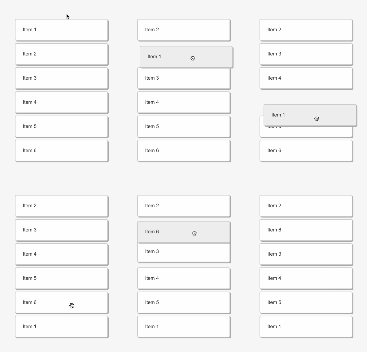
- Vertical drag and drop for your lists and tables
- No wrapping divs or additional markup
- Simple single component, no providers or HoCs
- Unopinionated styling, great for CSS in JS too
- Accessible, made for keyboards and screen readers
- Touchable, works on mobile devices
- Full control over the dragged item, it's a portaled React component
- Autoscrolling when dragging (both for containers and the window)
- Scrolling with the mousewheel / trackpad when dragging
- Works with semantic table rows too
- Smooth animations, can be disabled
- Varying heights of items supported
- Optional lock of the horizontal axis when dragging
- Typescript and Flow type definitions
- No dependencies, less than 4kB (gzipped)
- Coverage by e2e puppeteer tests
Keyboard support
tabandshift+tabto focus itemsspaceto lift or drop the itemjorarrow downto move the lifted item downkorarrow upto move the lifted item upescapeto cancel the lift and return the item to its initial position
<List /> props
renderList
renderList: (props: { children: React.ReactNode; isDragged: boolean; props: { ref: React.RefObject<any>; }; }) => React.ReactNode;renderList prop to define your list (root) element. Your function gets three parameters and should return a React component:
propscontainingref- this needs to be spread over the root list element, note that items need to be direct children of the DOM element that's being set with thisrefchildren- the content of the listisDragged-trueif any item is being dragged
renderItem
renderItem: (params: { value: Value; index?: number; isDragged: boolean; isSelected: boolean; isOutOfBounds: boolean; props: { key?: number; tabIndex?: number; 'aria-roledescription'?: string; onKeyDown?: (e: React.KeyboardEvent) => void; onWheel?: (e: React.WheelEvent) => void; style?: React.CSSProperties; ref?: React.RefObject<any>; }; }) => React.ReactNode;renderItem prop to define your item element. Your function gets 5 parameters and should return a React component:
value- an item of the array you passed into thevaluespropindex- the item index (order)isDragged-trueif the item is dragged, great for styling purposesisSelected-trueif the item is lifted with thespaceisOutOfBounds-trueif the item is dragged far left or rightprops- it has multiple props that you need to spread over your item element
values
values: Value[]An array of values. The value can be a string or any more complex object. The length of the values array equals the number of rendered items.
onChange
onChange: (meta: { oldIndex: number; newIndex: number, targetRect: ClientRect }) => voidCalled when the item is dropped to a new location:
oldIndex- the initial position of the element (0 indexed)newIndex- the new position of the element (0 indexed), -1 whenremovableByMoveis set and item dropped out of boundstargetRect- getBoundingClientRect of dropped item
The List component is stateless and controlled so you need to implement this function to change the order of input values. Check the initial example.
beforeDrag
beforeDrag?: (params: { elements: Element[]; index: number }) => void;Called when a valid drag is initiated. It provides a direct access to all list DOM elements and the index of dragged item. This can be useful when you need to do some upfront measurements like when building a table with variable column widths.
removableByMove
removableByMove: boolean;Default is false. When set to true and an item is dragged far left or far right (out of bounds), the original gap disappears (animated) and following item drop will cause onChange being called with newIndex = -1. You can use that to remove the item from your values state. Example.
transitionDuration
transitionDuration: number;The duration of CSS transitions. By default it's 300ms. You can set it to 0 to disable all animations.
lockVertically
lockVertically: boolean;If true, the dragged element can move only vertically when being dragged.
voiceover
voiceover: { item: (position: number) => string; lifted: (position: number) => string; dropped: (from: number, to: number) => string; moved: (position: number, up: boolean) => string; canceled: (position: number) => string; }In order to support screen reader users, react-movable is triggering different messages when user is interacting with the list. There is already a set of English messages included but you can override it with this prop.
arrayMove and arrayRemove
There are also additional two helper functions being exported:
arrayMove: <T>(array: T[], from: number, to: number) => T[]; arrayRemove: <T>(array: T[], index: number) => T[];They are useful when you need to manipulate the state of values when onChange is triggered.
Motivation
There are two main ways how you can implement drag and drop today:
- HTML5 drag and drop API. However, it has some severe limitations.
- Mouse and touch events. It's very low level. You have the full control but it has no concept of DnD.
There are multiple great libraries in React's ecosystem already. DnD can get pretty complicated so each one of them covers different use-cases and has different goals:
react-dnd is a general purpose DnD library that makes amazing job abstracting quirky HTML5 API. It provides well thought out lower-level DnD primitives and let you build anything you want.
react-beautiful-dnd is a really beautiful DnD library for lists. It comes with a great support for accessibility and it's packed with awesome features. It doesn't use HTML5 API so it doesn't impose any of its limitations.
react-sortable-hoc provides a set of higher order components to make your lists dnd-able. It has many features and approaches similar to react-beautiful-dnd but it's more minimalistic and lacks some features as accessibility or unopinionated styling.
So why react-movable was created? There are two main goals:
- Small footprint. It's about 10 times smaller than
react-dndorreact-beautiful-dnd(~3kB vs ~30kB) and half of the size ofreact-sortable-hoc(~7kB). That's especially important when you intend to usereact-movableas a dependency in your own library. However, that also means that some features are left out - for example, the horizontal DnD is not supported. - Simple but not compromised. - Every byte counts but not if it comes down to the support for accessibility, screen readers, keyboards and touch devices. The goal is to support a limited set of use cases but without compromises.
Features that are not supported (and never will be)
- Horizontal sorting.
- DnD between multiple list.
- Combining items / multi drag support.
- Supporting older versions of React. The minimum required version is
16.3since the newcreateRefandcreatePortalAPIs are used.
If you need the features above, please give a try to react-beautiful-dnd. It's a really well-designed library with all those features and gives you a lot of power to customize! If you are building an application heavy on DnD interactions, it might be your best bet! react-movable's goal is not to be feature complete with react-beautiful-dnd.
Planned features
- Built-in virtualization / windowing.
Other feature requests will be thoroughly vetted. Again, the primary goal is to keep the size down while supporting main use-cases!
End to end testing
This library is tightly coupled to many DOM APIs. It would be very hard to write unit tests that would not involve a lot of mocking. Or we could re-architect the library to better abstract all DOM interfaces but that would mean more code and bigger footprint.
Instead of that, react-movable is thoroughly tested by end to end tests powered by puppeteer. It tests all user interactions:
- drag and drop of items by mouse (same and different heights)
- keyboard controls (moving items around)
- auto scrolling for containers
- auto scrolling for the window
- visual regression testing
All tests are automatically ran in Travis CI with headless chromium. This way, the public API is well tested, including pixel-perfect positioning. Also, the tests are pretty fast, reliable and very descriptive.
Do you want to run them in the dev mode (slows down operations, opens the browser)?
yarn storybook #start the storybook server yarn test:e2e:dev #run the e2e testsCI mode (storybook started on the background, quick, headless)
yarn test:e2eBrowser support
- Chrome (latest, mac, windows, iOS, Android)
- Firefox (latest, mac, windows)
- Safari (latest, mac, iOS)
- Edge (latest, windows)
- MSIE 11 (windows)
Users
If you are using react-movable, please open a PR and add yourself to this list!
Contributing
This is how you can spin up the dev environment:
git clone https://github.com/tajo/react-movable cd react-movable yarn yarn storybook Shoutouts 🙏
The popular React DnD libraries were already mentioned in the motivation part. Big shoutout to react-beautiful-dnd react-movable!
Big thanks to BrowserStack for letting the maintainers use their service to debug browser issues.


