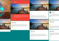
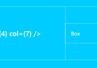
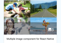
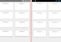
<Card><CardImage source={{uri:'http://placehold.it/480x270'}} title="Above all i am here"/><CardTitle title="This is a title" subtitle="This is subtitle"/><CardContent text="Your device will reboot in few seconds once successful, be patient meanwhile"/><CardAction separator={true} inColumn={false}><CardButton onPress={() => {}} title="Push" color="blue"/><CardButton onPress={() => {}} title="Later" color="blue"/></CardAction></Card>
Card Component Options
Prop
Type
Effect
Default Value
isDark
boolean
If the card background is dark, sets a light text color, this prop is passed to all child components
true
mediaSource
object
The image to show in background of a card, with content overlayed, passed to Image's source prop
undefined
avatarSource
object
The avatar image to be shown in the card's content or header section, whichever comes first, passed to Image's source prop
undefined
style
object
The style object to be merged with the default style
undefined
CardTitle Component Options
Prop
Type
Effect
Default Value
title
string
The title text
undefined
subtitle
string
The subtitle text
undefined
subtitleAbove
boolean
Whether the subtitle should be shown above the title
false
avatarSource
object
The avatar image to be shown, passed to Image's source prop
undefined
style
object
The style object to be merged with the default style
undefined
CardContent Component Options
Prop
Type
Effect
Default Value
text
string
The content text
undefined
avatarSource
object
The avatar image to be shown, passed to Image's source prop
undefined
style
object
The style object to be merged with the default style
undefined
CardImage Component Options
Prop
Type
Effect
Default Value
source
object
The image to be shown, passed to Image's source prop
undefined
style
object
The style object to be merged with the default style
undefined
resizeMode
string
Determines how to resize the image when the frame doesn't match the raw image dimensions
stretch
resizeMethod
string
Resize the image when the image's dimensions differ from the image view's dimensions.
resize
singleLineTitle
boolean
Set to true if you want the title to be one line, redacted with ellipses
undefined
CardAction Component Options
Prop
Type
Effect
Default Value
separator
boolean
Whether a separator should be shown
true
inColumn
boolean
Whether the buttons should be stacked in a column
false
style
object
The style object to be merged with the default style