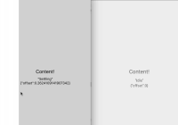
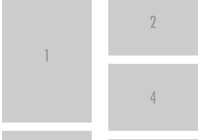
[](#contributors) 
Quick Jump
- Quick Jump
- Features
- Requirements
- Installation
- Usage
- Upgrading
- Documentation
- Contributors
- Backers
- Sponsors
- License
Features
- Add unlimited breakpoints
- Any property can be altered by a breakpoint
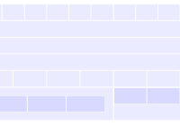
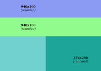
- Debug mode that allows easy visualization of your layout
Requirements
The follow dependencies must be installed in your project in order for hedron to work.
styled-components1.1.3 and up
Installation
Using yarn
yarn add hedron@nextUsing npm
npm install hedron@nextUsage
Basic Example
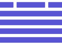
import React from "react"; import ReactDOM from "react-dom"; import Grid from "hedron"; const App = () => ( <Grid.Bounds direction="vertical"> <Grid.Box>Header</Grid.Box> <Grid.Box>Content</Grid.Box> <Grid.Box>Footer</Grid.Box> </Grid.Bounds> ); ReactDOM.render(<App />, document.getElementById("root"));Responsive Example
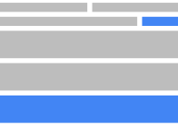
To make your layout responsive, use the Grid.Provider to define breakpoints. You can add as many or as few breakpoints as you'd like.
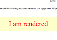
import React from "react"; import ReactDOM from "react-dom"; import Grid from "hedron"; const App = () => ( <Grid.Provider padding="20px" breakpoints={{ sm: "-500", md: "501-750", lg: "+750" }} > <Grid.Bounds direction="vertical"> <Grid.Box sm={{ hidden: true }}> This header hides on small screens </Grid.Box> <Grid.Box>Content</Grid.Box> <Grid.Box lg={{ padding: "50px" }}> This footer gains extra padding on large screens </Grid.Box> </Grid.Bounds> </Grid.Provider> ); ReactDOM.render(<App />, document.getElementById("root"));If you want to be more verbose with your naming convention, that's perfectly fine too! Go ahead and name your breakpoints whatever feels right
import React from "react"; import ReactDOM from "react-dom"; import Grid from "hedron"; const App = () => ( <Grid.Provider breakpoints={{ mobile: "-500", tablet: "501-750", wide: "+750" }} > <Grid.Bounds direction="vertical"> <Grid.Box mobile={{ hidden: true }}>Header</Grid.Box> <Grid.Box>Content</Grid.Box> <Grid.Bounds direction="vertical" wide={{ direction: "horizontal" }}> <Grid.Box>These boxes render side by side on wide screens</Grid.Box> <Grid.Box>These boxes render side by side on wide screens</Grid.Box> </Grid.Bounds> </Grid.Bounds> </Grid.Provider> ); ReactDOM.render(<App />, document.getElementById("root"));You don't need to fill all screen sizes either, if you only need elements to change on a single resolution, just add a single breakpoint! To learn more about breakpoints, check out the documentation for Grid.Provider.
Upgrading
Unfortunately, there's no simple way to upgrade from the pre 1.0.0 version, but here's a few tips to make your life easier if you decide to upgrade (which we recommend doing!)
- The
PageandSectioncomponents have been retired. In an effort to simplify, there are only two main components now with oneProviderthat helps configure the global grid. Rowhas been replaced byGrid.Bounds. This change was made becauseRowimplies that it can only go in one direction, whileGrid.Boundsis capable of arranging children either horizontally or vertically.Columnhas been replaced byGrid.Box. Again, this change was made becauseColumnimplies it only goes in one direction.BreakpointProviderhas been replaced byGrid.Provider. It was changed because it's can set more than just breakpoints.
Also: There are no longer default breakpoints. You must define breakpoints yourself via Grid.Provider. You can also finally set custom breakpoints, as many as you want!
Documentation
Grid.Provider
Props
padding:string- structure:20px- Default padding to use for child
Grid.Boxcomponents
- Default padding to use for child
breakpoints:{ key: string }- structure:{ name: query }- Breakpoints for setting resolution-specific properties on child
Grid.Boxcomponents. Here's a basic outline for writing breakpoint queries:-500means that the breakpoint will trigger at 500px and smaller250-800means that the breakpoint will trigger between 250px and 800px+900means that the breakpoint will trigger at 900px and larger
- Breakpoints for setting resolution-specific properties on child
Defining Breakpoints
Defining breakpoints gives you strong control over the way your content is rendered at various screen sizes. Any property that can be set on Grid.Box can be set per-breakpoint. Here's a few things to keep in mind when defining breakpoints:
- Breakpoints can be named whatever you'd like (with a few exceptions laid out in the next section)
- When defining breakpoints, you must pass an array object containing only two values: the min and max (both must be integers)
- Breakpoints can have overlapping values. Use responsibly though, as it's possible to produce unexpected results when setting conflicting values on a
Grid.Boxwith overlapping breakpoints. i.e. ifmobileandtablethave overlapping pixels, don't make aGrid.Boxhide on mobile and show on tablet.
Restricted Breakpoint Names
Although you can name breakpoints whatever you want, there are a few names that we do not recommend using because they will conflict with existing property names. Most of these are pretty obvious and would never come up in real usage, but it's worth having a list here just to be sure!
backgroundbordercheckedclassNamedangerouslySetInnerHTMLdisplayheighthiddenhtmlFormarginonChangeopacitypaddingselectedstylesuppressContentEditableWarningsuppressHydrationWarningvaluevisibilitywidth
Grid.Bounds
Props
debug:boolean- Outlines the grid system so you can visualize the layout
flex:string- structure:grow shrink basis- Controls the CSS
flexproperty
- Controls the CSS
direction:string-horizontalorvertical- Sets the primary axis the children should be in line with
wrap:boolean- Sets whether the children should wrap when there's no more room on the primary axis
valign:string-top,center, orbottom- Alignment of children along the vertical axis
halign:string-left,center, orright- Alignment of children along the horizontal axis
Grid.Bounds also inherits all properties that Stylable has.
Grid.Bounds accepts aliases for the width property.
Available aliases are:
half-50%quarter-25%third-33.3333333%twoThirds-66.666666%threeQuarters-75%
<Grid.Bounds sm={{ width: "half", height: "200px" }}> This box gains height on small devices </Grid.Bounds>Grid.Box
Props
debug:boolean- Outlines the grid system so you can visualize the layout
flex:string- structure:grow shrink basis- Controls the CSS
flexproperty
- Controls the CSS
fill:boolean- Sets whether the
Boxshould fill up all available space
- Sets whether the
fluid:boolean- Convenience property for disabling padding
shiftRight:boolean- Shifts the box to the right of the parent
Bounds
- Shifts the box to the right of the parent
shiftLeft:boolean- Shifts the box to the ;eft of the parent
Bounds
- Shifts the box to the ;eft of the parent
shiftUp:boolean- Shifts the box to the top of the parent
Bounds
- Shifts the box to the top of the parent
shiftDown:boolean- Shifts the box to the bottom of the parent
Bounds
- Shifts the box to the bottom of the parent
Grid.Box also inherits all properties that Stylable has.
Grid.Box accepts aliases for the width property.
Available aliases are:
half-50%quarter-25%third-33.3333333%twoThirds-66.666666%threeQuarters-75%
<Grid.Box sm={{ width: "half", height: "200px" }}> This box gains height on small devices </Grid.Box>Contributors
Thanks goes to these wonderful people (emoji key):
Garet McKinley | Matt Hamil | Mikko Matilainen | Nathaniel Piché | Brian Stanback | Stephen Mathieson | James G. Best |
This project follows the all-contributors specification. Contributions of any kind are welcome!
Want to help? Join our Spectrum.chat community to get started!
Backers
Support us with a monthly donation and help us continue our activities. [Become a backer]
Sponsors
Become a sponsor and get your logo on our README on Github with a link to your site. [Become a sponsor]
License
MIT
