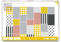
React Match Media

A React component that allows you to conditionally render your components based on media queries for your responsive website.
Underline it uses window.matchMedia

Usage
Install
npm i react-match-media Use it in your code (es6 syntax)
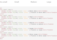
import React from 'react'; import ReactDOM from 'react-dom'; import { MatchMediaHOC } from 'react-match-media'; const ComponentForBigScreen = MatchMediaHOC(SomeComponent, '(min-width: 800px)'); const ComponentForSmallScreen = MatchMediaHOC(SomeComponent, '(max-width: 500px)'); ReactDOM.render( <div className="example"> <SomeElementAlwaysRendered /> <ComponentForBigScreen /> <ComponentForSmallScreen /> </div>, document.getElementById('root') )For more, see the examples
Supported browsers
- IE10 and above
- All other major browsers
For older browsers, you need to polyfill window.matchMedia. For more, see Can I Use matchMedia
Development of this component
Start the example
npm install npm start open http://localhost:3000 And then you can edit the source code, hotreloading is enabled, so you can see the changes immediatly
Linting
npm run lint Testing
npm run test To generate distribution code
npm run build Changelog
v2.2.0 - 25/April/2018
Used PropTypes from 'prop-types' package
v2.0.0 - 16/Jan/2017
Introduced a MatchMediaHOC high order component to replace the previous MatchMedia component.
License
MIT