Reflexbox
Responsive React Flexbox Grid System

Features
- Simple API for quickly controlling layout
- Helps promote composability and separation of concerns
- CSS-in-JS built in - no external dependencies
- Only generates the CSS needed to render
Getting Started
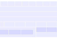
npm install reflexbox import React from 'react' import { Flex, Box } from 'reflexbox' class Component extends React.Component { render() { return ( <Flex p={2} align='center'> <Box px={2} w={1/2}>Box A</Box> <Box px={2} w={1/2}>Box B</Box> </Flex> ) } }Usage
// Fractional width <Box w={1/2} /> // Pixel width <Box w={128} /> // Responsive widths <Box w={[ 1, 1/2, 1/4 ]} /> // Padding <Box p={2} /> // Responsive padding <Box p={[ 1, 2, 3 ]} /> // Margin <Box m={2} /> // Responsive margin <Box m={[ 1, 2, 3 ]} /> // top, right, bottom, left <Box mt={1} mr={2} mb={3} ml={2} /> // x-axis <Box mx={-2} /> // y-axis <Box my={3} /> // align-items: center <Flex align='center' /> // justify-content: space-between <Flex justify='space-between' /> // Flex wrap <Flex wrap /> // Flex direction column <Flex column /> // Order <Box order={2} /> // flex: 1 1 auto <Box auto />API
<Flex />
Component primitive with display: flex
<Box />
Primitive for controlling width, margin, padding and more.
Props
Both <Flex /> and <Box /> share the same props.
w(number|string) sets width, where numbers 0-1 are percentage values, larger numbers are pixel values, and strings are raw CSS values with units.flex(boolean) setsdisplay: flexwrap(boolean) setsflex-wrap: wrapcolumn(boolean) setsflex-direction: columnauto(boolean) setsflex: 1 1 autoorder(number) setsorderalign(string) setsalign-itemsjustify(string) setsjustify-content
Margin and Padding
Margin and padding props accept numbers 0-4 for values from the spacing scale [ 0, 8, 16, 32, 64 ]. Numbers greater than 4 will be used as pixel values. Negative values can be used for negative margins. Strings can be passed for other CSS values, e.g. mx='auto'
m(number|string) margin based on a scale from 0–4.mx(number|string) x-axis margin based on a scale from 0–4.my(number|string) y-axis margin based on a scale from 0–4.mt(number|string) margin-top based on a scale from 0–4.mb(number|string) margin-bottom based on a scale from 0–4.ml(number|string) margin-left based on a scale from 0–4.mr(number|string) margin-right based on a scale from 0–4.p(number|string) padding based on a scale from 0–4.px(number|string) x-axis padding based on a scale from 0–4.py(number|string) y-axis padding based on a scale from 0–4.pt(number|string) padding-top based on a scale from 0–4.pb(number|string) padding-bottom based on a scale from 0–4.pl(number|string) padding-left based on a scale from 0–4.pr(number|string) padding-right based on a scale from 0–4.
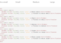
Responsive Array Prop Values
All props accept arrays as values for mobile-first responsive styles.
// Set widths for different breakpoints, starting from smallest to largest // This example will be 100% width below the smallest breakpoint, // then 50% and 25% for the next two breakpoints respectively <Box w={[ 1, 1/2, 1/4 ]} />Null values can be passed to the array to skip a breakpoint.
<Box w={[ 1, null, 1/2 ]} />Configuration
Values for the breakpoints and space scale can be configured with React Context.
Context can be set manually or with the <ReflexProvider /> component.
import React from 'react' import { ReflexProvider, Flex, Box } from 'reflexbox' const space = [ 0, 6, 12, 18, 24 ] const breakpoints = [ 32, 48, 64 ] class App extends React.Component { render () { return ( <ReflexProvider space={space} breakpoints={breakpoints}> <Flex mx={-2}> <Box w={1/4} px={2}>Box</Box> <Box w={1/4} px={2}>Box</Box> <Box w={1/4} px={2}>Box</Box> <Box w={1/4} px={2}>Box</Box> </Flex> </ReflexProvider> ) } }Higher Order Component
The core Reflexbox higher-order component can be used on any element that accepts className as a prop.
import React from 'react' import { reflex } from 'reflexbox' import MyInput from './MyInput' const FlexInput = reflex(MyInput) const App = () => ( <div> <FlexInput w={1/2} mb={2} defaultValue='Flex Input' /> </div> )Caveats
This currently DOES NOT work in Node.js server-side applications. If you need server-side support, see version ^2.2.0 or one of the related libraries below.