react-hexagon
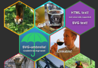
React component that renders a hexagon using SVG. Supports background images, links, SVG content, click handlers... Stylable with CSS.
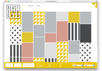
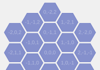
Demos
See the demos page for some demos.
Installation
react-hexagon can be installed using npm:
npm install --save react-hexagon Size of component is about ~1.5kB after gzip.
Basic usage
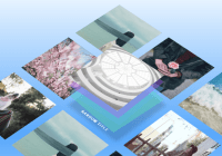
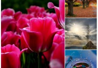
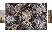
import React from 'react' import Hexagon from 'react-hexagon' React.render( <Hexagon style={{stroke: '#42873f'}} backgroundImage="img/red-panda.jpg" href="http://espen.codes/" />, document.getElementById('root') );Props
All properties are optional.
className- Class name of SVG element.href- Link target, if any. Hexagon will only be wrapped in an anchor if this is set.target- Target of link. Same role as in regular HTML.flatTop- Switches hexagon style to have a flat top (basically, rotate the hexagon by 90°). Default:falsebackgroundImage- URL to a background image. Recommend that the image has the same aspect ratio as a hexagon. See background sizing notes below.style- Styles for the hexagon element.children- Children nodes to put inside SVG element.hexProps- Arbitrary properties to apply to the hexagon element (the actual polygon, not the outer SVG). Useful to apply event listeners, class names or similar.diagonal- Size of diagonal. Affects sizing of elements within the SVG, and can usually be left as-is. Instead, scale the SVG element using CSS width/height. Default:500
Background sizing
Sizing and aligning the background image can be slightly tricky. We recommend that you try to stick with images that has the same aspect ratio as a hexagon, or square images that can be slightly scaled.
By default, if you give the hexagon element a background image with a different aspect ratio, it'll try to center the image horizontally/vertically while maintaining the original image aspect ratio. For square images, this means you'll end up with a small border. If you instead want to upscale the image to fill the hexagon, use the backgroundScale property (see below).
Background sizing properties are resolved in the following order (first one defined wins):
backgroundScale- Used to upscale the image, usually in order to fill the entire hexagon if the aspect ratio does not match.0.5mean scale to 50% of the hexagon,1.5means scale to 150%. For square images,1.05is usually a good number to use.backgroundWidth/backgroundHeight- Used to manually adjust the size of the background image.backgroundSize- Can be used if the image has a square ratio.
Note: backgroundWidth, backgroundHeight and backgroundSize are relative to the diagonal, which defaults to 500.
License
Licensed under the MIT License, see LICENSE