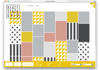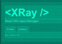
#react-native-layout-tester
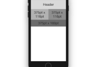
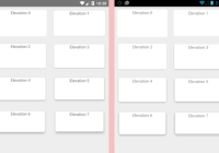
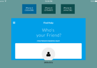
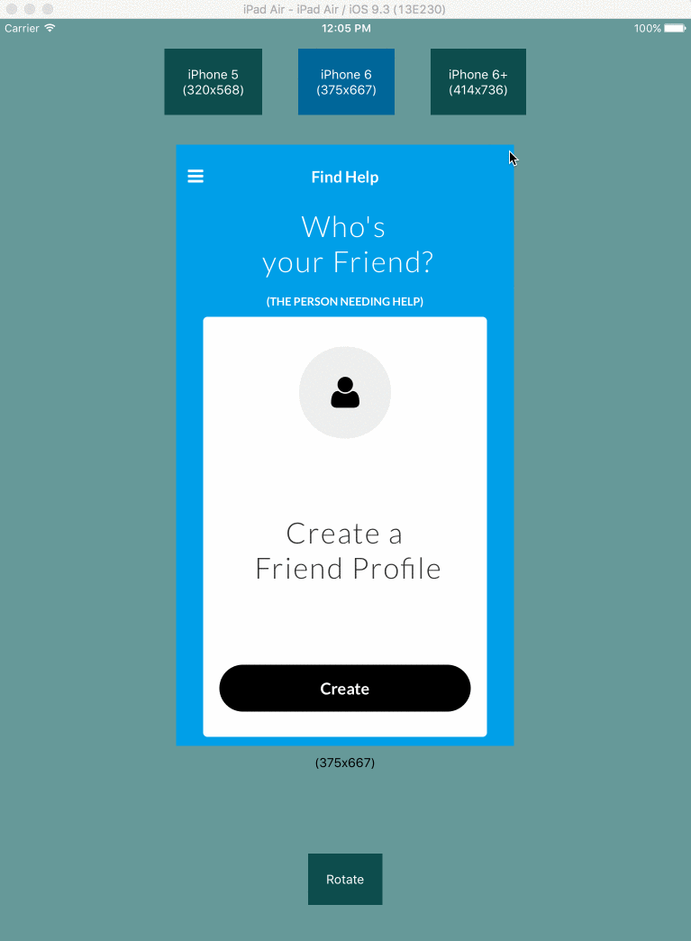
Use an iPad to test your component's layout in different iPhone sizes.
Installation
npm install --save react-native-layout-testerUsage
In order to test your entire app, first wrap your app in the LayoutTester (works with redux and Navigator as well).
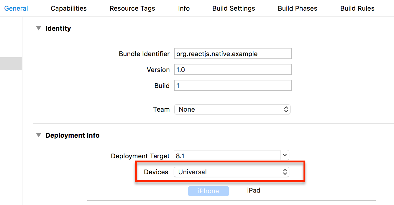
import LayoutTester from "react-native-layout-tester"; //... render() { return ( <LayoutTester> <Provider store={ store }> <Router initialRoute={ this._initialRoute } ref={ this._setRouter } /> </Provider> </LayoutTester> ); }Then run you application in the iPad Air simulator (it has enough width to accomodate an iPhone 6+ logical resolution in landscape mode). In order to accomplish this, you will have to set up your xcode solution to "Universal".
NOTICE: You won't need this package in your production bundle, so you can exclude this package by simply not importing it in any file.
Reacting to changes in viewport
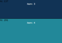
This module makes use of the react-native-layout-provider to react to changes in viewports. You can make your styles re-calculate on viewport changes. In order to do this, you can use a decorator shipped in react-native-layout-provider. The decorator will take changes in viewport and pass it through props to your wrapped components.
In your component's code, import the getLayout function.
import { getLayout } from 'react-native-layout-provider';Then calculate the styles based on the newly added props:
render() { const { label, viewport, portrait } = this.props; let style = ...Finally export your wrapped component.
export default getLayout(layout => layout)(Container);Here is a sample container component that adjusts the padding based on the width of the viewport.
import React, { Component } from 'react'; import { StyleSheet, View } from 'react-native'; import { getLayout } from 'react-native-layout-tester'; class Container extends Component { render() { let { viewport: { width } } = this.props; let padding = width * 0.05; //5% of width let style = StyleSheet.create({ container: { padding: padding, flex: 1, justifyContent: 'center', alignItems: 'center', } }); return ( <View style={ style.container }> { this.props.children } </View> ); } } export default getLayout(layout => layout)(Container);You can see more of react-native-layout-provider here.
Receiving dimensions props in production code
If you wrap your components to receive dimensions by props, then you will need these props when running your app on production as well. For doing this, you can pass the noTestWrapConfig prop to LayoutTester and it will not render the testing interface.
For example:
render() { return ( <LayoutTester noTestWrapConfig > <Container> <Text style={styles.welcome}> Welcome to React Native! </Text> <Text style={styles.instructions}> To get started, edit index.ios.js </Text> <Text style={styles.instructions}> Yeah! </Text> </Container> </LayoutTester> ); }noTestWrapConfig can either be a bool, or an object with the properties you want to pass to your wrapped components.
Properties
| Prop | Default | Type | Description |
|---|---|---|---|
| viewportChanged | undefined | func | Callback triggered when the viewport changes, either by changing device or rotating. |
| config | undefined | object | Device screens configuration. |
| noTestWrapConfig | undefined | object or bool | Device screens configuration to send to wrapped components. If true then config is taken from Dimensions (physical device dimensions) |
config (prop)
You can pass whatever device screen sizes you need (useful for android sizes).
// these are not real measure!!!! render() { return ( <LayoutTester config={ { nexus4: { label: "Nexus 4", width: 364, height: 640 }, motog: { label: "Moto G", width: 396, height: 640 } } } > <Provider store={ store }> <Router initialRoute={ this._initialRoute } ref={ this._setRouter } /> </Provider> </LayoutTester> ); }noTestWrapConfig (prop)
Here is a slightly more complex example of how to use this prop to pass props to all the wrapped components.
import React, { Component, PropTypes } from "react"; import { Platform, Dimensions } from "react-native"; import LayoutTester from 'react-native-layout-tester'; import Orientation from 'react-native-orientation'; import ExtraDimensions from "react-native-extra-dimensions-android"; let statusBarHeight = 0; if (Platform.OS === "android") { try { statusBarHeight = ExtraDimensions.get("STATUS_BAR_HEIGHT"); } catch(e) {} } class App extends Component { state = { orientation: Orientation.getInitialOrientation() }; _orientationDidChange = orientation => { this.setState({ orientation }); }; componentDidMount() { Orientation.addOrientationListener(this._orientationDidChange); } componentWillUnmount() { Orientation.removeOrientationListener(this._orientationDidChange); } render() { const { width, height } = Dimensions.get('window'); return ( <LayoutTester noTestWrapConfig={{ mode: 'default', width, height: height - statusBarHeight, portrait: this.state.orientation === 'PORTRAIT' }}> ... </LayoutTester> ); } }Known Issues
- Doesn't play well with styles generated based on
Dimensions(physical device dimensions). - Doesn't play well when styles depend on PixelRatio.
- Doesn't play well with styles that depend on keyboard status (yet?).
TODO
- Haven't yet tested it in Android
Credits
A special thanks to @jhen0409 for his awesome contributions which led to his cool react-native-layout-provider package.