react-stonecutter 
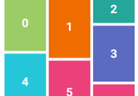
Animated grid layout component for React, inspired by Masonry.
Choose between CSS Transitions or React-Motion for animation.
Installation
With npm:
npm install --save react-stonecutter Usage
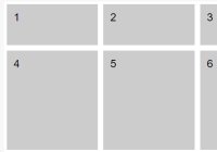
A simple layout with items of equal height:
import { SpringGrid } from 'react-stonecutter';<SpringGrid component="ul" columns={5} columnWidth={150} gutterWidth={5} gutterHeight={5} itemHeight={200} springConfig={{ stiffness: 170, damping: 26 }} > <li key="A">A</li> <li key="B">B</li> <li key="C">C</li> </SpringGrid>A Pinterest-style layout with varying item heights, this time using CSS transitions:
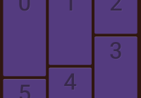
import { CSSGrid, layout } from 'react-stonecutter';<CSSGrid component="ul" columns={5} columnWidth={150} gutterWidth={5} gutterHeight={5} layout={layout.pinterest} duration={800} easing="ease-out" > <li key="A" itemHeight={150}>A</li> <li key="B" itemHeight={120}>B</li> <li key="C" itemHeight={170}>C</li> </CSSGrid>To render React components as children, wrap them in simple elements. This gives you full control of your markup:
<SpringGrid component="ul" // ...etc. > {data.map((datum) => ( <li key={datum.id}> <MyComponent datum={datum} /> </li> ))} </SpringGrid>If you don't know the heights of your items ahead of time, use the measureItems higher-order component to measure them in the browser before layout:
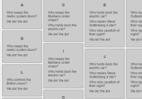
import { SpringGrid, measureItems } from 'react-stonecutter'; const Grid = measureItems(SpringGrid);<Grid // ...etc. > <li key="A">Who controls the British crown?</li> <li key="B">Who keeps the metric system down?</li> <li key="C">We do!</li> <li key="D">We do!</li> </Grid>If your grid spans the page and you want to vary the number of columns based on the viewport width, use the makeResponsive higher-order component which makes use of enquire.js:
import { CSSGrid, measureItems, makeResponsive } from 'react-stonecutter'; const Grid = makeResponsive(measureItems(CSSGrid), { maxWidth: 1920, minPadding: 100 });API Reference
Exports:
SpringGridCSSGridmeasureItemsmakeResponsivelayoutenterExitStyleeasings
SpringGrid and CSSGrid props
columns={Number}
Number of columns. Required.
You can wrap the Grid component in the makeResponsive higher-order component to set this dynamically.
columnWidth={Number}
Width of a single column, by default in px units. Required.
gutterWidth={Number}
Width of space between columns. Default: 0.
gutterHeight={Number}
Height of vertical space between items. Default: 0.
component={String}
Change the HTML tagName of the Grid element, for example to 'ul' or 'ol' for a list. Default: 'div'.
layout={Function}
Use one of the included layouts, or create your own. Defaults to a 'simple' layout with items of fixed height.
Included layouts:
import { layout } from 'react-stonecutter'; const { simple, pinterest } = layout;The function is passed two parameters; an Array of the props of each item, and the props of the Grid itself. It must return an object with this shape:
{ positions: // an Array of [x, y] coordinate pairs like this: [[0, 0], [20, 0], [0, 30]] gridWidth: // width of the entire grid (Number) gridHeight: // height of the entire grid (Number) }Have a look at the code for the included layouts to get a feel for creating your own.
enter={Function}
entered={Function}
exit={Function}
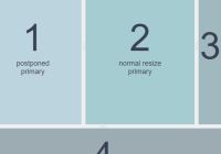
These allow you to change how items animate as they appear and disappear from the grid. Supply functions that return objects with the opacity and transform values for an item's start and end states. By default the item's scale and opacity go from 0 to 1 and back to 0 on exit, like this:
enter={() => ({ scale: 0, opacity: 0 })} entered={() => ({ scale: 1, opacity: 1 })} exit={() => ({ scale: 0, opacity: 0 })}The functions are passed three parameters, the item props, grid props and grid state which includes the current height and width of the grid. For example to have disappearing items fall off the bottom of the grid:
exit={(itemProps, gridProps, gridState) => ({ translateY: gridState.gridHeight + 500 })}CSS transform-functions are split up so they can be easily animated individually. Supported functions:
translateXtranslateYtranslateZskewskewXskewYscalescaleXscaleYrotaterotateXrotateY
Some example functions are included:
import { enterExitStyle } from 'react-stonecutter'; const { enter, entered, exit } = enterExitStyle.foldUp;Check out the demo to see them in action.
perspective={Number}
The perspective distance used for 3D transforms. If you are using a transform function like rotateX, use this to strengthen the effect. Default is no perspective applied.
lengthUnit={String}
The length unit used throughout. Default: 'px'. Experimental. You could try using 'em' or 'rem' and then adjust the font-size for a fluid layout, but it may not work well with the measureItems and makeResponsive higher-order components. % does not work well due to the way CSS transforms work.
angleUnit={String}
The angle unit. Affects transform-functions such as rotate. Default: 'deg'.
SpringGrid only props
springConfig={Object}
Configuration of the React-Motion spring. See the React-Motion docs for more info. Default: { stiffness: 60, damping: 14, precision: 0.1 }.
CSSGrid only props
duration={Number}
Animation duration in ms. Required.
easing={String}
Animation easing function in CSS transition-timing-function format. Some Penner easings are included for convenience:
import { easings } from 'react-stonecutter'; const { quadIn, quadOut, /* ..etc. */ } = easings;Default: easings.cubicOut.
measureItems options
Pass like this:
const Grid = measureItems(SpringGrid, { measureImages: true })measureImages: Boolean
If set to true, waits for images to load before measuring items and adding them to the Grid. This may be necessary if you don't know the height of your images ahead of time. Powered by imagesLoaded.
background: Boolean|String
This option is passed through to the imagesLoaded library. It allows you to wait for background images to load, in addition to <img> tags.
makeResponsive options
Pass like this:
const Grid = makeResponsive(SpringGrid, { maxWidth: 1920 })maxWidth: Number
Maximum width for the Grid in px.
minPadding: Number
Minimum horizontal length between the edge of the Grid and the edge of the viewport in px. Default: 0.
defaultColumns: Number
Default number of columns before the breakpoints kick in. May be useful when rendering server-side in a universal app. Default: 4.
Alternatives
If you have a list already nicely laid out by the browser, check out React Flip Move which uses the very cool FLIP technique.
License
MIT
