react-cellblock
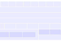
React Cellblock makes it easy to build components that respond not only to a grid’s break point, but also to the size of their containing column.
Cellblock shares some conventions with popular grids, such as Bootstrap and Foundation, but it combines the benefits of fractional grids with the benefits of grids that use fixed units.
Features
- Your breakpoints can be fixed or flexible.
- You can interleave grid sections with non-grid sections.
- You can specify any grid division you want (not always fractions of 12 for instance).
- Your components can observe the grid’s break point as it changes.
- Your components can observe the width of their containing column as it changes.
Use
$ npm install react-cellblock To run examples
$ cd react-cellblock $ npm install $ npm start Open http://localhost:8080 and start playing around.
What’s included
- Grid provides a context and configuration for all other grid components.
- Row creates a container for a set of columns.
- Column divides rows into regions.
- observeGrid takes a component and returns a new one that recieves grid properties (Higher order component).
A Simple Example of a Layout
To create a layout, you must have one <Grid/> component. Inside you can use <Row/> and <Column/> components. You may also use custom components (which could include furthur <Row/> and <Column/> components.
Here is a layout divided into two equal columns:
import React from 'react'; import {Grid, Row, Column} from 'react-cellblock'; const Layout = () => ( <Grid> <Row> <Column width="1/2"> Left! </Column> <Column width="1/2"> Right! </Column> </Row> </Grid> );A Simple Example of a Responsive Component
Here is a custom component that displays a “small view” when it is in a small column and a “big view” when it is in a big column.
import React from 'react'; import {observeGrid} from 'react-cellblock'; class YourComponent extends React.Component { static propTypes = { colWidth: React.PropTypes.number // How wide is this component in “grid units”? }; render() { return (this.props.colWidth > 4) ? (<div>Big View</div>) : (<div>Small View</div>); } }); const YourNewResponsiveComponent = observeGrid(YourComponent); // then inside some other component or jsx // on the "12 unit breakpoint" <Column width="1/4"> // 3 units wide on 12 unit breakpoint <YourNewResponsiveComponent/> // this will render “Small View” </Column> <Column width="3/4"> // 9 units wide on 12 unit breakpoint <YourNewResponsiveComponent/> // this will render “Big View” </Column>If your component is simple, you can take advantage of react’s Stateless functional components to make the example above more succinct:
const ResponsiveComponent = observeGrid(({colWidth}) => ( (colWidth > 4) ? ( <div>Big View</div> ) : ( <div>Small View</div> ); ));Grid
The <Grid/> component provides a context and configuration for all other Cellblock components. It has no visual styles associated with it. This allows you to have full-width items inside the grid that are not constrained by the grid.
Configuring the Grid Component
When you set up a Cellblock grid, you choose how wide you want your columns and gutters to be and you choose how many columns you want to fit in each breakpoint (you can have as many breakpoints as you need).
For example, if you want to have two breakpoints that contain 4 and 8 columns respectively you would do this:
<Grid breakpoints={[4,8]}/>As a result you would have a “4 unit” breakpoint and an “8 unit” breakpoint. The 8 unit breakpoint would trigger as soon as the screen is wide enough to fit 8 columns.
If you want the grid to be flexible at all breakpoints:
<Grid breakpoints={[4,8]} flexible={true}/>And if you want the only certain breakpoints to be flexible:
<Grid breakpoints={[4,8]} flexible={[4]}/>Example Configuration
Here is what the default configuration looks like:
<Grid columnWidth={60} // a “grid unit” is at least 60px wide gutterWidth={20} // there are 20px between columns breakpoints={[4,8,12,16]} // there are 4 breakpoints flexible={[4]} // the 4 unit view is flexible onChange={breakpoint => {}} // fires every time breakpoint changes />Grid Properties
| Property | Type | Default | Description |
|---|---|---|---|
| columnWidth | Number | 60 | The width (in pixels) of each column unit. On flexible breakpoints this will be the minimum width. |
| gutterWidth | Number | 20 | The width (in pixels) of the gutter between Columns. |
| breakpoints | Array | [4,8,12,16] | A sorted list of how many columns are in each breakpoint. |
| initialBreakpoint | Number | undefined | The first breakpoint to render (useful for isomorphic rendering) |
| flexible | Array/Bool | [4] | A list of which breakpoints are flexible. If true, all breakpoints will flex. |
| onChange | Func | noop | Fires every time the breakpoint changes. Recieves the new breakpoint as its first argument. |
| className | String | undefined | A custom class name. |
Note: You should never put a
<Grid/>inside another<Grid/>.
Row
The <Row/> component creates a container for a set of columns. Any time you want to nest columns, you must have a row around them.
At the highest level, rows constrain the grid and give meaning to columns:
<Grid> <Row> // The row establishes the outer grid boundry. <Column width="1/2"/> <Column width="1/2"/> </Row> <div>Full Width<div> // Without a row, elements stretch to fill the screen. <Row> <Column width="1/3"/> <Column width="2/3"/> </Row> </Grid>So this is an example of what NOT to do:
<Grid> <Column width="3/5"/> // This is BAD! there is no row around the columns. <Column width="2/5"/> </Grid>Inside columns, rows allow complex nesting:
<Grid> <Row> <Column width="1/3"/> <Column width="2/3"> <Row> // The Row allows you to nest columns. <Column width="7/10"/> <Column width="3/10"/> </Row> </Column> </Row> </Grid>And an example of what NOT to do:
<Grid> <Row> <Column width="2/3"> <Column width="7/10"/> // This is BAD! The column nesting won’t work without the row. <Column width="3/10"/> </Column> </Row> </Grid>The fact that rows function in both these ways can make your components more generic.
Take the following example:
class YourComponent extends Component { render() { return ( <Row> <Column width="1/2"/> <Column width="1/2"/> </Row> ); } } // elsewhere in your code... <Grid> <YourComponent/> // YourComponent works at the top level <Row> <Column width="1/3"> <YourComponent/> // YourComponent also works inside a column </Column> <Column width="2/3"> <YourComponent/> </Column> </Row> </Grid>Notice how the use of row as the outer container for the grid and the mechanism for nesting columns allows your component to function in more places. This allows for more sharable fragments of layouts.
Row Properties
| Property | Type | Default | Description |
|---|---|---|---|
| className | String | undefined | A custom class name. |
Note: You should not put a
<Row/>directly inside another<Row/>, there should always be a Column barrier.
Column
The <Column/> component divides rows into regions. Even though you configure the grid in terms of units (an 8 unit view or 12 unit view) You specify the width of a columns as a fraction of its parent. This keeps nesting from becoming brittle. In this sense, the column nesting is similar to bootstrap and foundation.
Here is an example of using fractions:
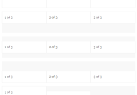
<Grid> <Row> <Column width="1/6">I am one sixth</Column> <Column width="2/6">I am two sixths</Column> <Column width="3/6">I am three sixths</Column> </Row> <Row> <Column width="2/4">I am one half</Column> <Column width="1/4">I am one quarter</Column> <Column width="1/4">I am one quarter</Column> </Row> </Grid>Notice that the fractions only need to make sense within each row. You can use quarters in one row and thirds in the next, whatever makes sense for that section of the layout.
If you want to keep the units you are dealing with in mind, it can be helpful to express your fractions using those units as denominators. Here is an example of what that might look like:
<Row> <Column width="3/8">I am three units</Column> <Column width="5/8"> I am five units <Row> <Column width="3/5"> I am three of the five units above </Column> <Column width="2/5"> I am two of the five units above </Column> </Row> </Column> </Row>Column Properties
| Property | Type | Default | Description |
|---|---|---|---|
| width | FractionString | undefined | The width of the column expressed as a fraction string. For example: as "1/3" or "3/7". |
| offset | FractionString | undefined | The left offset of the Column. |
| className | String | undefined | A custom class name. |
So why bother with grid units at all?
Well, take a look at this example:
<Row> <Column width="1/2"> I am one half! </Column> <Column width="1/2"> <Row> <Column width="1/2"> I am one half! </Column> <Column width="1/2"> I am one half! </Column> </Row> </Column> </Row>In the example above, If all you know about is fractions, every column only knows that it is 1/2. But this means a very different size if you are a deeply nested column or if you are on a bigger or smaller breakpoint. So even though you have more flexibility, you have lost an absolute sense of scale. 1/2 of what? 1/2 of a small screen? 1/2 of a 1/2 column? 1/2 of a 1/3 column on a medium screen? It gets hard to think about.
Grid units give you a convention to measure against. A convention that is constant across all breakpoints and no matter how deeply you nest your columns. So while you may be thinking in fractions while you create your layout. Your components can still think in terms of grid units when they decide how to display.
Your components can access their absoulte size in grid units by using observeGrid()...
observeGrid
observeGrid(Component) is a higher order component. It takes another component as an argument and returns a new one that is aware of grid related properties. This allows you to create simple state-free components that expect properties about their column width or breakpoint and let observeGrid handle the updates.
Here is the information you get when you use observeGrid:
const YourComponent = observeGrid(class extends Component { static propTypes = { colWidth: PropTypes.number, // column width in “grid units” colMinPixelWidth: PropTypes.number, // minimum number of pixels available in this column colMaxPixelWidth: PropTypes.number, // maximum number of pixels available in this column breakpoint: PropTypes.number, // current grid breakpoint }; // ... });colWidth is ideal for most responsive use cases, because it doesn’t matter whether or not the breakpoint is flexible. 3 grid units is always 3 grid units. However, for more difficult cases, you can use colMinPixelWidth and colMaxPixelWidth (they will be the same for non-flexible breakpoints). breakpoint is available, but not typically as useful.
A Note on responsive components
The good part about colWidth is that you don't need to know how your column got its size (whether it is 1/2 or 1/2 of 1/3 for example), but you should not assume at the component level that your colWidth will be an integer. Always assume it can be a decimal as well.
For example, this is what you do NOT want to do in your render method:
render() { // This is BAD! '===' assumes colWidth is an integer return (colWidth === 4) ? '4 unit view' : 'default view'; }Instead, consider this alternative:
render() { // This is GOOD! '<=' allows for decimal values for columns return (colWidth <= 4) ? '4 unit view' : 'default view'; }This makes more sense, because no matter what size column your component is in it will render the correct view. (even if the column is 3.333 grid units wide)
License
Released 2015 by Greg Skiano @ Dow Jones


