react-styled-flexboxgrid


Set of React components that implement flexboxgrid.css but with styled-components/emotion. Furthermore, it allows to customize grid configuration like gutter width...
Highly inspired by the excellent react-flexbox-grid which the API is nearly the same than this module.
Usage
Installation
npm i -S react-styled-flexboxgrid react-styled-flexboxgrid depends on 2 peer dependencies:
react@^0.14.0 || ^15.0.0-0 || ^16.0.0-0prop-types@^15.0.0-0styled-components@2
You should install them in your project.
Basic
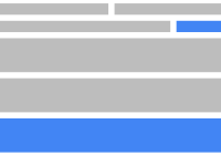
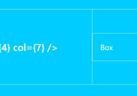
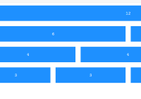
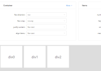
import React from 'react' import {Grid, Col, Row} from 'react-styled-flexboxgrid' const App = props => <Grid> <Row> <Col xs={6} md={3}>Hello, world!</Col> </Row> </Grid>Grid
The <Grid> component is optional and can help to wrap children in a fixed/fluid container. Use the configuration container for fixed width value.
Props
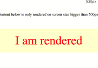
fluid(Boolean): Create a responsive fixed width container or a full width container, spanning the entire width of your viewport. Default: false
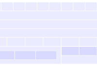
Row
Props
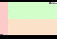
reverse(Boolean): Useflex-direction: row-reverse. Default: falsestartcenterendtopmiddlebottomaroundbetweenfirstlast(String(xs|sm|md|lg): Align elements to the start or end of row as well as the top, bottom, or center of a column.
Col
Props
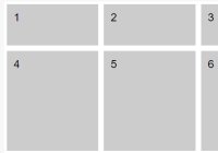
reverse(Boolean): Useflex-direction: column-reverse. Default: falsexssmmdlg(Boolean|Integer):- When
true, enable auto sizing column. - When
false, hide colomn for the breakpoint. - When
integervalue, it specify the column size on the grid. (1 to 12)
- When
xsOffsetsmOffsetmdOffsetlgOffset(Integer): Offset the column.
Configuration
The grid use same defaults than flexboxgrid.css.
You can customize values using <ThemeProvider> component from styled-components. react-styled-flexboxgrid will looks at the flexboxgrid property in the theme.
import React from 'react' import {ThemeProvider} from 'styled-components' import {Grid, Col, Row} from 'react-styled-flexboxgrid' const theme = { flexboxgrid: { // Defaults gridSize: 12, // columns gutterWidth: 1, // rem outerMargin: 2, // rem mediaQuery: 'only screen', container: { sm: 46, // rem md: 61, // rem lg: 76 // rem }, breakpoints: { xs: 0, // em sm: 48, // em md: 64, // em lg: 75 // em } } } const App = props => <ThemeProvider theme={theme}> <Grid> <Row> <Col xs={6} md={3}>Hello, world!</Col> </Row> </Grid> </ThemeProvider>Use with Emotion
To use react-styled-flexboxgrid with emotion, import from 'react-styled-flexboxgrid/emotion':
import { Grid, Col, Row } from 'react-styled-flexboxgrid/emotion'Related projects
License
MIT