react-flexa
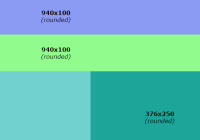
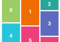
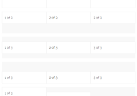
Responsive React Flexbox (CSS Flexible Box Layout Module) grid system based heavily on the standard CSS API.
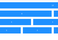
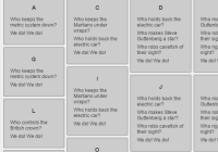
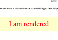
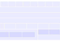
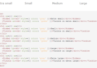
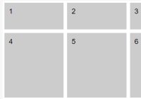
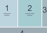
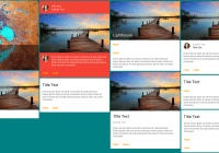
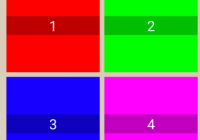
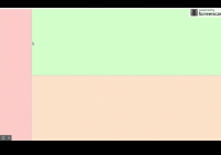
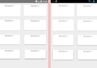
react-flexa demo
Features
- Simple API is based off CSS Flexbox API, no need to learn a new syntax.
- Uses styled-components to customize generated components styles
- Easily change grid settings based on responsive breakpoints
Installation
yarn add react-flexaUsage
Basic usage
import React from 'react'; import { Row, Col } from 'react-flexa'; class Component extends React.Component { render() { return ( <Row justifyContent="center"> <Col xs={3}>25% width</Col> <Col xs={3}>25% width</Col> </Row> ); } };Advance responsive usage
View Responsive API using objects for more information on how to responsively set flexbox properties based on breakpoint.
import React from 'react'; import { Row, Col } from 'react-flexa'; class Component extends React.Component { render() { return ( <Row justifyContent={{ sm: "center", lg: "flex-end" }} gutter="16px"> <Col xs={3} md={6}>25% width on extra small displays, 50% width on medium displays and up</Col> <Col xs={3} md={6}>25% width on extra small displays, 50% width on medium displays and up</Col> </Row> ); } };API
Row Props
These are the available and reserved props that can be used on the Row component. All other props such as className will be automatically be passed down to the generated element.
| Prop | Valid types | Valid values | Default value | Description |
|---|---|---|---|---|
gutter | integer, string, object | '1rem''12px'4(etc) | '1rem' | Sets the width of the gutter to be used between columns. For correct positioning you must set the same value (if custom) on children Col's. |
display | string, object | 'flex''inline-flex' | 'flex' | This defines a flex container; inline or block depending on the given value. Read more about display. |
flexDirection | string, object | 'row''row-reverse''column''column‑reverse' | 'row' | This establishes the main-axis thus defining the direction flex items are placed in the flex container. Read more about flex-direction. |
flexWrap | string object | 'nowrap''wrap''wrap‑reverse' | 'wrap' | By default flex items will wrap to new lines as needed. You can change it to allow all items try to fit onto one line with this property. Read more about flex-wrap. |
justifyContent | string, object | 'flex‑start''flex‑end''center''space‑between''space‑around' | 'flex‑start' | This defines the alignment along the main axis. It helps distribute extra free space left over. Read more about justify-content. |
alignItems | string, object | 'flex‑start''flex‑end''center''baseline''stretch' | 'stretch' | This defines the default behavior for how flex items are laid out along the cross axis on the current line. Read more about align-items. |
alignContent | string, object | 'flex‑start''flex‑end''center''space‑between''space-around''stretch' | 'stretch' | This aligns a flex container's lines within when there is extra space in the cross-axis. Read more about align-content. |
elementType | string, object | 'div''span' | 'div' | This enables you to change the HTML element type generated. |
Flexbox descriptions sourced from CSS-Tricks
Col Props
These are the available and reserved props that can be used on the Col component. All other props such as className will be automatically be passed down to the generated element.
| Prop | Valid types | Valid values | Default value | Description |
|---|---|---|---|---|
xs | integer/ string | 0-12(based on default columns) hiddenauto '390px' - 'calc=(100% - 390px)' | nill | Number: Sets the width of the col based the column configuration (12 by default) for the XS breakpoint and up. String: Set a width like string xs="390px" to fixed have a fixed colum, or create a calc xs="calc(100% - 390px)" base on sibling to have a responsive column. |
sm | integer/ string | 0-12(based on default columns) hiddenauto '390px' - 'calc=(100% - 390px)' | nill | Number: Sets the width of the col based the column configuration (12 by default) for the SM breakpoint and up. String: Set a width like string sm="390px" to fixed have a fixed colum, or create a calc sm="calc(100% - 390px)" base on sibling to have a responsive column. |
md | integer/ string | 0-12(based on default columns) hiddenauto '390px' - 'calc=(100% - 390px)' | nill | Number: Sets the width of the col based the column configuration (12 by default) for the MD breakpoint and up. String: Set a width like string md="390px" to fixed have a fixed colum, or create a calc md="calc(100% - 390px)" base on sibling to have a responsive column. |
lg | integer/ string | 0-12(based on default columns) hiddenauto '390px' - 'calc=(100% - 390px)' | nill | Number: Sets the width of the col based the column configuration (12 by default) for the LG breakpoint and up. String: Set a width like string lg="390px" to fixed have a fixed colum, or create a calc lg="calc(100% - 390px)" base on sibling to have a responsive column. |
gutter | integer, string, object | '1rem''12px'4 | '1rem' | Sets the width of the gutter to be used between columns. For correct positioning you must set the same value (if custom) on the parent Row |
order | string, object | -101(etc) | 0 | By default, flex items are laid out in the source order. However, the order property controls the order in which they appear in the flex container. Read more about order. |
alignSelf | string, object | 'auto''flex‑start''flex‑end''center''baseline''stretch' | 'auto' | This allows the default alignment (or the one specified by align‑items) to be overridden for individual flex items. Read more about align-self. |
elementType | string, object | 'div''span' | 'div' | This enables you to change the HTML element type generated. |
flex | string, integer, object | 1'1 1 auto''1 0 auto'(etc). | 0 0 auto | This allow to grow automatically (flex: 1) |
display | string, object | 'flex''block''inline'(etc) | block | This defines the display property of the col, inline, block, flex etc. |
Flexbox descriptions sourced from CSS-Tricks
Responsive API using objects
Props with a valid type of "object" enable you to set the value corresponding to a breakpoint. Including an object with keys matching that of the breakpoints will set the desired value on that particular breakpoint.
For example, the object for setting a Row component setting justifyContent to "flex-start" on sm breakpoint, "center" on md breakpoint, and finally "flex-end" on lg breakpoint would look like:
{ xs: "flex-start", md: "center", lg: "flex-end", }Note: we have chosen to not change anything on the sm breakpoint.
Using this object in the example of the Row component:
import React from 'react'; import { Row, Col } from 'react-flexa'; class Component extends React.Component { render() { return ( <Row justifyContent={{ xs: "flex-start", md: "center", lg: "flex-end" }}> ... </Row> ); } };This will now generate CSS with min-width media queries for the responsive values. Note: a media query is not set for any value assigned to xs due to mobile first min-width media query structure.
Default values when using responsive objects
Props such as gutter by will use the default value from the ThemeProvider if not set within the object. For example:
<Row gutter={{ xs: 1, lg: 2 }} />Will take the sm and md gutter values set by default in the ThemeProvider. To remove these simple set them as 0 to these within the responsive object.
Theming
Default Theme
By default the configuration for react-flex is:
{ columns: 12, gutter: { xs: 1, // rem sm: 1, // rem md: 2, // rem lg: 2, // rem }, breakpoints: { xs: 0, // rem sm: 30, // rem md: 48, // rem lg: 60, // rem }, };Custom Theme
You can customize these values using the <ThemeProvider /> component from styled-components and wrap your App with the modified values. Note: You don't need to include all values in the the new theme if you don't wish to overwrite them.
Its important you use the key of flexa when applying the theme (as shown below).
import React from 'react'; import { ThemeProvider } from 'styled-components'; const customTheme = { flexa: { columns: 24, gutter: { xs: 2, sm: 2, md: 4, lg: 4, }, breakpoints: { xs: 0, sm: 50, md: 60, lg: 70, }, } }; class App extends React.Component { render() { return ( <ThemeProvider theme={customTheme}> ... </ThemeProvider> ); } };Development
Requirements
Setup
- Install the version of Node specified in
.nvmrc(optional):
$ nvm install && nvm use- Install Yarn:
$ npm i -g yarn- Install the project's dependencies:
$ yarnUsage
Develop with Storybook:
$ yarn storybookRun unit tests with Jest:
$ yarn jest # Watch for changes $ yarn jest:watchLint code with ESLint:
$ yarn lint