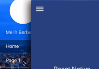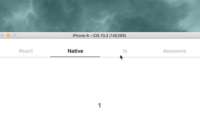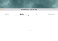
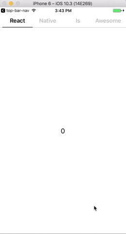
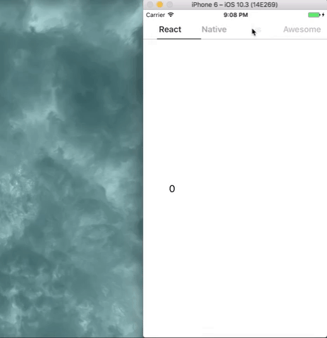
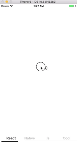
top-bar-nav
A top bar navigator for React Native that is super light, simple, and customizable.
Install
npm install --save top-bar-nav
Import
import TopBarNav from 'top-bar-nav';
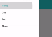
Usage
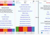
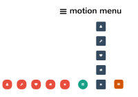
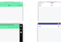
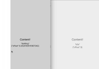
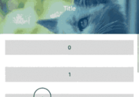
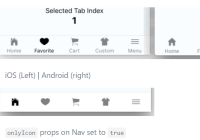
import React from 'react'; import { View, Text, StyleSheet } from 'react-native'; import TopBarNav from './TopBarNav'; const Scene = ({ index }) => ( <View style={{ flex: 1, justifyContent: 'center', alignItems: 'center' }}> <Text style={{ fontSize: 20 }}>{index}</Text> </View> ); const ROUTES = { Scene // ideally you would have a ROUTES object with multiple React component scenes }; // There are three types of labels (image, text, and element) const ROUTESTACK = [ { image: require('./search.png'), title: 'Scene' }, { text: 'Hello', title: 'Scene' }, // title is just the name of the Component being rendered. See the renderScene property below { element: <Text>World</Text>, title: 'Scene' } ]; export default class Example extends React.Component { render() { return ( <View style={{ flex: 1 }}> <TopBarNav // routeStack and renderScene are required props routeStack={ROUTESTACK} renderScene={(route, i) => { // This is a lot like the now deprecated Navigator component let Component = ROUTES[route.title]; return <Component index={i} />; }} // Below are optional props headerStyle={[styles.headerStyle, { paddingTop: 30 }]} // probably want to add paddingTop if using TopBarNav for the entire height of screen to account for notches/status bars labelStyle={styles.labelStyle} underlineStyle={styles.underlineStyle} imageStyle={styles.imageStyle} sidePadding={40} // Can't set sidePadding in headerStyle because it's needed to calculate the width of the tabs inactiveOpacity={1} fadeLabels={true} /> </View> ); } anotherRender() { // if rendering the nav bar at the bottom is your thing return ( <View style={{ flex: 1 }}> <View style={{ flex: 1, transform: [{ scaleY: -1 }] }}> <TopBarNav // routeStack and renderScene are required props routeStack={ROUTESTACK} renderScene={(route, i) => { // This is a lot like the now deprecated Navigator component let Component = ROUTES[route.title]; return ( <View style={{ flex: 1, transform: [{ scaleY: -1 }] }}> <Component index={i} /> </View> ); }} // Below are optional props headerStyle={{ paddingTop: 20, transform: [{ scaleY: -1 }] }} // probably want to add paddingTop: 20 if using TopBarNav for the entire height of screen on iOS underlineStyle={{ height: 3 }} /> </View> </View> ); } } const styles = StyleSheet.create({ headerStyle: { borderBottomWidth: 1, borderColor: '#e6faff', backgroundColor: '#3385ff' }, labelStyle: { fontSize: 15, fontWeight: '500', color: '#fff' }, imageStyle: { height: 20, width: 20, tintColor: '#e6faff' }, underlineStyle: { height: 3.6, backgroundColor: '#e6faff', width: 40 } });Demo
Props
static propTypes = { routeStack: PropTypes.array.isRequired, initialIndex: PropTypes.number, renderScene: PropTypes.func, headerStyle: stylePropType, textStyle: stylePropType, imageStyle: stylePropType, underlineStyle: stylePropType, sidePadding: PropTypes.number, inactiveOpacity: PropTypes.number, fadeLabels: PropTypes.bool, scrollViewProps: PropTypes.object }; static defaultProps = { initialIndex: 0, sidePadding: 0, inactiveOpacity: 0.5, fadeLabels: false, scrollViewProps: {} };